Xray_Crystal_Junkie
Senior Member
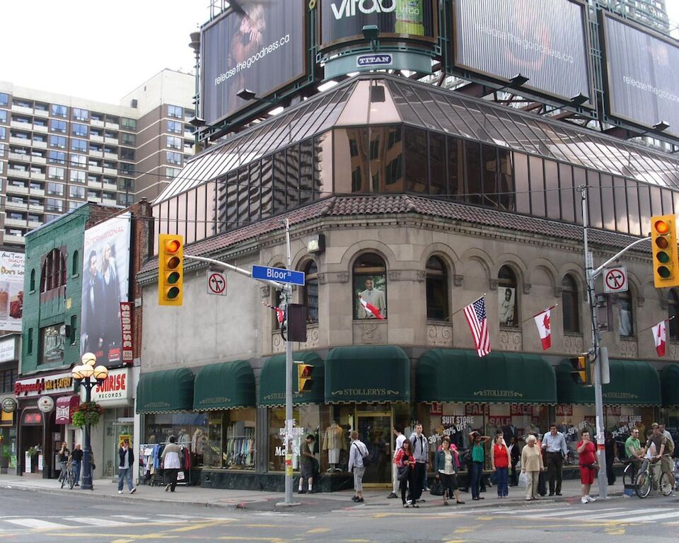
With the space at the western most part of the roof, it certainly looks like it could have been set back further from Yonge. Is that patio space back there?
I find that my eyes are primarily drawn to the architectural details of the building, and the glass work at the top secondary. IMO they missed the mark only in that they should have replicated the first floor cornice detail around the top of the glass of the addition. It would have made the addition look less like one, and reduced its modern appearance.
It would have made the addition look less like one, and reduced its modern appearance.
Yes, this is a case where something very light, airy and transparent should've been employed. The heavy dark glass is straight out of the 1980s, and is very distracting. I won't go as far as saying it's ruined the whole building, but it's definitely a detriment.


What it mostly means is doing traditional restoration of a building’s exterior, but gutting the interior to create adaptable space with a more modern look and the sort of amenities tenants would expect in a new property.
More.........Which takes us to the first hurdle in saving heritage buildings