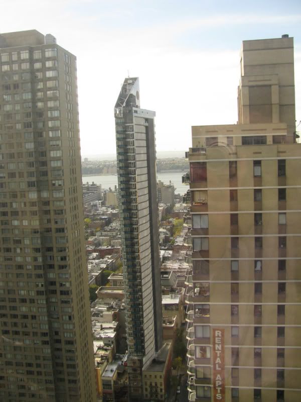
Just like people, age usually works the other way!
With Crystal-Grey.....errr I mean....Crystal-Blu turning out to be disappointing in its cladding (I do like the slimness though), I'm hoping that this one turns at least decent (i.e. eye-catching in whatever way possible) so that this area will be more pleasing to the eye.
So, for all you highly knowledgeable people out there: How many of you would want to see the grey brutalist Manulife Building and the grey BMO building (on Bloor) changed to a different color (if possible), and if so, what would your color preferences be? I want the Bloor-Yorkville corridor to look a little less grey. (My disclaimer: I know a bit about the brutalist history of toronto buildings but am curious regardless and am therefore using this forum to express this; please limit the 'hate' mails.) Thanks.


