someMidTowner
¯\_(ツ)_/¯
Today:

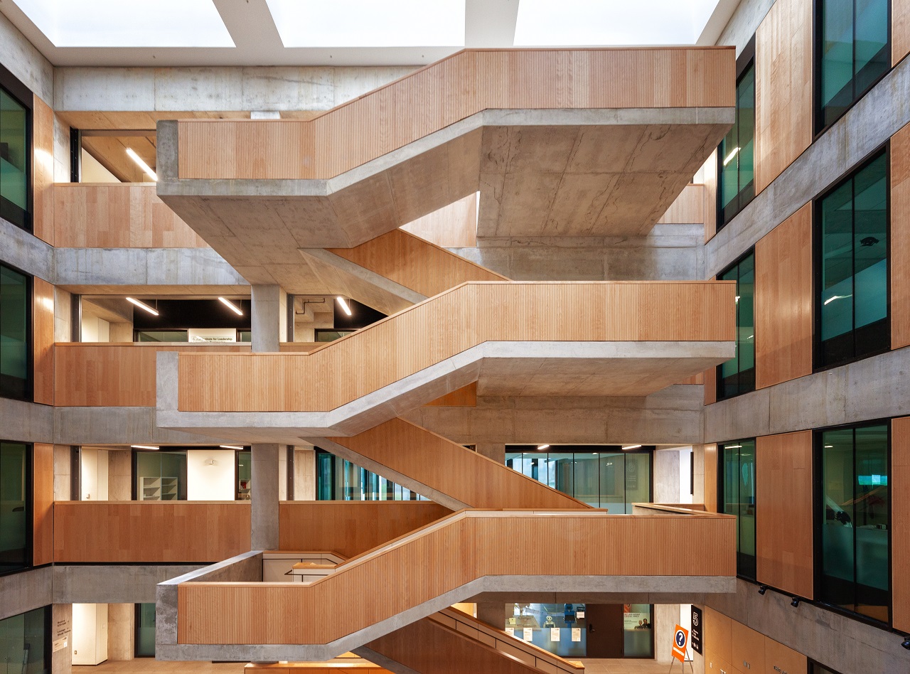
 Myhal Centre by Marcanadian, on Flickr
 Myhal Centre by Marcanadian, on Flickr
 Myhal Centre by Marcanadian, on Flickr
 Myhal Centre by Marcanadian, on Flickr
 Myhal Centre by Marcanadian, on Flickr
 Myhal Centre by Marcanadian, on Flickr
 Myhal Centre by Marcanadian, on Flickr
 Myhal Centre by Marcanadian, on Flickr
 Myhal Centre by Marcanadian, on Flickr
Criiiiiiisp shotsSunday:
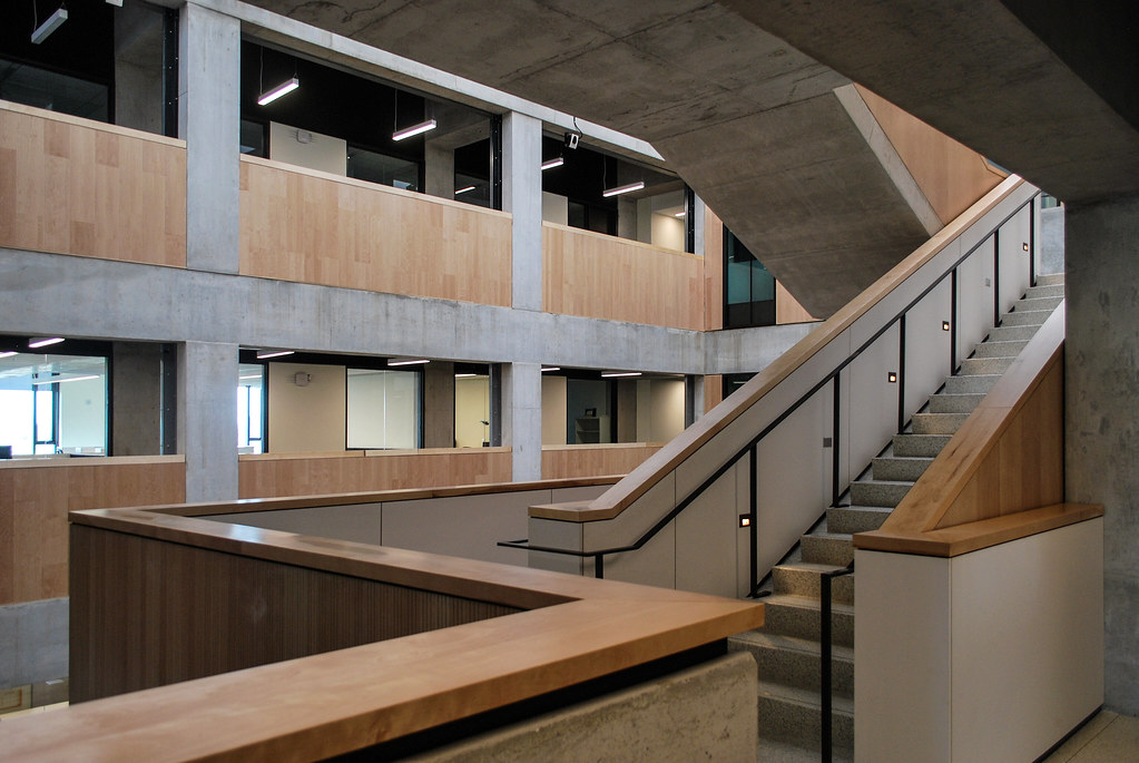
Myhal Centre by Marcanadian, on Flickr
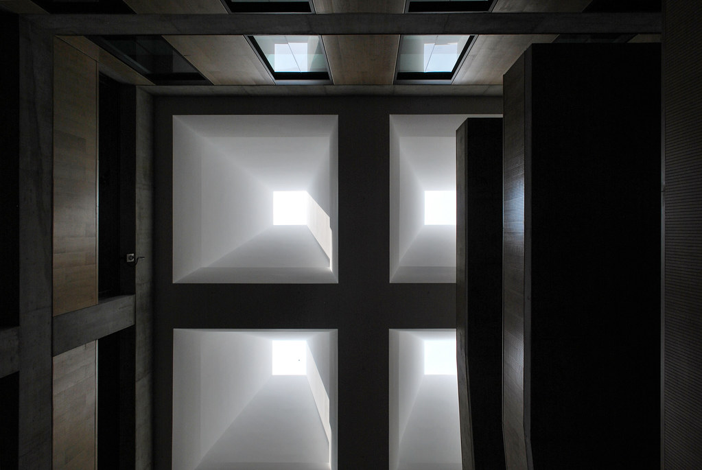
Myhal Centre by Marcanadian, on Flickr
Myhal Centre by Marcanadian, on Flickr
Myhal Centre by Marcanadian, on Flickr
Myhal Centre by Marcanadian, on Flickr
Myhal Centre by Marcanadian, on Flickr
Myhal Centre by Marcanadian, on Flickr
Myhal Centre by Marcanadian, on Flickr
Myhal Centre by Marcanadian, on Flickr
It's one of those buildings where all the good stuff is inside.
(While acknowledging that this is veering off topic...)You've just described almost every older building at the University of Waterloo (except Dana Porter library).
My issue w/this building is really only its intrusiveness in the King's College Circle area where its height + form given it an intrusive and over-bearing feel to me.
I disagree - the yellow bricks are a great modern counterpoint to a lot of the older yellow buildings on campus, and ever since they cleaned the facade of Convocation hall the new building is surprisingly similar in colour. I really appreciate the modern contrast between the two and in no way find it overwhelming.
You can see the brick cleaning in process below - note how similar the masonry colours are between the two buildings
View attachment 279197