News   GLOBAL  |  Apr 02, 2020
 9.8K     0 
News   GLOBAL  |  Apr 01, 2020
 41K     0 
News   GLOBAL  |  Apr 01, 2020
 5.6K     0 

c'mon, there's much worse than these (excl. Archivistower's selection)
 
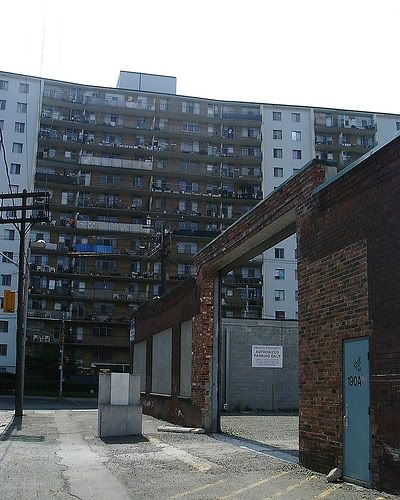
Here is a building that balconies are used as storage rooms.Also not much left of a small industrial building that was leveled and turned into a parking lot.

352354192_bb636e307d1.jpg
 
Last edited:
Yeah, I beg to differ about RoCP being a "hands-down winner", too. Not that it isn't that great; but it isn't so obviously the worst, either (except, maybe, when viewed as an Old City Hall backdrop)

Yet unmentioned, though, is this

HolidayInn_onKing.jpg
 
Come on thats not that ugly,i agree that it may be in the wrong city.It looks like it would fit nice by the beach in some tropical island.
 
^ Ha, funny you mention that, Automation, I havve thought several times that this hotel belongs on the beach in Miami, where it would fit in quite nicely. I wonder how it got transported to Toronto.

The Sheraton looks cool and elegant, in my opinion, from a distance. It frames Nathan Philips Square nicely. It's pretty unfortunate when you get closer up, and see how it utterly fails to "meet the street" in any sensible way whatsoever. I would like this building a lot if you could somehow jack it up, rip out just the main level, and redo it.

Ugliest of all? The Bay store at 2 Bloor East, hands down, complemented by the attached office tower, which makes no effort at all to be welcoming or relate to the surroundings.
 
Last edited:
Ugliest of all? The Bay store at 2 Bloor East, hands down, complemented by the attached office tower, which makes no effort at all to be welcoming or relate to the surroundings.

That one gets my vote too..
 
I don't like those apartments from the 1960s and 1970s commonly found in the suburbs, though there are some downtown as well (in reference to the second tower Automation Gallery suggested). The lack of differentiation or innovation means that they used the simplicity and functionality embraced by modernism as an excuse for generic pieces that aren't ambitious at all. Some of these towers also have a generic, black chimney tacked on the top. I couldn't see myself arguing to save buildings like that. Even in terms of colour palette they're not that attractive. Combining white with brown or cream still doesn't look good, even at a time when we're beginning to come to terms with Brutalism and once again celebrating modernist achievements. These generic apartments are the expendable side of mid-century modernism, unlike, say, Peter Dickinson's apartment designs. They're hardly attractive.
 
RoCP looks fine to me too.

But +1 for the Toronto Star building. That thing should be demolished.

I never found CCW particularly attractive either... although I have a feeling I might get flamed for that one:

cibc_vertical.jpg
 
First Canadian Place is quite clearly the ugliest, but only because of the condition of the marble. Any number of brown-siding'd commie blocks could also win, as well as any one of 100 Tridel condos...Skymark, Element, stuff in Scarborough, etc.

I never found CCW particularly attractive either... although I have a feeling I might get flamed for that one:

cibc_vertical.jpg

Flamed? No.

Burned at the stake? Yes!

Or possibly flame-throwered...
 
I don't like those apartments from the 1960s and 1970s commonly found in the suburbs, though there are some downtown as well (in reference to the second tower Automation Gallery suggested). The lack of differentiation or innovation means that they used the simplicity and functionality embraced by modernism as an excuse for generic pieces that aren't ambitious at all. Some of these towers also have a generic, black chimney tacked on the top. I couldn't see myself arguing to save buildings like that. Even in terms of colour palette they're not that attractive. Combining white with brown or cream still doesn't look good, even at a time when we're beginning to come to terms with Brutalism and once again celebrating modernist achievements. These generic apartments are the expendable side of mid-century modernism, unlike, say, Peter Dickinson's apartment designs. They're hardly attractive.

I have to agree. I can't believe, they were once considered to be "luxury" apartments since they are ugly and lame.
 

Back
Top