/\ Yup. Like I said earlier, it was much better when the bridge was just arbitrarily 'left' there by the architect. It looks too thought out now - its lost its whimsical nature and has instead pursued a "low-rise office park in Streetsville" aesthetic. I know its only a preliminary rendering and I really liked the other one; but now I'm just not sure.
 
That image must be phase II, where the long, narrow building is next to Redpath. I agree though, Phase I looks more "whimsical" while this looks more "Vaughan with a bridge".
 
This project is getting a lot of unjustified criticism.

The waterfront is going to remain very accessible to the public both physically and visually. At the same time it will be adding a substantial amount of greenspace to the city. And with respect to the comments about the lack of retail, I'm sure that phase 3 and 4 (parallel to Queen's Quay) will have retail.
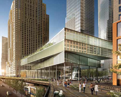


I think my criticism is justified. I feel that the new concept shot lost much of the original flavor which made it ever so 'distinct' in the first place. My justification? The fact that this critique is blatantly obvious and has been corroborated by several other forum members.

Furthermore, while this is more 'cutting edge' for Toronto; that's just sad. Why not put something like the base for Stern and Co's proposal for the Hudson Yards here - the one which looks like several books laying on top of one another (modified, of course, for residential use). Something like that has a little more imagination than two office parks from Barrie with a hastily engineered 'bridge' spanning the void between them. Are we scared or something?

7.jpg


We already know the general media (JBM aside) seems to love the mediocrity of the aforementioned 'Toronto style.' And while the recent news about design review boards (the Corus opposition is testament to this) is wonderfully refreshing, we still need more people to stand up and demand more. My justification? We deserve it.
 
This project is getting a lot of unjustified criticism.

The waterfront is going to remain very accessible to the public both physically and visually. At the same time it will be adding a substantial amount of greenspace to the city. And with respect to the comments about the lack of retail, I'm sure that phase 3 and 4 (parallel to Queen's Quay) will have retail.

Me thinks you don't understand the difference between "unjustified" criticism, and justified criticism that you happen not to agree with. The first is blind ignorance, or just unwilling to see things differently, the second is something that we can debate, and I have no problem with.
 
Me thinks you don't understand the difference between "unjustified" criticism, and justified criticism that you happen not to agree with. The first is blind ignorance, or just unwilling to see things differently, the second is something that we can debate, and I have no problem with.

Semantics aside, I think it's a terrific project and I have a lot of faith in aA and their ability to resolve the urban planning aspects of the project.
 
Does anybody know the status of the second phase? Doesn't the building phase near Redpath Sugar (east side) have to be built before anything can go forward at this site?
 
Phase 1 and 2 are going to be built simultaneously.

I suppose the sales office, which is under construction, is going to be for the later phases adjacent to Queen's Quay.
 
So, how are non-residents supposed to penetrate to the water's edge? Do they have to wander around and find the narrow passageway on one side of the mega-development?
 

Back
Top