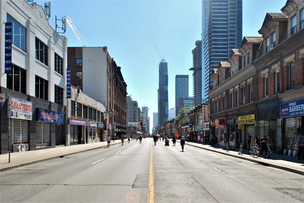
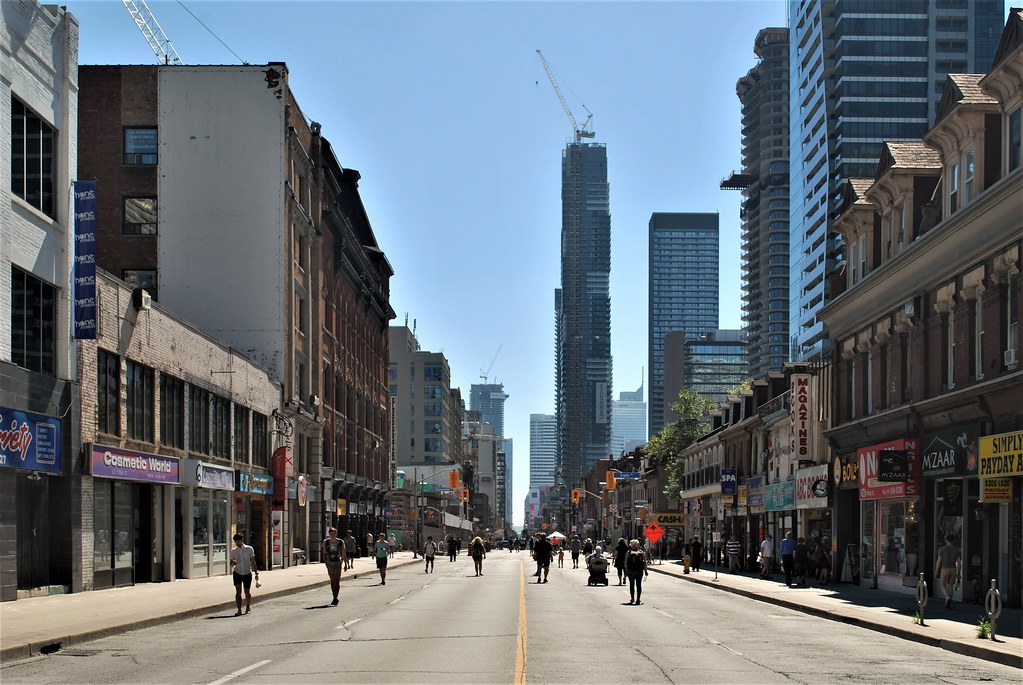
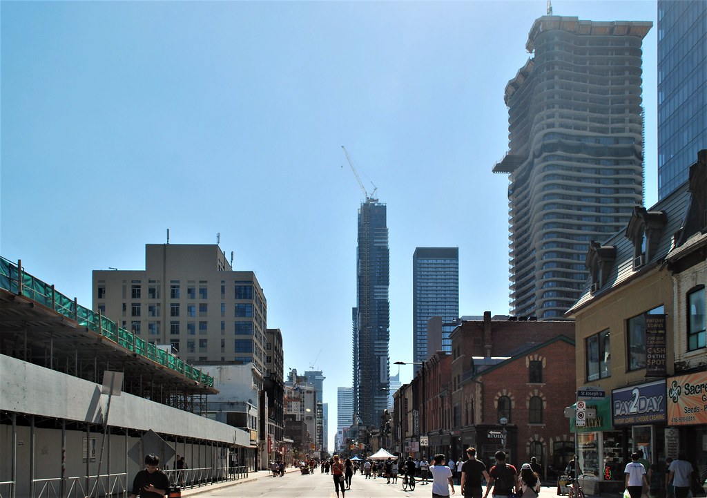
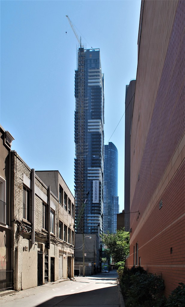
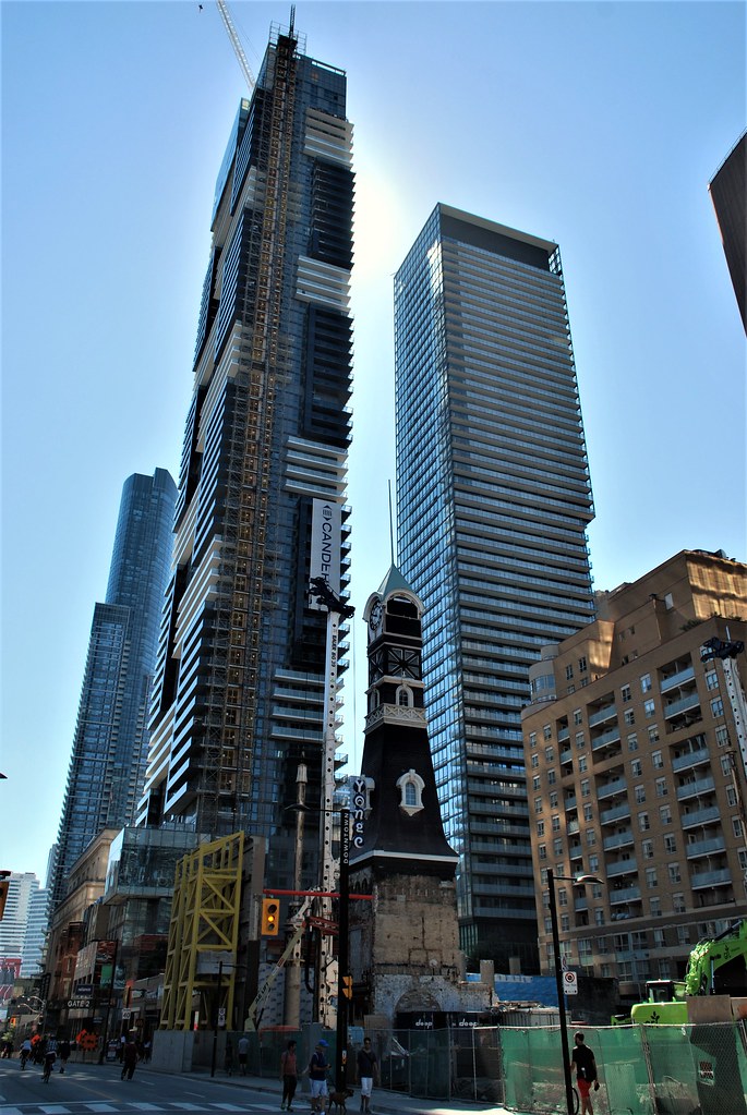
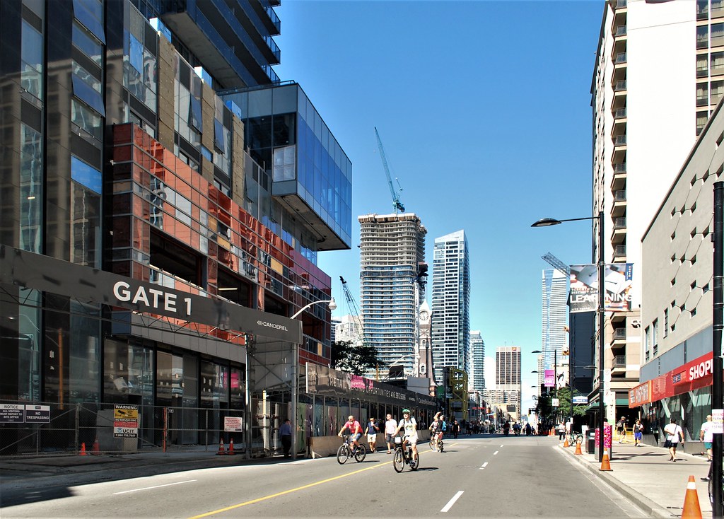
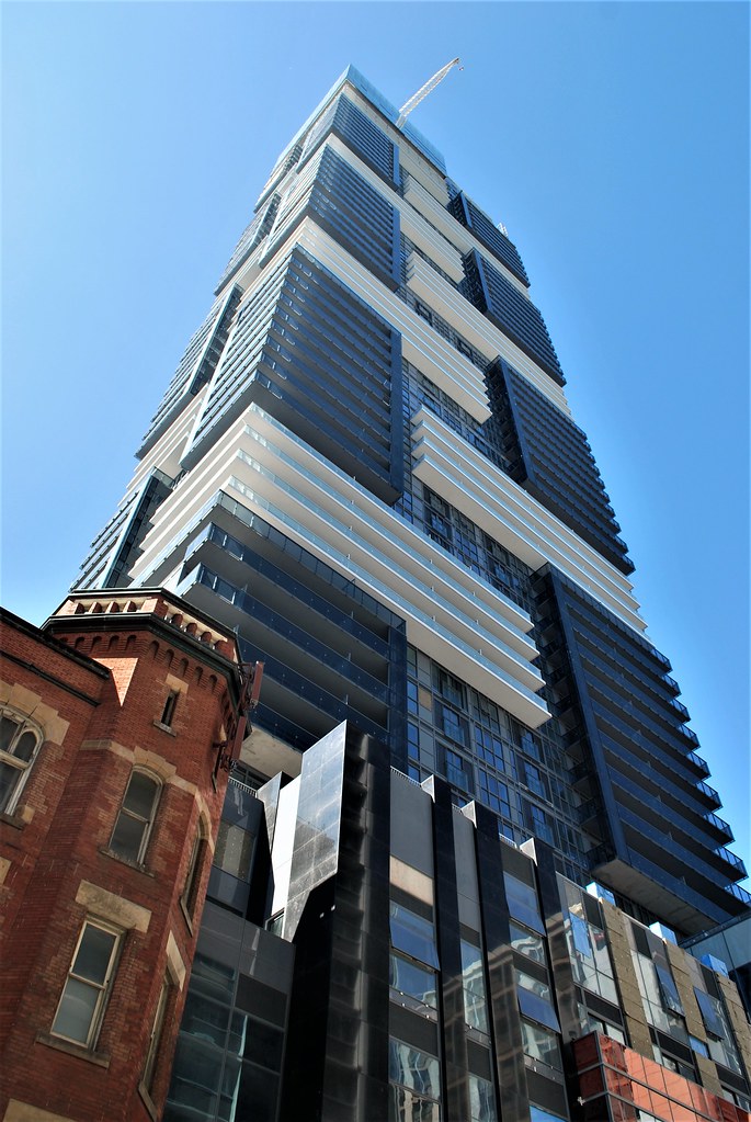
The big bright balconies and tiled appearance give this tower a beautiful and almost West Coast styled appearance! It's definitely among my favourite new projects, right up there with Aura. And keep in mind, the slim profile will mean each unit gets more natural light and more view!
 
IMG_2613.JPG
 

Attachments

  • IMG_2613.JPG
    IMG_2613.JPG
    195.6 KB · Views: 717
  • IMG_2615.JPG
    IMG_2615.JPG
    194.6 KB · Views: 467
May be if the gray cladding of the Tower was replaced with the Orange color to alternate with the black cladding, we will be singing praises
 
Taken by me today from the TD Centre.
This project does look better the further away you are. I'm amazed how much the Yonge canyon has grown over the last five years, and how different it will look in another five.

20180918_095049.jpg
 

Attachments

  • 20180918_095049.jpg
    20180918_095049.jpg
    258.4 KB · Views: 831
Last edited by a moderator:
Although I truly appreciate those taking the time to post photo updates, I just can't bring myself to "like" the posts containing pictures of this sad excuse for a tower.

I look at it a bit differently. I can “ like” the quality of a photo without also liking the architecture of its subject matter. For example, the photo by Tarazet of Karma and YC caught in the distortion of the glass of whichever building that may be is well worth a. “Like”, IMO.
 
I look at it a bit differently. I can “ like” the quality of a photo without also liking the architecture of its subject matter. For example, the photo by Tarazet of Karma and YC caught in the distortion of the glass of whichever building that may be is well worth a. “Like”, IMO.
I look at it the same way. I like posts based on the information they offer and the effort put in by the poster. Me liking a post isn't an endorsement of the design quality
 
It's a massive eyesore not deserving its location or its height if buildt anywhere. That extends to the colour block design, the engineered rather than designed elements and, the window wall cladding. My opinion, of course. Someone on Urbantoronto using "striking" for this pile is a cause of concern for me as well. Sorry if that comes across as harsh.

No offense taken, though I admit I am reassessing my aesthetics sense here, considering how strong in numbers the down-vote team is :).

The general architecture scene in Toronto has made me shift my taste, not necessarily down, but in a different realm, using a different measuring scale so to speak. Before, I could not get myself to look at Brutalist architecture, e.g. York U's Ross Humanities and Social Sciences Building or Scott library, without being clinically depressed temporarily. Now I appreciate mostly everything, even brute Ross (though partly because they've attempted to incorporate color art and some bright painted walls inside, creating a contrast with the bare concrete and this interesting minimalist effect. I'm now trying to get used to line 1's new water-dripping bare sidewalls at track level :), York U station included. You could say my approach is self-serving..

What projects in the city would you guys rate say 8/10 in execution? I suppose YC gets a 5/10 for materials choice. I'd give it a 7 mostly because of the vibe I get from its concept.
 

Back
Top