In addition to the orange, there are at least 3 shades of gray, plus granite black and off white on the podium. Way too busy!
 
The grey mullions on the podium look incomplete as if they should be capped with a differnet colour like black or orange. It's hard to look at.

Are they trying to contrast the grey by adding bright orange because to me the coninuation of messy mullions on both colours just all blend together in the whole podium. A better contrast would be to use a different type material or at least use a thicker framing of stainless steel around the box. Grey mullions are ugly, plus way too much of it to frame these stupid little spandrel pieces.
 
Sometimes you wonder if these architects are on something . Wow !! the colours ! Maybe the podium might look great at night when it's all lit up, we hope ! Happy Thanksgiving us nothing but an eye sore !
 
Today:

43396510670_48277c30ff_k.jpg


43396510090_1bc7d1581a_k.jpg


43396511040_de14c93c9d_k.jpg
 
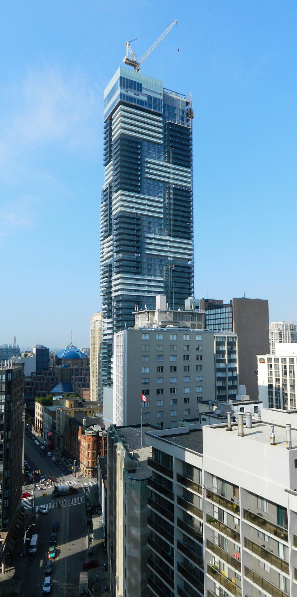
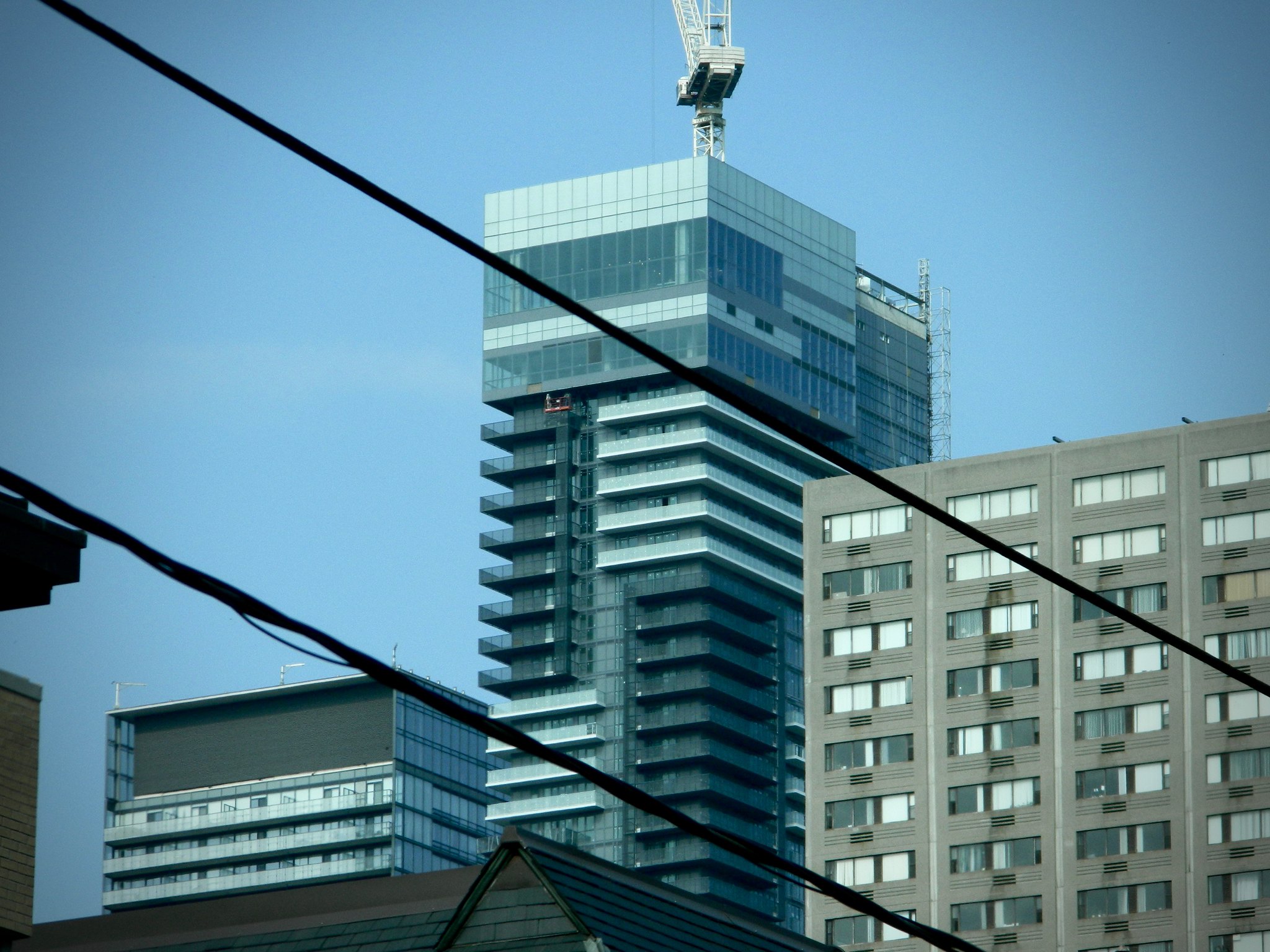
Unfortunately one doesn't get that view when standing at street level. From that vantage, the crown looks like an afterthought.
 

I don't understand, why cant they build condos without balconies? is it expensive to build without balconies? look at the top part of Aura, looks so nice. all these condos with balconies look so crappy I bet they would have looked amazing without balconies. even YC condos would look amazing without balconies.
 

Back
Top