maestro
Senior Member
The shifting boxes is very much on point with current trends in Toronto. I would rather have this without the shift and more attention given to the actual facade. It's clean and elegant but, very simple.
Not to be too picky - but I am not surprised that you are not able to see plans submitted on October 6, 2021 yet....There have been changes here, but the Docs aren't terribly revealing.
The latest plans are marked Jan 27, 2021; but are partial and minor technical changes w/o renders.
But, according to the cover letter, these are a revision to plans submitted October 6, 2021, which I don't see anywhere.
Not to be too picky - but I am not surprised that you are not able to see plans submitted on October 6, 2021 yet....

I don't think my CERB money can cover the itAnyone want to buy a development site?

Commercial Opportunity: A High-Profile Site in the Middle of Bloor-Yorkville | UrbanToronto
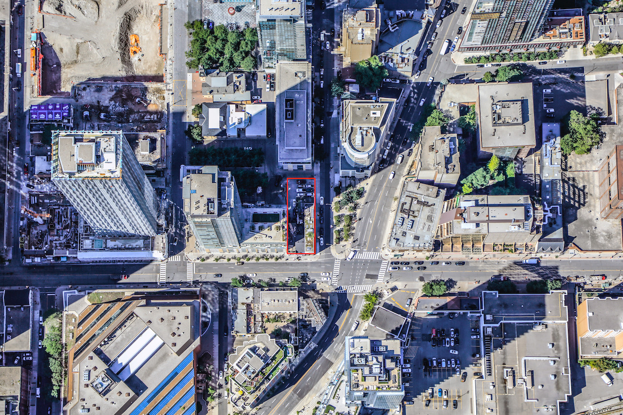
A property in the heart of Toronto is for sale. Nestled between the sought-after neighbourhoods of Yorkville and Rosedale, the site is ideally positioned at the corner of Yonge and Scollard streets. Currently the site has three low-rise buildings on it, but zoning is in place for a tall...urbantoronto.ca
42
This building is going to look real nice! It's simple but effective by having thick cream white cladding around the square punctured windows. Let's hope they'll use dark glazed windows. That will really make this building pop out from a distance!