News   GLOBAL  |  Apr 02, 2020
 8.5K     0 
News   GLOBAL  |  Apr 01, 2020
 39K     0 
News   GLOBAL  |  Apr 01, 2020
 4.7K     0 

Hi there! I'm new to this site and just came across this thread :)

I thought I'd share this map I made a couple months ago as a fun hobby project during quarantine.

ttc_2054_3100x1772.png
I like the concept though I think the city would greatly benefit from some more higher-order transit. Three grade-separated line does not seem like anywhere near enough. Also steeles feels pretty left out 😮 
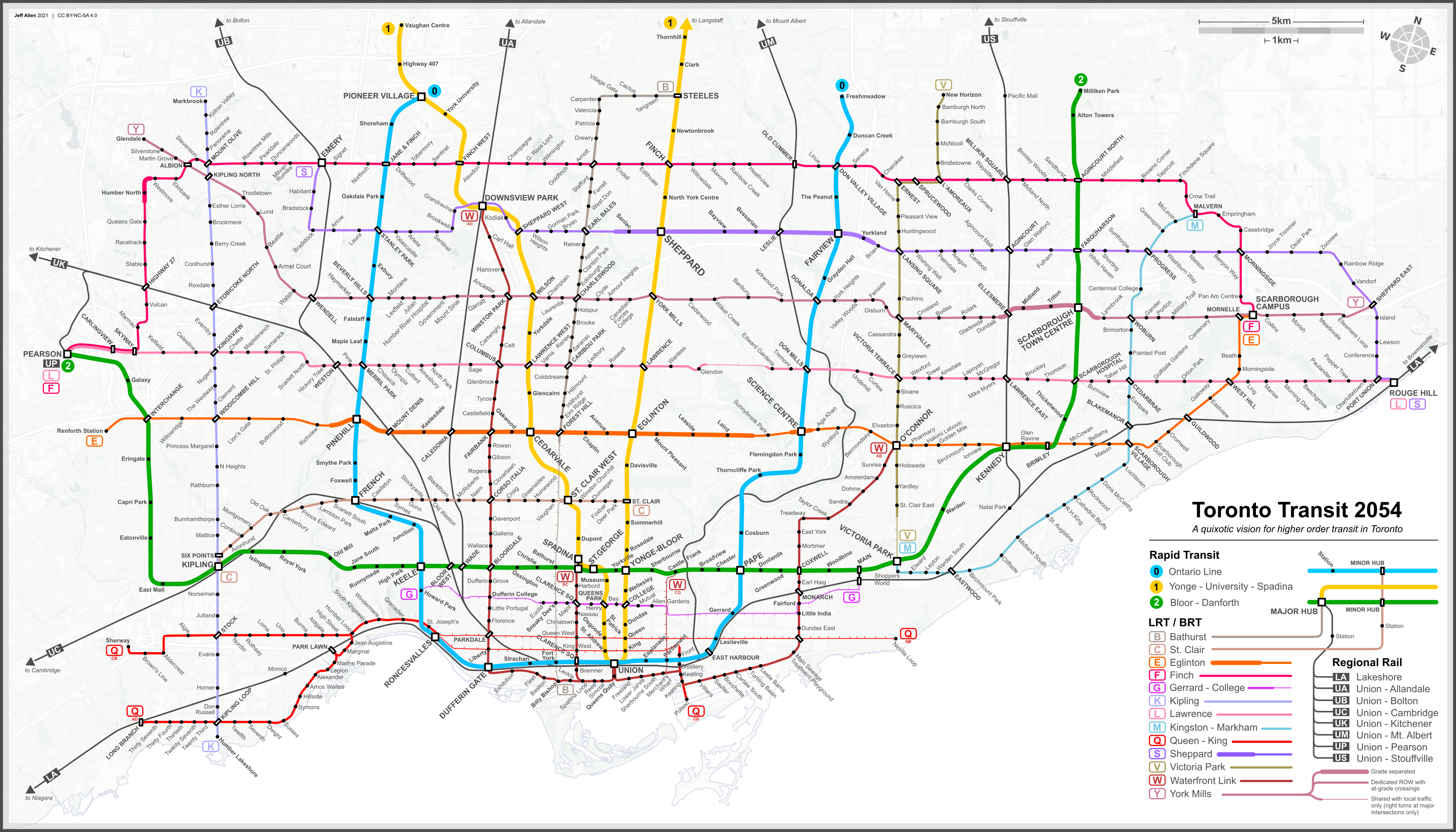
I like your waterfront link from Downsview to OConnor a lot though
 
I'm not sure if this is the right place for this but I've been working on a redesign of the subway and streetcar map to include GO services for a while now, and I think I finally have a finished version of the present-day map.

Subway Map redesign 2021 Final.png


I am very much looking for feedback so if you have any suggestions or see any mistakes feel free to let me know! The next step is to add future extensions and lines to the map, many of which have already been accounted for in the original design (mainly the Ontario line, as this whole project arose from me finding that the Ontario line didn't fit in very well on the current official map).

ALSO PLS NAME SUGGESTIONS THIS IS THE BEST I COULD COME UP WITH BUT IT SUCKS
 
I'm not sure if this is the right place for this but I've been working on a redesign of the subway and streetcar map to include GO services for a while now, and I think I finally have a finished version of the present-day map.

View attachment 321385

I am very much looking for feedback so if you have any suggestions or see any mistakes feel free to let me know! The next step is to add future extensions and lines to the map, many of which have already been accounted for in the original design (mainly the Ontario line, as this whole project arose from me finding that the Ontario line didn't fit in very well on the current official map).

ALSO PLS NAME SUGGESTIONS THIS IS THE BEST I COULD COME UP WITH BUT IT SUCKS
Main not Maine!
There’s a lot I like about this. Clearview looks great, along with the GO network!
 
Main not Maine!
There’s a lot I like about this. Clearview looks great, along with the GO network!
AHH idk had New England on my mind ig lol!
Thanks, i agree Clearview looks really clean here I'm hoping the TTC adopts it for their maps as Metrolinx has stated they want to use it in all of their wayfinding.
 
I'm not sure if this is the right place for this but I've been working on a redesign of the subway and streetcar map to include GO services for a while now, and I think I finally have a finished version of the present-day map.

View attachment 321385

I am very much looking for feedback so if you have any suggestions or see any mistakes feel free to let me know! The next step is to add future extensions and lines to the map, many of which have already been accounted for in the original design (mainly the Ontario line, as this whole project arose from me finding that the Ontario line didn't fit in very well on the current official map).

ALSO PLS NAME SUGGESTIONS THIS IS THE BEST I COULD COME UP WITH BUT IT SUCKS
I really love the aesthetic. This easily could look like a future transit map made by Metrolinx/TTC with the style. It honestly looks clean.

but I feel the GO station names; the colour of the names doesn't contrast with the black background. Especially station names on the Lakeshore West and Kitchener Lines. Maybe switch them all to white or try some other colours?

Also Leslie/Oriole has a walking connection, but the connection is not on the map, they're two separate stations on your map.

Dundas West/Bloor is hard to read because of the Milton line, try having the Milton Line stick to the Kitchener/UP lines just until above the text and then split the line.

You misspelt Eglinton as Eglington :)
Thanks for the feedback! I think I may mess around with some strokes behind the GO station names to make the m more legible but otherwise yea I think white may be a better option. If I can make the station names more legible i don't think I'll have to move the milton line as that could mess up how things line up with the 512 but I'll give it a shot!
 
I get why you'd want to use the Richmond Hill corridor to Leslie, but since you're turning up to Seneca anyways, I think it makes far more sense to stay elevated above Don Mills to Sheppard and then to finch just to hit the higher density along with don mills. There's definitely room for an elevated structure through that whole area. Once you get to the hydro corridor you could turn one branch west to meet up with the GO corridor at Old Cummer, and have another branch head east to Markham as you showed.
Staying on Don Mills - possibility of serving the Peanut if line goes up to Finch.
Using the rail ROW - serves the Lesmill employment area
I'd prefer the second option, because the Peanut will still be served by frequent 25 Don Mills regardless.
 
Staying on Don Mills - possibility of serving the Peanut if line goes up to Finch.
Using the rail ROW - serves the Lesmill employment area
I'd prefer the second option, because the Peanut will still be served by frequent 25 Don Mills regardless.
Understandable. I think because the don mills alignment would still serve that employment is (maybe not as well) and because of the extra density along with don mills, i still think it would be the better alignment. Also idk how I'd feel about planning this kind of infrastructure around the bus network given bus routes are quite impermanent compared to subway lines.
 
Sorry bout the double post but do you think the white font makes things more legible?
Good looking map! One more suggestion for the labels though: What I do is I put a box (either white for a white background, or black for a black background) at around 50% opacity behind the label but above the line. It allows you to still see the line underneath it, but it just makes the label a little bit more readable.
 
Good looking map! One more suggestion for the labels though: What I do is I put a box (either white for a white background, or black for a black background) at around 50% opacity behind the label but above the line. It allows you to still see the line underneath it, but it just makes the label a little bit more readable.
Thanks, I might try that!
And add Line 5 since it’s about to appear.
I already have line 5 just about done all I need to do is add the station names and rearrange other station names. The ontario line is also mostly done as well as the sse, though I still need to get line 6 on there first
 

Back
Top