


Dan416
Senior Member
I'm kinda underwhelmed. Still prefer the Montreal ones.
|
|
|
I'm kinda underwhelmed. Still prefer the Montreal ones.


Perhaps with a subway station symbol. Many other cities do this ...
... and with a lot less real estate on the pole to label!
About the same height as you typically see bus stop signs elsewere - about the same as a parking sign. It's an odd camera angle ...What elevation are they mounting the STM signs at? Besides the STM.info, 515, Autobus, and perhaps the metro and train symbols the rest of the font sizes look like you would need to be holding the sign in your hands to read it.
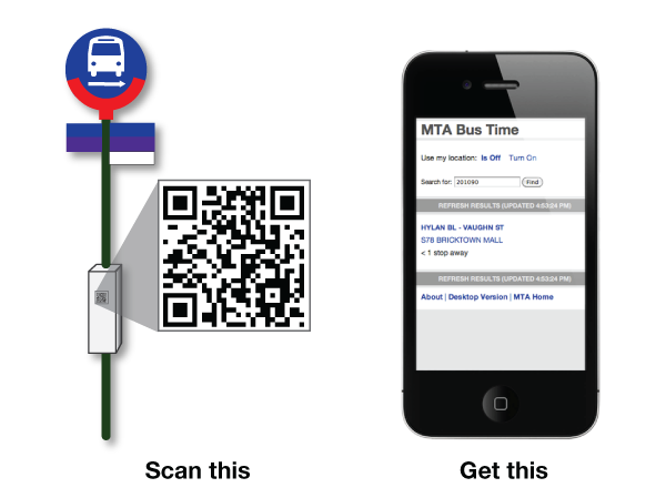
To avoid having to add too much information on the stop pole, just add a QR code (instead of the text number) so that people with smartphones can scan it for more information like route & system maps, timetable, next vehicle info, breakdowns, detours, police activity, fires, bunching, etc..
For next vehicle, it should include not just how many minutes away it is, but also how many stops away it is.