News   GLOBAL  |  Apr 02, 2020
 9.6K     0 
News   GLOBAL  |  Apr 01, 2020
 41K     0 
News   GLOBAL  |  Apr 01, 2020
 5.4K     0 

There was nothing wrong with the older bus stops. The older Stops catch my attention, this doesn't. They should make the red more thicker at least! And the maps aren't too bad, just way over done. The system map used in Mississauga, YRT and Brampton is what TTC should use. Colourful and not all over the place.
 
Last edited:
My comment from BlogTO (which has images of the new maps):

Well, a step in the right direction, but still obviously flawed.

The first main problem is that for the local maps, they appear to reuse them for a specific area. This means that in some cases, the "You Are Here" point is nowhere near the centre, but closer to the edge.

This leads to the second problem: the regional maps which not only show the extensions of the current route, but all routes which pass through the local area. This just looks confusing, even to those who are familiar with Toronto's geography (especially considering the scale change, where to the south it is far closer than in the north).

What is even stranger is that they will show the full scope of nearby local routes, but not the subway! Personally, if I'm at Harboard and Bathurst, I could care less that the College streetcar goes out to Woodbine! Howeever, knowing that a subway line nearby would take me to that destination would be of more value, especially since it is better designed for such a trip.

The subway connections map in the corner does a far better job explaining the geography of the route than the main local map does.

That out of the way, the general look of the new maps are much improved. The current ones simply look bland, and the thinner lines are far more eye pleasing.
 
As for the stops... once again, step in the right direction, but miss the mark.

First, what I like, I like how they indicate which routes stop there, and how they divide them up to clearly indicate which ones are regular, express, limited, etc. I also like how they use the modern international bus symbol, rather than the old one which was based on the old GM buses.

What I don't like: First, they don't tell you anything about the route. Yes, the 94 stops here, what is your point? What is the name of the route? Where does it run to? In what direction? Etc. Secondly, if viewing them from a distance, they tell you nothing that the old ones don't already. At York University, you have all these stop poles, but you have to get right up to them to actually figure out where they are going. Even then, they tell you the route name as well as the number. Something like the one shown for Montreal would be much better for everyone.

That out of the way, for local stops located at side streets and are not heavily used, these new ones are more than an adequate upgrade. For major stops which are used heavily, more work is needed.
 
I'm kinda underwhelmed. Still prefer the Montreal ones.

Montreal's STM seems to do everything better in terms of graphics and aesthetics, from simple transit signs to station renovations, and even the little melody they play before announcements at subway stations. We still have the more iconic melody before the subway doors close and our unique system font, but why is there always a gulf between the TTC and STM's graphic and design capabilities? Even Montreal's emergency assistance areas on the platforms of Metro stations are marked with a cool blue light, instead of the cheap orange the TTC uses for designated waiting areas. I dream of a day when the TTC outdoes them on something. It's possible that the new Spadina line stations will have the best subway station architecture ever built in Canada (which would be major), but when the TTC renovates the existing stations like Dufferin, it's still the same old rubbish tiles.
 
Saw none of the new shelters map along my route today

TTC Current Bus Stops Signs
8512328942_d4d508c43e_b.jpg


New signs around Queen Park area
8511223267_f1b1da742c_b.jpg


8511224823_c336d33fcc_b.jpg


8511224041_bf69ac958a_b.jpg


8512329554_6175a19ed9_b.jpg
 
Perhaps with a subway station symbol. Many other cities do this ...
515-yellow.jpg
... and with a lot less real estate on the pole to label!

What elevation are they mounting the STM signs at? Besides the STM.info, 515, Autobus, and perhaps the metro and train symbols the rest of the font sizes look like you would need to be holding the sign in your hands to read it.
I agree that an indicator of whether or not each bus can take you to the subway is a benefit. It seems like the most commonly asked question to drivers is "does this bus go to the subway". In almost all places in the city a stop on one side of the street is going to the nearest subway and the other side is going away from the nearest subway and infrequent users don't know which side of the street to use so making it visible from afar which side is going to the subway would probably be more valuable than even the route number. The route number will be the same route number on the other side of the street and the two stops are taking you in opposite directions. You can check the system map and know you are at Eglinton and Don Mills and you want the 34 bus, but without having a compass you don't know if you are on the right corner, and two opposite corners with long light phases and 14 lanes between them both say 34. I guess it is a bit like a 401 on-ramp with no East / West / Destination indication... just 401... hope you like it.
 
Last edited:
What elevation are they mounting the STM signs at? Besides the STM.info, 515, Autobus, and perhaps the metro and train symbols the rest of the font sizes look like you would need to be holding the sign in your hands to read it.
About the same height as you typically see bus stop signs elsewere - about the same as a parking sign. It's an odd camera angle ...

I've never had any problem reading them ...
 
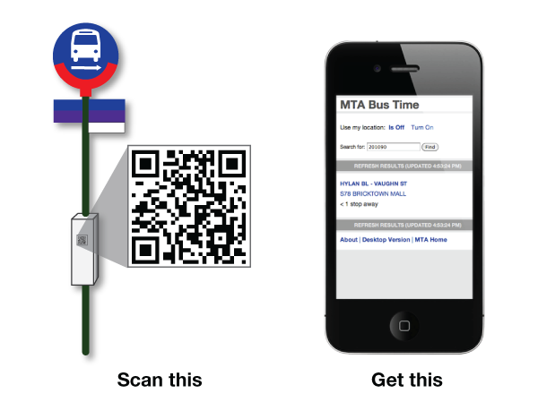
To avoid having to add too much information on the stop pole, just add a QR code (instead of the text number) so that people with smartphones can scan it for more information like route & system maps, timetable, next vehicle info, breakdowns, detours, police activity, fires, bunching, etc..

MobileQRCode.png


For next vehicle, it should include not just how many minutes away it is, but also how many stops away it is.
 
Last edited:
And include a streaming video of the actual bus and display it on a monitor attached to the pole so it can be seen where it is at any given time.
 
To avoid having to add too much information on the stop pole, just add a QR code (instead of the text number) so that people with smartphones can scan it for more information like route & system maps, timetable, next vehicle info, breakdowns, detours, police activity, fires, bunching, etc..

MobileQRCode.png


For next vehicle, it should include not just how many minutes away it is, but also how many stops away it is.

QR chooses have been brought up a lot recently, and while great ideas, there is one problem with using it to replace texting: data roaming charges. If I'm visiting from another country, I'd rather incur the roaming charges from texting than from data. In fact, when I'm visiting another country, our even a place where I can't get Wind service I will simply turn my data service off.
 
Full route name(s) and direction is good enough for bus stop signs. Indicating the destinations might be excessive for what is essentially a grid-based transit network.
 
If you're not familiar with the area, even if you know the layout of the city, it can be hard to know which way is which. Therefore I agree with showing which direction is going to the subway.
 

Back
Top