News   GLOBAL  |  Apr 02, 2020
 9.8K     0 
News   GLOBAL  |  Apr 01, 2020
 41K     0 
News   GLOBAL  |  Apr 01, 2020
 5.6K     0 

I rarely hear people call streetcars "cars," but if it is more common to do so, then it would be interesting to learn.
Rarely? I'm not paying much attention most of the time, but I'd swear that (for example) when the driver is telling you there is another LRV behind you, when you are short-turned, that they invariably say "there's a car coming soon", not a "streetcar coming soon". If it's just conversation that isn't about streetcars, sure the longer form is common to differentiate from a car. But when the discussion is about streetcars, the shorter form seems more common to me. Though now you've said that, I'll have to listen more carefully.

Likewise, there is no confusion between compact fluorescent lightbulbs and the Canadian Football League (despite sharing the same acronym).
And yet I hear people calling them CFLs in casual converstation more frequently when I'm in the USA. But I agree ... it's not confusing.
 
If a TTC renaming was possible or plausible, the most rational likelihood would presently be on behalf of "Metrolinx" becoming some kind of GTA-wide standard--maybe a little how regional Gray Coach services morphed into GO's bus network...
 
Another failed ripoff of the New York system. I'm happy that there is more mention of using the TTC typeface but I just don't have faith they'll use it properly. Their in-house design team needs some design education. All of their work looks like it was designed in powerpoint.

If anyone wants to see the issues with all the standards, Joe Clark had some great studies created a number of years ago highlighting the issues. http://joeclark.org/appearances/atypi/2007/TTC/inscribed/
 
The TTC unveiled their new signage standards today, thoughts?

http://www.blogto.com/city/2013/10/ttc_unveils_new_system_map_and_wayfinding_signage/

IMHO there are better designs in this thread and elsewhere online than their so-called "in-house" solution.

Here's the link directly to the TTC report.

It's certainly an improvement on the current system. Yes, they could have gone further, but I can't say I think any of the designs in this thread are better. And it does make practical sense for it to integrate well with the existing signage, since, given their record, much of it will be sticking around for decades.

I'm glad they're retaining compass directions. "Eastbound" and "Westbound" is so much clearer than "Kipling-bound" and "Kennedy-bound".

What I do find actually exciting is the cleaned-up system map that uses different line weights to represent frequency -- I would love to see the full thing!

"Vaughan Metropolitan Centre" looks predictably ridiculous on the subway map...
 
While I'm not a big fan of the "numbers," I think the fact that the TTC acknowledges the hodge podge of signage and is serious about standardizing its stations and facilities is a step in the right direction.
 
Last edited:
The TTC unveiled their new signage standards today, thoughts?

http://www.blogto.com/city/2013/10/ttc_unveils_new_system_map_and_wayfinding_signage/

IMHO there are better designs in this thread and elsewhere online than their so-called "in-house" solution.

For the most part the design looks good. That entrance to Osgoode looks horrendous though. Sandwiching a station name between two graphics looks awful. They should have found a way to give the station name its own dedicated space free of clutter.
 
It like it a lot to be honest. Expanded use of the iconic font, simplifying overly long route names and better communication as to what they are doing construction-wise. It meets with what one would expect to find on other major systems with regard to wayfinding and communication.

I do think though that there is a need to talk with Metrolinx and standardize some things with GO as well. For instance, GO Rail on subway maps, perhaps GO lettering their lines (whereas the TTC will use numbers) and maybe TTC adopting GO's 24-hour clock, etc. Moreover, other GTHA systems can then follow a similar standard based on the two monster systems.
 
I do think though that there is a need to talk with Metrolinx and standardize some things with GO as well. For instance, GO Rail on subway maps, perhaps GO lettering their lines (whereas the TTC will use numbers) and maybe TTC adopting GO's 24-hour clock, etc. Moreover, other GTHA systems can then follow a similar standard based on the two monster systems.
VERY good ideas but will the silo mentality at both organizations allow such ideas to be implimented?
 
I am not entirely against the usage of the letters/numbers for lines, but it looks too much like New York's MTA subway style in its current proposed form. I really like how they are using the TTC subway font for entrances, especially how they are presented in the Bloor-Yonge mockup (not so much the O S GOOD E [!] example). The ride guide is much improved IMO, and I am also curious as to how the frequency map will work out. Not a fan of the other example signage, especially how connections with GO Transit are displayed (simply put the logo there, no need to smush the words "Regional Transit" underneath).

Although as stated earlier, having the TTC finally take action on this issue is something good to see nonetheless.

I do think though that there is a need to talk with Metrolinx and standardize some things with GO as well. For instance, GO Rail on subway maps, perhaps GO lettering their lines (whereas the TTC will use numbers) and maybe TTC adopting GO's 24-hour clock, etc. Moreover, other GTHA systems can then follow a similar standard based on the two monster systems.

GO already has some form of standard for signage.
 
L7YpW0n.jpg


original.jpg


Torontoist (comments)

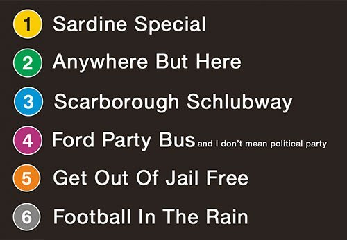
:rolleyes:
 
I like the new signage, but I think that the RT routes should include a letter prefix indicating the type of service (S = subway, L = LRT, B = BRT, E = GO REX, R = Regional GO rail). That way, the naming convention can be applied across the entire region, and eventually routes in the 905 can be added using the same standard.

The other thing I'd like to see is odd numbered routes being N-S routes, and even numbered routes being E-W routes. That may result in some of the numbering sequence being a tad out of order (more E-W routes than N-S routes), but it would make wayfinding a lot easier, knowing that, just based on the number, you can tell which on which axis you're travelling.
 

Back
Top