News   GLOBAL  |  Apr 02, 2020
 9.4K     0 
News   GLOBAL  |  Apr 01, 2020
 40K     0 
News   GLOBAL  |  Apr 01, 2020
 5.3K     0 

Originally Posted by investor
This should really breathe new life into Wellesley East of Jarv. Too bad the design is so unappealing though. I didn't realize that it would so abruptly cut off the eastern view along Wellesley from the west. How disappointing.

No, how perfect!

exactly! the only view it cuts off is of empty sky... one of the problems with the city until this recent building boom is that looking east/west on major cross streets, the skyline ends too abruptly. Having buildings like Verve or Vu placed where the cross streets do their little zag gives a view terminus when looking along those streets, makes the city feel bigger and more closed in... hope you all know what I mean.
 
I believe what Investor is referring to is the fact that at these terminus points, where normally the architectural requirements would be higher the practical outworking is sub-par. The point of creating a reference point on a street is to create something people will consider and discuss. Think about the former Pan am/ current Metlife building, which sits atop Grand Central Station in New York for an easy example.

Sadly, Verve is no PanAm...
 
Interesting pics, Tridelwebmaster...and thx....:)
 
Sadly, Verve is no PanAm - really? PanAm is one of NY's most hated buildings. Actually, I find Verve to be better in its "view blocking potential" than Pan Am. Because Pan Am spans not only what you would commonly see of the building, but also extends outside that viewable limit so that at a distance you can never quite see the whole thing, it seems really piggy - like a guy who should be wearing size 42 pants crammed into a size 34 and bulging out unattractively below his waistline.

I actually have no problem with relatively fit little Verve, and yes, I'm happy it shows up so prominently on Wellesley. To me, it looks quite dapper from a distance.
 
I'm with you, Archivist. Is Verve an architectural jewel? Not by a long shot. But it certainly isn't a failure. And I suspect it will age reasonably well. Unlike, for example, the many fake-modernist condos that are sprouting all around city. Look at 22 Wellesley - a jejune brise-soleil on one side, a squat, pig-like look on the other, and don't event get me started on the "raw" concrete and 50 cent tongue and groove on the ground floor...
 
Verve vs. 22

cbailey. That's so right on. It seems fair to compare the two, so close together on the same street. I have to say, 22 looks Ok from a block away, where you can't see it at street level, but (architect aside) it's pretty disastrous at street level. It's like walking past a parking garage. Verve is not finished yet, but from the glimpses I am seeing of it's street level presence it will make 22 look like what it really is: 2.2!

Given that Verve is in an area with little commercial promise, and 22 borders a portion of Wellesley that sort of almost makes it as a commercial street, and has some potential, I think this is unfortunate.
 
Feb 2, 2008

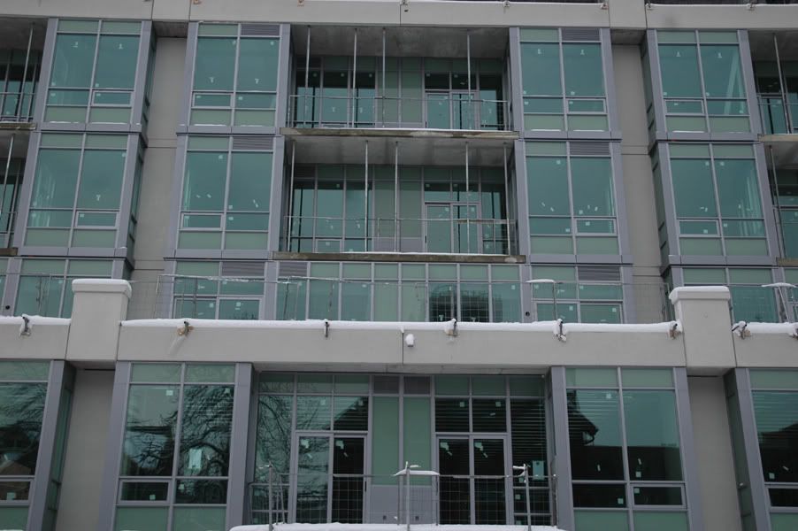
Green whine? Cladding at townhomes at back.
verve3-2.jpg


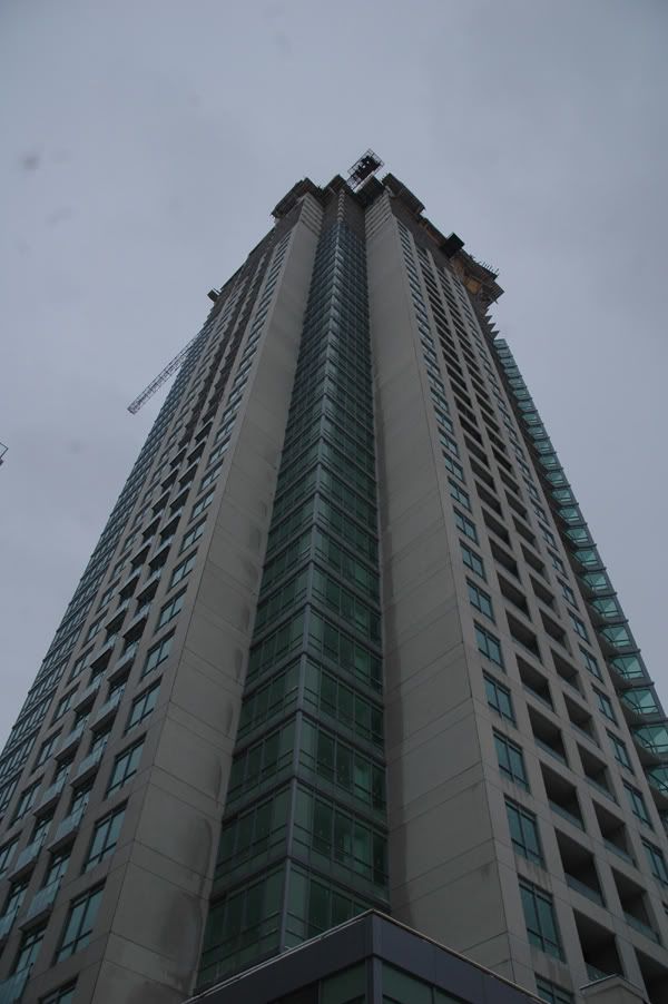
Rather tall.
verve2-3.jpg


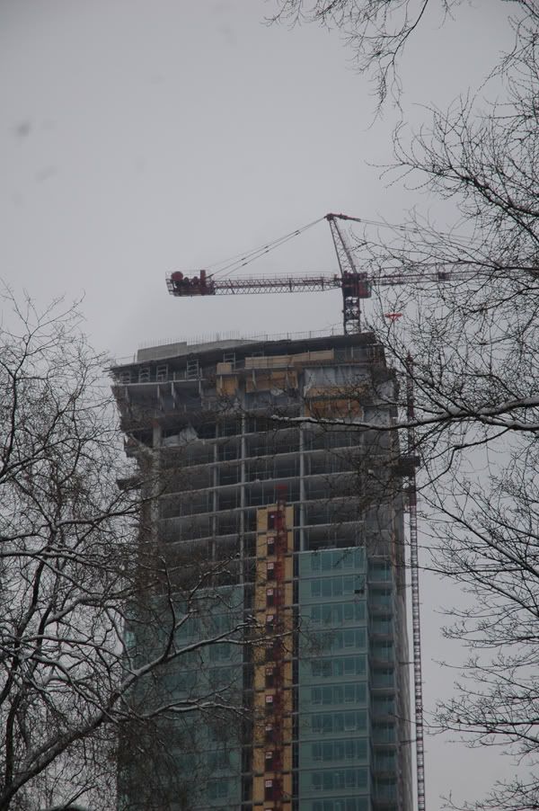
And possibly topped out.
verve1-2.jpg
 
I don't understand why do many people diss this building. It looks fine to me and it's a great addition to a less than spectacular neighbourhood.
 
Personally, G, I think it is because of the name attached to it. It's Burka-Varacalli, not Aa, so it can't be good.
 
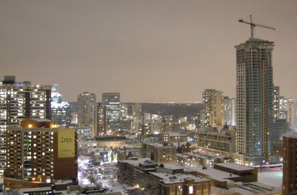
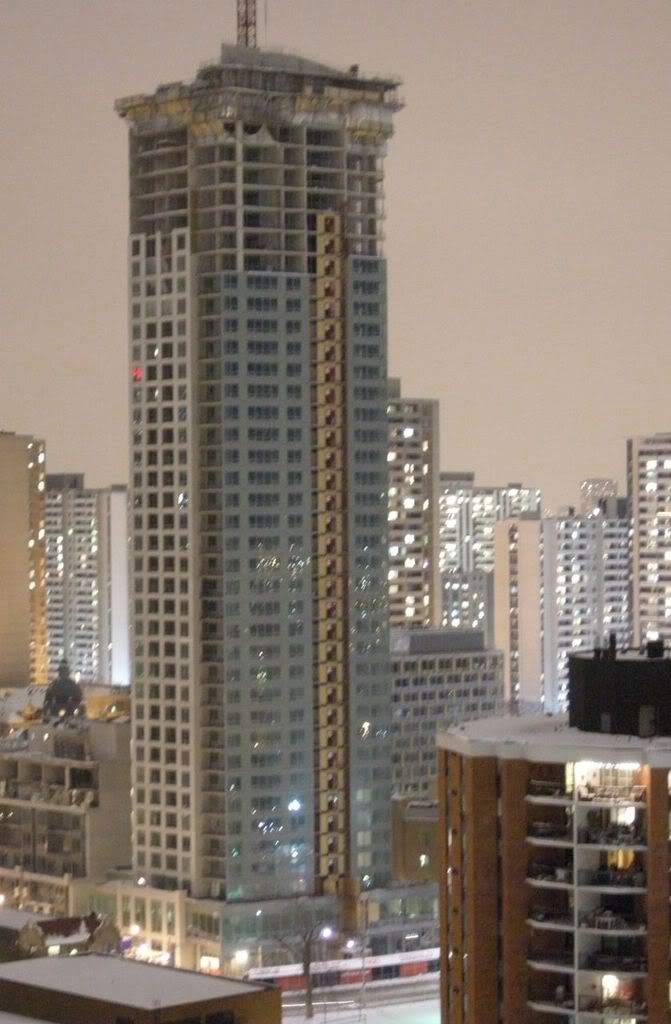
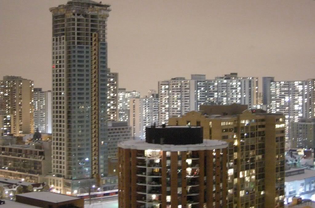
here are some pictures i took a few days before new years when i was staying across the street from ROCP.

2j299xu.jpg


bhc2ok.jpg


vec3h5.jpg
 

Back
Top