News   GLOBAL  |  Apr 02, 2020
 9.4K     0 
News   GLOBAL  |  Apr 01, 2020
 40K     0 
News   GLOBAL  |  Apr 01, 2020
 5.3K     0 

What's your opinion of 1 St. Thomas?


  • Total voters
    33
  • Poll closed .
I think scarberian's got it right.....we need at least one more Stern here in Toronto, to help us make up our minds....;)

How about a Banana Republic building? Stern designed one in Chicago, and I hear they just luv it.;)
 
... Zephyr, I'm not sure where your comments are ironic or sincere. ...

I guess my comments were simply sarcastic, that happens to be the way I show anger and/or frustration most of the time.

Those lamentable swoopes onto this thread with venom and incivility have a way of getting to me. But at some point I can only hope that those attempts at mudslinging by way of ambush will be seen for what they truly are - someone desparately attempting to throw everything and everything at the wall to see what will stick, and dragging all of us down to that level as a reward.

In the meantime, I intend on fulfilling my obligation to correct the latest misdirection (and it is most assuredly that) but only through footnotes since it is admittedly off topic. We will return to more normal ways of dealing with our differing opinions if we want this thread to remain what it is intended to be - an open forum to allow for various views on urban Toronto, and not an open season to attack people in a wild, and ultimately irresponsible manner.
 
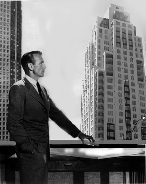
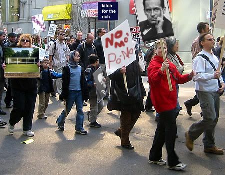
Some pics from around the building today...

fountainheadache.jpg


DSC_0121.jpg


modernprotest.jpg


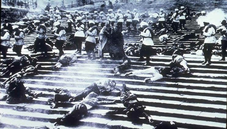
img0006.jpg
 
Zephyr--I agree that AP's a little overwrought in calling you an idjit; I think the big issue is of *how* one defines that which is Postmodern--or maybe even more properly, *how it was defined or perceived in the era in question*. Like, when you refer to
From the other direction, some of that "everything goes" for post-modernism is revisionist history. I have no doubt that you've read it, but the facts tend to dispute it, especially when post-modern began and there was a tonne of outright shouting at symposia and forums that were held throughout the US.
.
Look. I was more or less "there", as an interested observer if not as a practitioner--and the latter may be an important point, because said symposia-shouting was probably enough to make *any* average person tell these pompous architect prigs to FOAD but good, whatever their inclination, modern, PoMo, whatever.

Perhaps the "interested observer" point is important; for I'd say it turned out more of a revolutionary era in architectural beholding and observation, than of practice per se--and perhaps it even turned the primacy of "practice" on its head.

So, quoting Venturi might not be as misleading as it appears--indeed, the popular perception of Postmodern *was*, in early days, quite expansive. Consider Charles Jencks' "The Language of Post-Modern Architecture", the volume which practically gave birth to the term in 1977--and then to consider how the definition unfortunately tightened up over a decade, the same author's 1987 volume, "Post-Modernism, The New Classicism in Art and Architecture". Rather than throwing the "revisionist" label in my lap, I'd rather fling it back at that latter book title.

Like, it may not seem such the obvious case now, but in its day, Jahn's Board of Trade addition *was* generally hailed as Postmodern, as was perhaps the most familiar and beloved Chicagoscraper of the 80s, KPF's 333 West Wacker Drive. Today, their PoMoisms seem mild at best. Heck, as indicated, even Jahn's futuristic State of Illinois Building was "PoMo-identified", though the most PoMo thing about it today is that it's Chicago's ultimate 80s cheese landmark a la Police Headquarters in Toronto.

True, there's not a lot of blatant pastiche a la that Johnson thing (Harold Washington Library is too "artful" to count); interestingly, when the architect who almost singlehandedly invented the "superscale-retro" aesthetic, Ricardo Bofill, did his Chicago thing, the result was so muted it might as well be a supertall version of what Page & Steele or WZMH might have done over here.

Then again, I do know what you mean, in how something like a red vs blue divide developed--I guess Prince Charles' parallel Yankee seed-planter would have been Tom Wolfe's "From Bauhaus To Our House", which enshrined the Postmodern as a "silent majority" option...(I'd consider writing more, if it weren't past 12:30 in the morn)
 
Sticky Thicket is the Ticket

Zephyr ... I think the big issue is of *how* one defines that which is Postmodern--or maybe even more properly, *how it was defined or perceived in the era in question*. ...

I do have a response to your post - a very mild response indeed, given the refinement of your point after I read your followup - but first I need to tie-up my initial installment of the footnote responses I have promised.

Just as a teaser, but remaining broadly on-topic: as you say, there can be and has been different takes on what is postmodern. Some people think, for instance, that 1 St. Thomas is postmodern. I saw that at the beginning of this thread, and I wouldn't have argued with that view except that Stern himself re-labeled a number of his latest buildings "modern traditionalism" to distance them from his own amorphous title that he spearheaded in the 1970s. Specifics and consistency of use are at the heart of all these labels, that is why we have to ask what each of us think that these labels mean, give examples, and see how that input aligns with scholarship on the topic - otherwise we will have multiple labels for every building that comes forth, and that will result, in turn, in mass confusion as to what is and what is not postmodern.

Design styles, grouping of styles, and stylistic references to design, make up a thicket that is difficult to traverse on any thread, and is best addressed in a different venue. Nevertheless, if you come at a building such as this one, from a design direction first, you cannot ignore the thicket, just because it is in the way.
 
I'm wondering if Venturi is to the Postmodern what Daniel Patrick Moynihan was to the Neoconservative, i.e. revere his spirit, but don't blame him for what the label came to denote over time...
 
I'm wondering if Venturi is to the Postmodern what Daniel Patrick Moynihan was to the Neoconservative, i.e. revere his spirit, but don't blame him for what the label came to denote over time...

Now this I would agree with wholeheartedly! Moreover, it's a brilliant analogy for me, because I totally understood your point long before I read the rest of your explanation.
 
Sorry for boorishly interrupting this PoMo circle-jerk-o'-the-nerds, but just wanted to blurt out that CN remains the King, while Zephyr's tight-sphincter'd ultra-earnestness and preciously thin skin are alternately making me all misty and cracking me up.

Please do carry on.
 
Post #406:
Those lamentable swoopes onto this thread with venom and incivility ...

Variation # 1 - The Simple Ambush Name Call (the least difficult and the most practised) <<<<
Variation # 2 - The Opening or Closing Name Call (usually appended to a misdirection post when left on the run)
Variation # 3 - The Response Name Call (after a drop in to register disagreement - this is used in place of an actual response)

This is fun isn't it? :rolleyes:

But we've already seen this variation on the Stern thread before. The last time a name-calling comment was removed, it went to a depth that few would be so foolish as to entertain, but it was Variation # 1, just like yours Pep'rJack. Congratulations, you'll probably get away with this one, it's much too sophomoric to be taken seriously, but it was meant to serve the same function as the one deleted.

Come to think of it, it's not just the Stern thread, I've seen all these variations before. Curious how the same avatars can be associated so often with the act of persistent name calling. If you have chosen to use these alternate means of communication rather than discussion - enjoy. The person you bring down the most will ultimately be yourself.

.​
 
dermatology.jpg


On Modernism And Dermatology


Although buildings since time immemorial have relied on thick, heavy, load-bearing walls to give them an air of authority, permanence and beauty, Modernism - and its attendant structures - have traditionally relied on a thin, transparent skin coupled with the slenderest of structural supports to give them their claim to fame. Indeed, on some of the best modernist buildings - which approach the notion of 'pure idea', it is as if they have no clothes on at all.

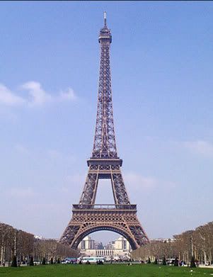
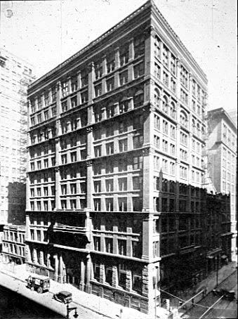
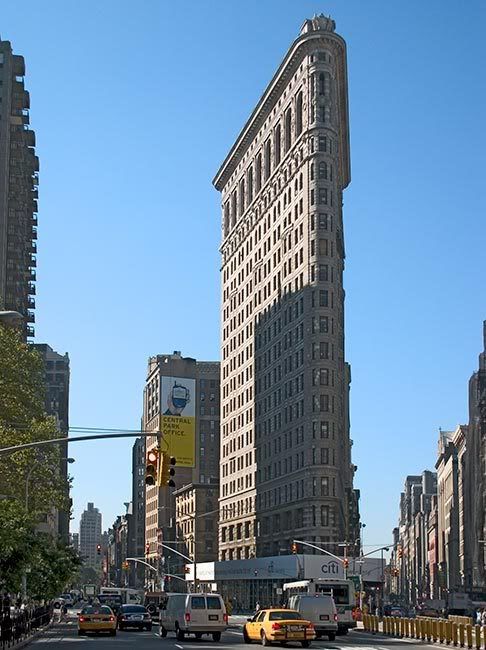
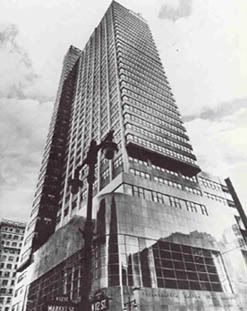
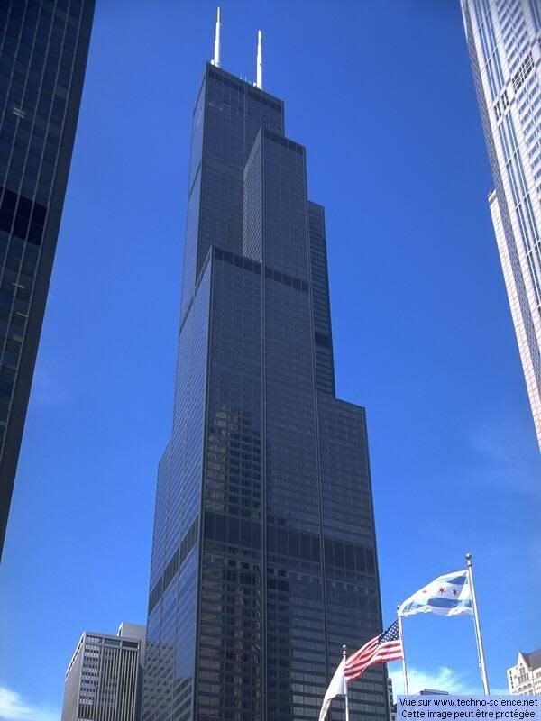
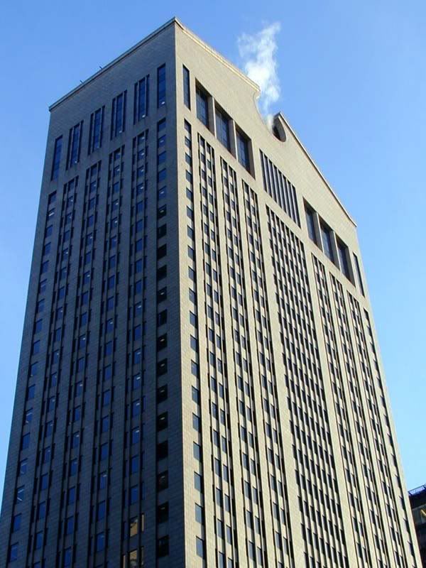
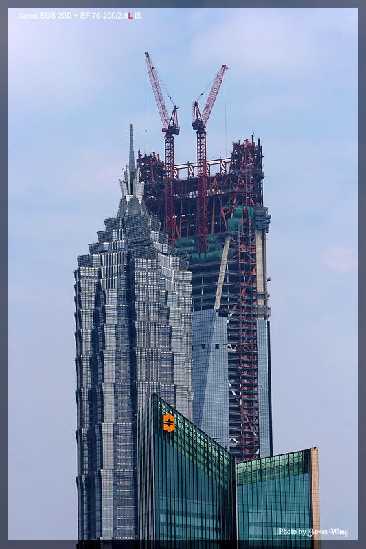
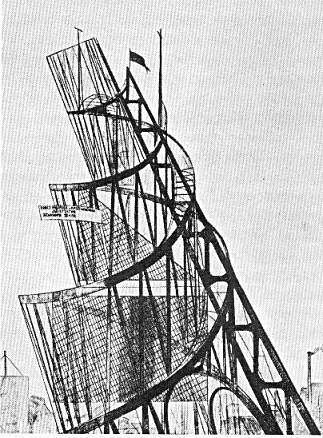
Which of these modern buildings has the thickest skin? Answer carefully! A cohesive theory, like a well-written comedy, can be more powerful than a gun.

a)
eiffel-tower-picture.jpg


b)
HomeInsuranceBuilding.jpg


c)
Flatiron_8775.jpg


d)
psfsbw.jpg


e)
Sears_Tower_1.jpg


f)
sony_building_att_top.jpg


g)
picshome45621_1186389941.jpg


h)
Tatlin_tower.jpg


i) Any building over two floors by Mies VanDerRohe.

Answers are written in Grey and White invisible ink on a sheet of iron-free glass framed in Nirosta Steel (that most nostalgic of metals), locked in a Chippendale-style time-capsule under the former site of Pruitt-Igoe. Apparently, it can be detected in a video by Nam June Paik (check the newest gallery exhibition schedules for non-seeings).
 
Apropos this thread

http://www.newyorker.com/arts/critics/skyline/2007/08/27/070827crsk_skyline_goldberger

The Sky Line
Past Perfect
Retro opulence on Central Park West.
by Paul Goldberger
August 27, 2007

070827_r16536_p233.jpg


In an essay titled “The Plight of the Prosperous,†published in 1950 in this magazine, Lewis Mumford dismissed the living accommodations of upscale New Yorkers as little better than slums. “I sometimes wonder what self-hypnosis has led the well-to-do citizens of New York, for the last seventy-five years, to accept the quarters that are offered them with the idea that they are doing well by themselves,†he wrote. The typical Upper East Side apartment, he said, was dark, airless, and badly laid out. Mumford was mostly right, but, by the time he was writing, design and construction standards were heading downhill so fast that the prewar buildings he was sneering at had come to evoke the grand living of a bygone era.

Today, if you want such luxuries as high ceilings and a dining room, an old building is pretty much the only place to find them. Forget Richard Meier and Jean Nouvel and their sleek glass condominiums: for connoisseurs of Manhattan apartments, the real celebrity architects have always been Rosario Candela, J. E. R. Carpenter, and Emery Roth, who designed the best buildings put up between the wars. That period—when Roth built the San Remo, on Central Park West, while Candela produced the sombre citadels of 740 Park Avenue and 834, 960, and 1040 Fifth Avenue—ended up being the glory years. Such buildings still represent the apogee of New York residential design. Brokers often mention Candela in their ads, because people will pay a premium to live in one of his buildings.

Candela has been dead for more than fifty years, but he should get at least partial credit for 15 Central Park West, a new apartment building, designed by Robert A. M. Stern, that occupies the full block between Central Park West and Broadway and Sixty-first and Sixty-second Streets. I have never seen anything quite like it: historical pastiche is common enough in country houses or museums, but it’s rare on the scale of a skyscraper. Stern’s entire building is covered in limestone (it took roughly eighty-five thousand pieces), outdoing even Candela, whose fanciest buildings still had brick at the back. The two hundred and one apartments have casement windows, ten-, eleven-, or fourteen-foot ceilings, dining rooms, plenty of moldings, and plenty of light, Stern having devised a floor plan that gives nearly every room an open view. I am not sure what Mumford would have found to complain about, other than the fact that the building looks as if it had been put up seventy-five years ago.

But that very conservatism may be why 15 Central Park West has become the most financially successful apartment building in the history of New York. All the apartments were sold before the building was finished, at prices that started at more than two thousand dollars a square foot and were subsequently raised nineteen times. Demand was so extreme that brokers started to worry that the building was taking all the business away from other high-end buildings nearby. Someone I know who bought an apartment early on for about twelve million dollars was offered the chance to resell it for potentially more than sixteen million before ever moving in. (He didn’t bite.) The average three-bedroom, four-bath apartment went for more than ten million dollars, and the total selling price of the building was close to two billion. Among the buyers have been celebrities like Denzel Washington, Sting, Norman Lear, and Bob Costas, but, in truth, the more spectacular units went for prices that would make even a movie star blanch. The most expensive of all—a forty-five-million-dollar penthouse bought by the hedge-fund manager Daniel Loeb—was for a while the most expensive apartment ever sold in the city. A plurality of the buyers come from the world of finance, including Sanford Weill, the former head of Citibank, and Lloyd Blankfein, the C.E.O. of Goldman Sachs.

So what does twenty million buy you these days? When the building opens, this fall, it will have a private dining room for its residents, a walnut-panelled library, a screening room, and a chauffeurs’ waiting room. There is also a wine-storage area, with thirty private wine cellars, sold separately, and, on a low floor, twenty-nine maids’ suites, also sold separately. The layouts resemble those of classic apartments from the twenties, but instead of tiny kitchens and butlers’ pantries and maids’ rooms there are eat-in kitchens and picture windows, not to mention bathrooms big enough to bathe your polo pony in and closets the size of some studio apartments. The idea is to create, ready-made, the kind of place you would get by renovating an old apartment. Some occupants will take this a stage further, treating their apartment, or apartments, as raw space, stripping out the walls and starting over, perhaps to produce temples of luxury beyond even Stern’s imagining.

A building like this leaves you two choices: you can resist it or you can yield to it. On one level, there’s something unsettling about the whole thing—is costume-drama luxury the best that our new century has to offer? And what are we to make of the feeding frenzy surrounding it, in an already hypertrophied real-estate market? (Perhaps it’s worth remembering that 740 Park Avenue, the 15 Central Park West of its time, went into construction a few months before the 1929 crash.) But the building itself is deeply seductive. For years, developers have been claiming that this one or that one of their latest creations signalled the restoration of prewar elegance, but it usually turns out to mean that they sprang for a powder room. This time, the assertion is not so hollow. Rooms are laid out in sumptuous procession around formal central galleries, and New York probably hasn’t seen such exquisitely crafted marble trim in a residential lobby since the days of Cole Porter.

Stern, who is the dean of the Yale School of Architecture, has spent much of his life as a writer and a teacher, and the architecture of New York is his main subject. He began his career as a postmodernist, with a propensity for ironic quotations, but as the years have gone by (and he has become more successful) he has tossed away the pastiche in favor of replicating models of the past more directly. Stern is big on fitting into context: his business school at the University of Virginia is pure Thomas Jefferson, his Norman Rockwell Museum in Stockbridge looks like a classic New England meeting house; he’s done sprawling Shingle Style houses in East Hampton and Spanish Colonial ones in California. Stern knows how to do a building like 15 Central Park West better than almost anyone, which is why the details—such as the book-matching of marble slabs in the bathrooms—ring true and don’t look like cheap imitation.

The building consists of two parts: the House, a twenty-story structure on Central Park West that mimics the pattern of terraced setbacks characteristic of its prewar neighbors; and the Tower, a thirty-five-story slab that rises behind it, on Broadway, topped by an ornate, asymmetrical loggia (hiding a cooling tower) based on Candela’s rooftop design at 1040 Fifth Avenue. The House and the Tower are separated by a spacious courtyard containing a round glass pavilion with a copper-and-glass cupola. Dividing the full-block site like this was an ingenious piece of urban design: the traditional-looking front wing blends into Central Park West as if it had always been there, and the tower behind it looks at home among the taller towers of Broadway. A formal entrance on Central Park West leads to a lobby that evokes the world of one of New York’s lost prewar hotels—the Marguery, perhaps, or the Park Lane.

In some ways, the building seems less a piece of architecture than a creation along the lines of Woody Allen’s “Manhattan,†an homage to the city by someone who not only loves the New York of the twenties and thirties but actually believes that he can will it back into existence. But, like Woody Allen, Stern is also smart enough not to be shackled by his infatuations. This building invokes the past to solve a set of contemporary problems: can you reproduce the grandeur of the past without any of the inconveniences that annoyed Mumford? And how can you make money on a piece of land for which the developers, the brothers Arthur and William Lie Zeckendorf, paid the seemingly outrageous price of more than four hundred million dollars? You don’t recoup that kind of investment by putting up studio apartments, or monoliths of the type that have been going up all over town. Ubiquitous as glass condo buildings have lately become—glass is the new white brick—New York’s wealthy, unlike their Mies van der Rohe-dwelling counterparts in Chicago, have always equated stone with substance. Even the Time Warner Center, after all, looks like the sort of development you might find in Hong Kong or Shanghai or Dubai. Whatever else you can say about 15 Central Park West, it could only be in New York. ♦
 

Back
Top