News   GLOBAL  |  Apr 02, 2020
 9.7K     0 
News   GLOBAL  |  Apr 01, 2020
 41K     0 
News   GLOBAL  |  Apr 01, 2020
 5.5K     0 

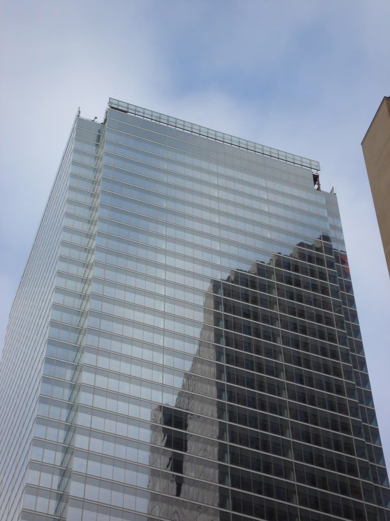
If the cut-in corner sections were clad at the top with metal, then the "fins" effect would be highlighted and much more visually effective.

Perhaps this is what's going on? I'll have to see in person to have any clue what I am talking about though.
 
DSC00078.jpg


DSC00079.jpg


DSC00080.jpg
 

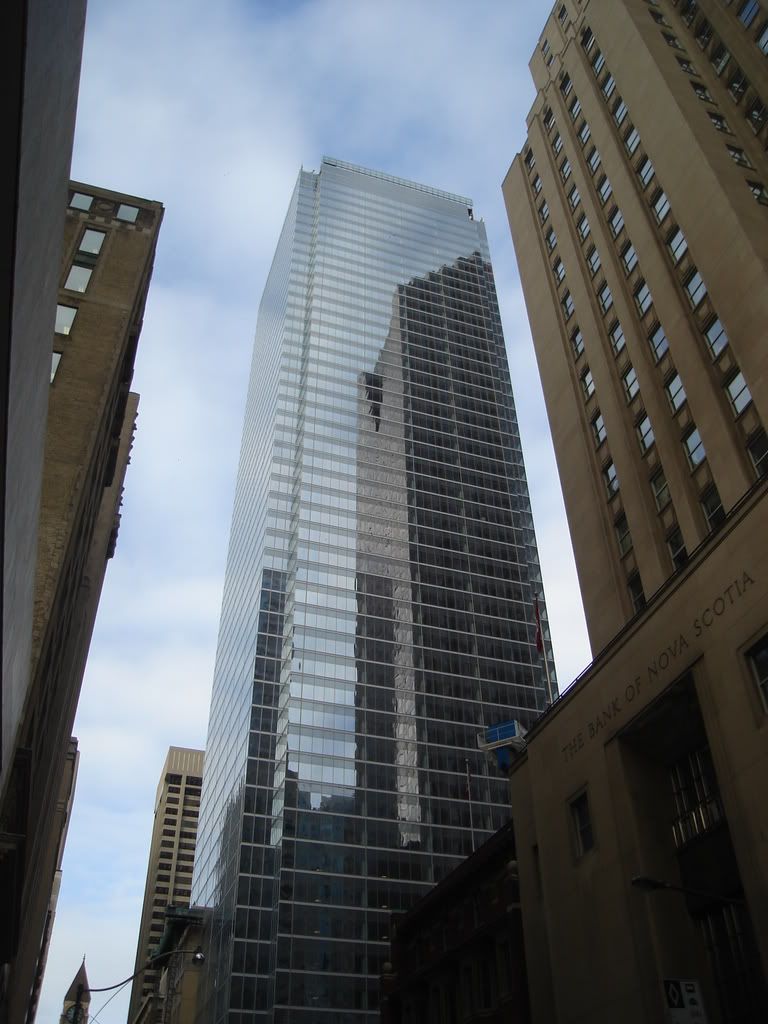
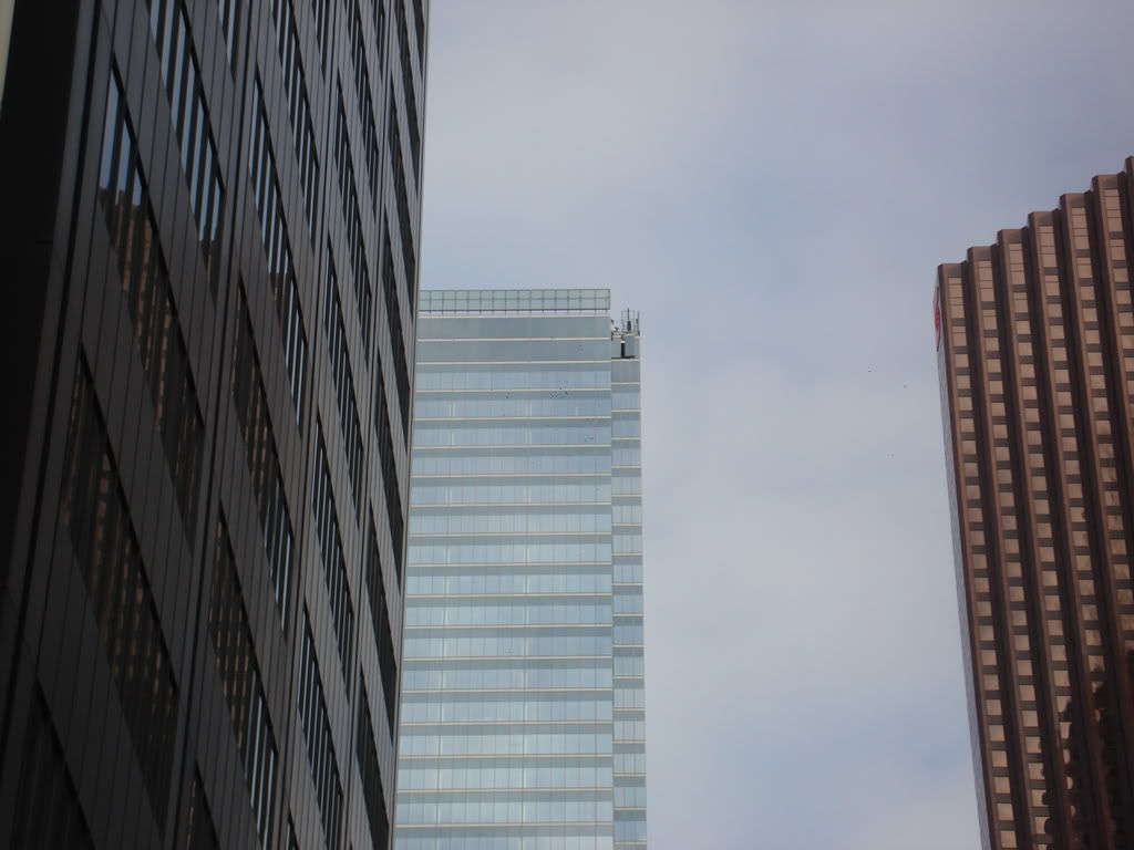
I generally don't like to re-post images, especially the post directly before, but that it is this is the best shot I've seen of BAC (maybe because Scotia steals the show). That is quite the reflective glass. Very nice smuncky!
 
Bay-Adelaide is funny in a sense, sometimes I look at it and pictures of it and I'm completely underwhelmed. Other times I catch it, I suppose in the right light and at a good angle, and I think it looks great. Anyway, like I've mentioned, at this point it's really coming down to the base and plaza treatment for me. B/A will be hemmed in by future development in the skyline soon enough, so it's up to some imaginative landscaping and ground-level treatment for it to make an impact on the area.
 
We might be expecting too much but why can we get condos that are interesting like Spire but not office buildings? And we may not be an economic superpower but we were, in the past, able to be build innovative buildings like the TD Centre, FCP, CC, Royal Bank, Scotia Tower and Brookfield Centre. No reason to think we couldn't do that again.

OMG! What is with you people and Spire. That condo is so whatever. It's like any other condo tower, It's a BOX with coloured panes here and there. THat's not very architecturally groundbreaking if you ask me. I agree that the older office towers were all different and interesting, and BA sorta slacks there by mimicking FCP.
 
First of all, why does everything have to be "groundbreaking"? It isn't that said older office towers are any more so in that regard, necessarily. (Even with TD, Mies was basically copying himself. Not that that's bad or anything.)

Besides, I don't know why (unless it's some wishful-think FCP-recladding fantasy) everybody's assuming that just because it's a reentrant-cornered square shaft, Bay-Adelaide "mimics" FCP. I don't get that vibe at all; BAC is too stocky, and the materials change everything. If we want to think of 60s/70s skyscraper precedents, it's way more SOM than Ed Stone.

And if there's any mimickry here, it's as a watered-down cross between SOM's WTC7
wtc7jan06fr4.jpg


and Renzo Piano's NYTimes.
nytimes.jpg
 
And if there's any mimickry here, it's as a watered-down cross between SOM's WTC7

That's the point, isn't it? It was watered down. I think we'd all be a lot happier if it more closely resembled the elegant NY Times building.
 
What I like about BA is that, for our skyline, it's unique.

We just don't have any other all-glass office towers of that size.
 
i do think toronto's skyline, like those of most great cities, is unique.

each tower is very distinct, and while reserved, works terrifically when examined as only one piece of a complex whole.

equally, i've always enjoyed the colour of our skyline. the stark grey of the cn tower, the white of fcp, the bright red of scotia, the beautiful black of td centre, several silvers, and now, the blue of BAC.
 
That's the point, isn't it? It was watered down. I think we'd all be a lot happier if it more closely resembled the elegant NY Times building.

it's the proportions that really kill it for me. unlike the WTC and NYT, it is squat and dumpy.
as my mother would say "a big boned girl...but likely good at something"
 
i do think toronto's skyline, like those of most great cities, is unique.

each tower is very distinct, and while reserved, works terrifically when examined as only one piece of a complex whole.

equally, i've always enjoyed the colour of our skyline. the stark grey of the cn tower, the white of fcp, the bright red of scotia, the beautiful black of td centre, several silvers, and now, the blue of BAC.

I agree, I've always liked the diversity of the major corporate towers. Unfortunately, the wave of condominium construction has brought quite a few monotonous concrete and glass towers around them.
 
OH MY GOD.

me and junctionist finally agree on something! i was in his doghouse for a while.

anyway, yes, the condos are generally very boring. i don't want toronto to look like vancouver.
 
It doesn't have to be groundbreaking, I'm just letting off steam here after reading pages after pages of praises for Spire, and people keep on saying how amazing it looks. I mean, yes it looks really nice, but it's no match for the Financial District. can you possibly deny that BA's indents remind us of FCP's indents. I'm jsut saying. I, personally, really do like this buildings, let me clarify that, I'm just saying that it's not compltely unique, like all the other tower comlexes in the CBD, Which isn't necessarily a bad thing as FCP and BA really look good together, and fit together well.
 
TD + Commerce (+ RBP, for that matter) don't count as sufficiently "all-glass"?

They do have a lot of glass, but they've got mullions too. When I look at BA all I see is blue glass. The other buildings don't quite achieve that mirror effect.
 

Back
Top