


sodapop
Active Member
ooo la la, looks great 
|
|
|
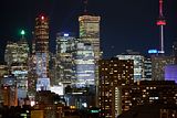
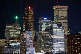
Please tell me that I am not the only one who hates these corporate logos on the buildings (for purely aesthetic reasons). Anyone? Anyone?
Please tell me that I am not the only one who hates these corporate logos on the buildings (for purely aesthetic reasons). Anyone? Anyone?
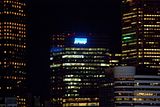
Evening shots of the now lit, KPMG sign on the north side. I shot with the fastest ISO that I have (1600) so sorry about the overexposure in a few of the shots.
Please tell me that I am not the only one who hates these corporate logos on the buildings (for purely aesthetic reasons). Anyone? Anyone?
Please tell me that I am not the only one who hates these corporate logos on the buildings (for purely aesthetic reasons). Anyone? Anyone?
Most major cities are littered with corporate signs on their skyscrapers. It's hardly a Toronto phenomenon.
The original signs on the Modernist towers downtown had the sophisticated logos of the banks which could be considered attractive finishing touches.
I love the logos. Anything that brings more colour to the night time skyline is two thumbs up for me.
I agree.. especially from a distance.
Anyone who has driven on the 401 at night time (looking south towards the city) knows that the only distinguishable buildings from that distance are the logos of TD (the green light), Scotia (the Red light), and BMO (the blue light). so yes, logos really make their mark on the skyline at night. if you're the head of a company, you want your logo to be seen. especially miles away at night (even though you can't make the lettering out with the naked eye.


