General rating of the project

  • Great

    Votes: 8 14.3%
  • Very Good

    Votes: 32 57.1%
  • Good

    Votes: 14 25.0%
  • So So

    Votes: 2 3.6%
  • Not Very Good

    Votes: 0 0.0%
  • Terrible

    Votes: 0 0.0%

  • Total voters
    56
They need to pick a colour. It's to confusing as white. I don't know if its decorative or utility for security.
 
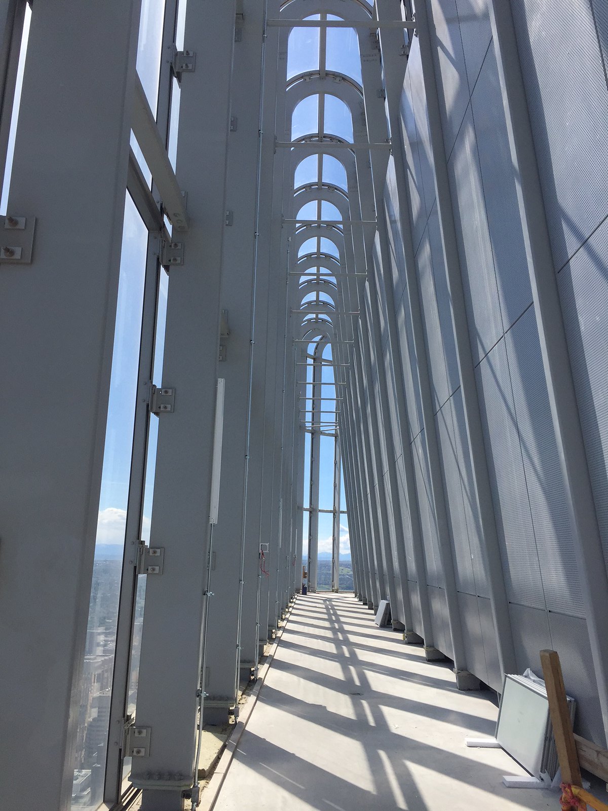
If that's the case the gap will be noticeable every time people take pictures of it
I think on the long side, in the middle there's 3 columns between the lights and then it goes to 2 columns between lights which creates a break between the falloffs.

[L] C C [L] C C [L] C C C [L] C C [L] C C [L]

34645075294_f070a4c761_h.jpg
 
I saw the crown lit up last night and that gap in the middle was there.....mildly infuriating :(

Please tell me it's not permanent.

It is in any picture I've seen. Or I'm losing my mind (partially caused by disappointment of this crown).
 
A few more pics of the crown, this time with a tripod!

00-2017 July 17 384.JPG
00-2017 July 17 447.JPG
00-2017 July 17 451.JPG
00-2017 July 17 458.JPG
00-2017 July 17 472.JPG

003-2017 July 17 451.JPG
 

Attachments

  • 00-2017 July 17 384.JPG
    00-2017 July 17 384.JPG
    801.9 KB · Views: 257
  • 00-2017 July 17 447.JPG
    00-2017 July 17 447.JPG
    1.2 MB · Views: 262
  • 00-2017 July 17 451.JPG
    00-2017 July 17 451.JPG
    794.9 KB · Views: 238
  • 00-2017 July 17 458.JPG
    00-2017 July 17 458.JPG
    685.2 KB · Views: 241
  • 00-2017 July 17 472.JPG
    00-2017 July 17 472.JPG
    1,001.3 KB · Views: 257
  • 003-2017 July 17 451.JPG
    003-2017 July 17 451.JPG
    162.8 KB · Views: 249
I'm beginning to wonder if this lighting only some sort of auxiliary lighting and the real thing is yet to come
 
It's almost like when you've finished something in Minecraft then you go to admire it from a distance you kinda cock your head and go, "That shoulnd't be like that." o_O Then you realize you'd have to tear half the sucker down to fix it and your grip on reality begins to slip. At least it's symmetrical.
 
It's almost like when you've finished something in Minecraft then you go to admire it from a distance you kinda cock your head and go, "That shoulnd't be like that." o_O Then you realize you'd have to tear half the sucker down to fix it and your grip on reality begins to slip. At least it's symmetrical.

The lights line up with the vertical lines of the frame. The middle sections on all the floors are wider. I can see how that would irk the "mildly infuriating" crowd, but it seems like a design decision and I don't mind it. Definitely it helps, for me, that they line up vertically.
 
Honestly, I'm waiting for the whole thing to make a final decision. Still a fan! I just hope it will look better with more than one side illuminated.

It does also look better when you follow those vertical lines to the crown.
 
Last edited:
I'm beginning to wonder if this lighting only some sort of auxiliary lighting and the real thing is yet to come

That's what I've been thinking the whole time, otherwise... how completely disappointing.
 
Looking at the fixtures in @Urb 's pic they do look kind of simple and cheap. If it was my lighting design I would have the lighting fixtures on the ground in between the vertical columns so that people down below can't see the fixtures themselves, also it would add some light on the vertical beams which I think would look good.
 

Back
Top