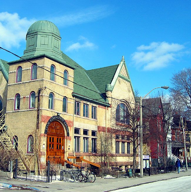
Not sure whether the windows there are original or "respectful"--but I agree that it's a superior retrofit to the Yonge + Woodlawn ones, in which old and new actually form a counterpoint (and even the new stuff has a neat 80s-tech stylishness).
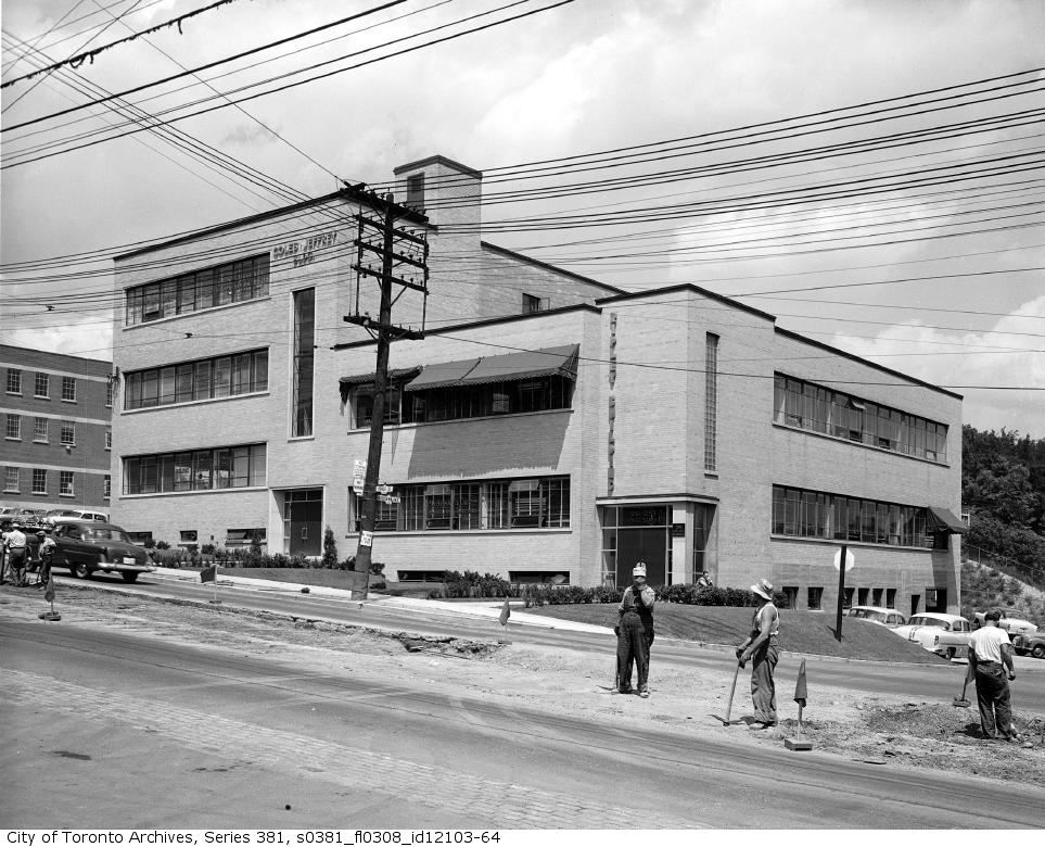
And in some ways, I even agree with the "dull" part; all that constipated-conservative-brick-semi-modern from the Yonge-subway-construction era, from Procter & Gamble to CHUM, did have a way of making the "Lake Iroquois incline" one of the deadest stretches of Yonge back in the day. I suppose one could call the affliction "Kerr-Hall-itis".
Still, there are certain ways to either adapt to or remedy deadness; and the REMAX/Homeservice Club block is an example of how not to--tacky, clashing, and half-bakedly incoherent--even the "keeping the elements of the old" that Aladone and (from the other end) Urban Shocker refer to only underlines the half-bakedness of it all. Oh, sure, there may be an "extemporaneous urban vernacular" alibi; but on simple aesthetic grounds, when it comes to PoMo-era extreme makeovers, give me CineplexOdeon to the north anyday.
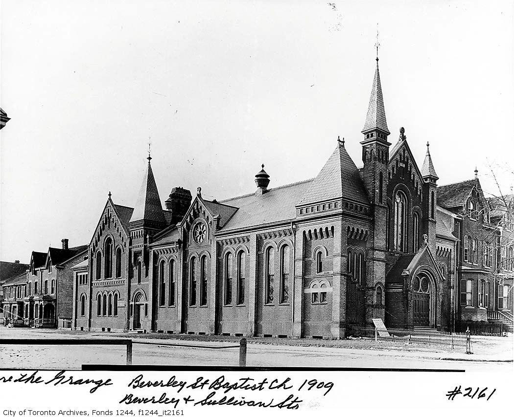
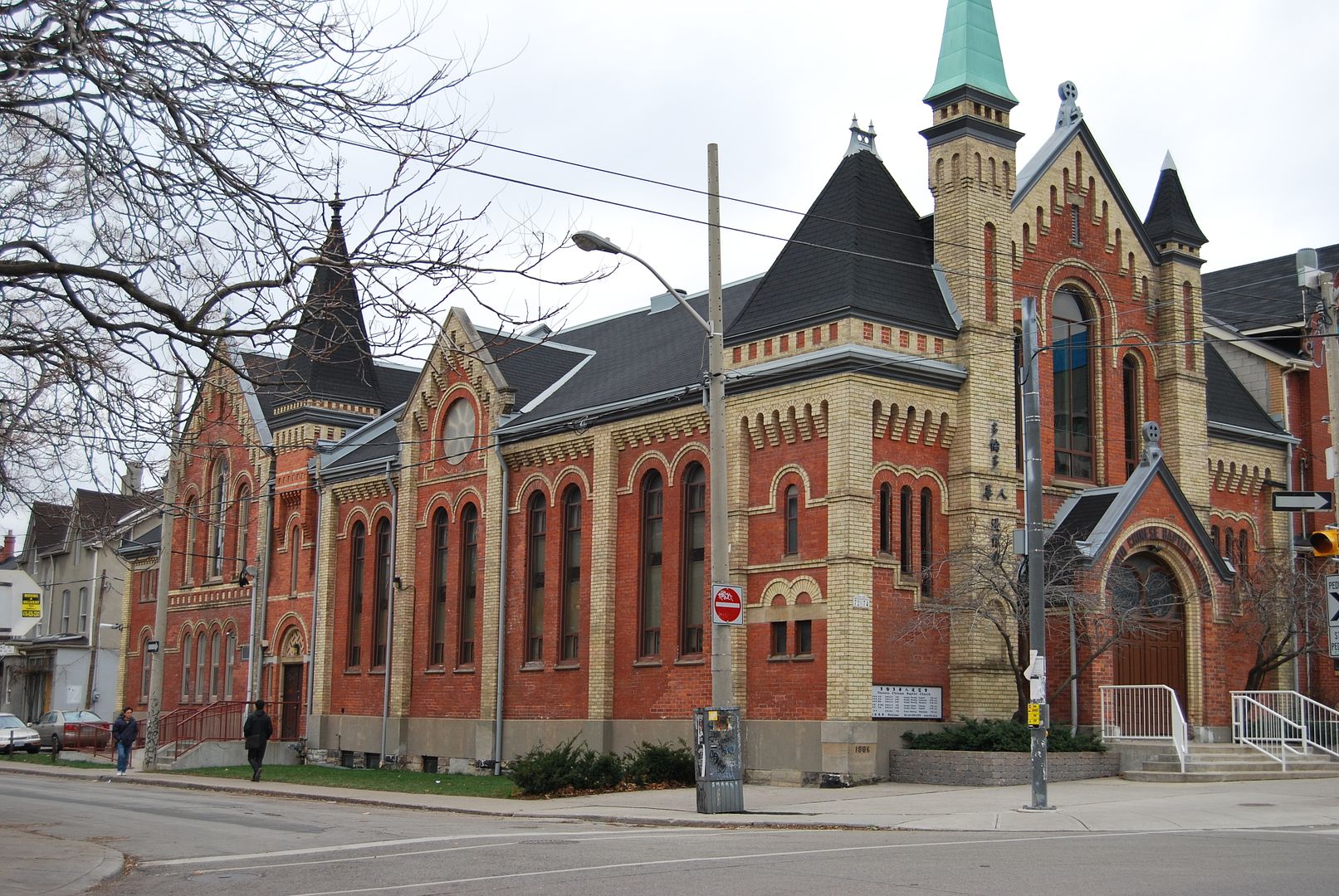
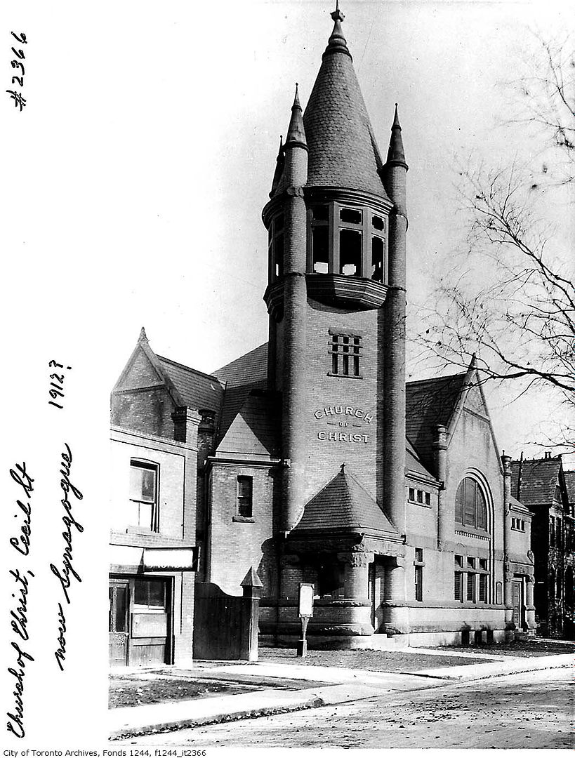
And, Traynor, I don't get why you're so jumpy, unless either you or your father worked on one of these kinds of projects and you're "feeling the burn". Well, tough bananas then. And to be fair, let's put "You have a right to your opinion, as do others" in practice re some of the other examples on this thread page. Let me call the Beverly Street Baptist Church a horrid piece of late Victorian polychromy that's better off demolished, likewise with the Church of Christ on Cecil Street and thank God! they removed that nightmareish tower already. And watch me get berated for stating my "opinion". Or else, imagine a forum where I'm not berated for stating such an opinion; imagine how insipid such a place would be...
