News   GLOBAL  |  Apr 02, 2020
 8.4K     0 
News   GLOBAL  |  Apr 01, 2020
 39K     0 
News   GLOBAL  |  Apr 01, 2020
 4.7K     0 

With the recent 50th aniversary of the Canada flag, I've seen some candidates that were considered at the time. I thought the red maple leaf with blue borders looked quite nice - except maybe the 3 leaves were too busy. I also think the blue borders were a bit thin. Too bad nobody suggested the blue borders with single red leaf. The blue would represent the two oceans, but also Quebec.
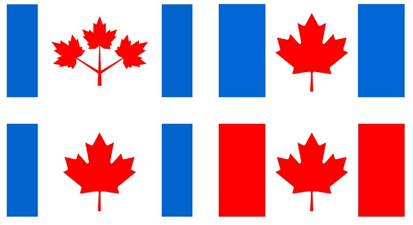
Canada.jpg
 

Attachments

  • Canada.jpg
    Canada.jpg
    100.3 KB · Views: 4,873
I actually like your design, Krago. I'd love to see some competition for it, though, we need some debate! :)

All provincial flags are quite cluttered, compared to national flags that are usually simplistic. I would want to avoid the appearance that it was created by some grade 3 art class (i.e. Nunavut).
When I think of Ontario colours, I usually think of Blue and Red, not green and gold - those are Saskatchewan colours.

flag-canada-provincial.gif
 

Attachments

  • flag-canada-provincial.gif
    flag-canada-provincial.gif
    103.5 KB · Views: 6,125
Would want to see the Ontario trillium on the flag. Don't know about colours or position, but it should have the trillium.

attachment.php


white-trillium.jpg
 
It would be good for Ontario to change its flag. Perhaps it can have a solid field (perhaps make it green) with a (perhaps gold) trillium in the middle. After all, green and gold are Ontario's official colours. It is better than having a flag that looks similar to Manitoba's from afar (oh, and Manitoba should have a new flag as well, so that each provincial and territorial flag is substantially unique).

Many American states have flags that are on a blue field with the state shield in the middle, which is unoriginal.

I would have never guessed that green and gold are Ontario's official colours - but its on Wikipedia, so it must be true. When I look at the flag, I see red and then second maybe the British blue. The curling rink at the Brier (and Scotties) is (were) wearing red. At Canada games, Ontario wears red.
 
All provincial flags are quite cluttered, compared to national flags that are usually simplistic. I would want to avoid the appearance that it was created by some grade 3 art class (i.e. Nunavut).
When I think of Ontario colours, I usually think of Blue and Red, not green and gold - those are Saskatchewan colours.

I actually like the Nunavut flag - it's graphically bold and distinctive.

Saskatchewan's, on the other hand, looks like one from a banana republic and Nfld looks like someone started drawing a Union Jack and then gave up.
 
Would want to see the Ontario trillium on the flag. Don't know about colours or position, but it should have the trillium.

The green and gold could be the leaves and centre, respectively, of the trillium as seen in the photo you posted (I'm not keen on the trillium, stylized or otherwise, being gold because I'm pretty sure they never have golden petals, right?). All that needs to be decided is the background colour.
 
Here are a couple of others to consider.

Ont1.png


Ont2.png
 

Attachments

  • Ont1.png
    Ont1.png
    66.9 KB · Views: 1,549
  • Ont2.png
    Ont2.png
    29.1 KB · Views: 2,229
I like the above version of the trillium. Not keen on the Canadian flag in the upper corner version. Neutral on the green bars.
 
Not too happy about any of them - looks like something that would be at a food fair. Need something that is simple and dignified - like a counterpart to our national flag. I still hold the old Government of Ontario logo (Trillium in "O") in the highest esteem - and it would not be out of place in a provincial flag, centred and all by itself. White outline in a green background would be fairly eye-catching (though it might also resemble the Saudi flag, maybe reverse the colours and have green outline in white).

AoD
 
Last edited:
I still have troubles viewing Ontario as green - even though the green vertical bars with the trilium in the middle is my favourite so far.

I suggest red bars on either side to link to Canada, and maintain the British blue in the middle. Add the triple maple leaf in the centre and 2 triliums to make it symetrical. It would be a hard enough sell to get rid of the british and english crosses, so I am trying to retain as much history as possible, while eliminating the union jack.

flag-ont.jpg
 

Attachments

  • flag-ont.jpg
    flag-ont.jpg
    26.4 KB · Views: 1,545
I still have troubles viewing Ontario as green - even though the green vertical bars with the trilium in the middle is my favourite so far.

I suggest red bars on either side to link to Canada, and maintain the British blue in the middle. Add the triple maple leaf in the centre and 2 triliums to make it symetrical. It would be a hard enough sell to get rid of the british and english crosses, so I am trying to retain as much history as possible, while eliminating the union jack.


May I add your suggestion to the gallery of proposed Ontario provincial flags here: http://vexillology.wikia.com/wiki/Ontario ?
 

Back
Top