condovo
Senior Member
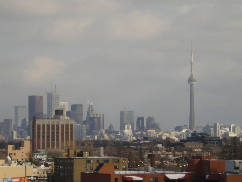
Not filled in yet but surely will be based on my observation walking by this afternoon.
|
|
|
I'm not so sure I would agree.
The glass it self, coupled with what's to come at the RITZ site created a somewhat unique look for Toronto, seeing how we don't have that many glass towers concentrated together.
Moreover, what solution would you propose?
Building something with a closer form to the bank of America building so it would fit in?
")