greenleaf
Senior Member
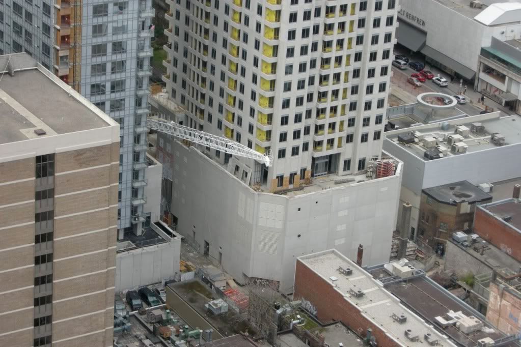
It could have been worse. They could have installed the lighter panels to spell
B
L
U
down the side of the building!
B
L
U
down the side of the building!

The building is such a sexy shape that it's a shame to detract from it with the contrast between the windows and the cladding. It would have looked so much more high-end if the the entire tower were virtually all the same colour so you couldn't really tell where the windows are.

I'm perplexed by all this quacking about the color of panels. Is it fair to conclude that the builder is blind and/or stupid, or is it more likely that there is an explanation for the color of certain panels? Does anyone know if they will stay or go or what the function of the alternately colored panels will be?


In any case, I would have thought people would generally be more supportive of quality development in the area. When you walk around south of Bloor there are lots of really unbelievably grim looking buildings. The new buildings, whether or not they are blue enough for some people, are a marked improvement of the disgusting Soviet bunkers that pock-mark the Toronto landscape.
Easy does it.
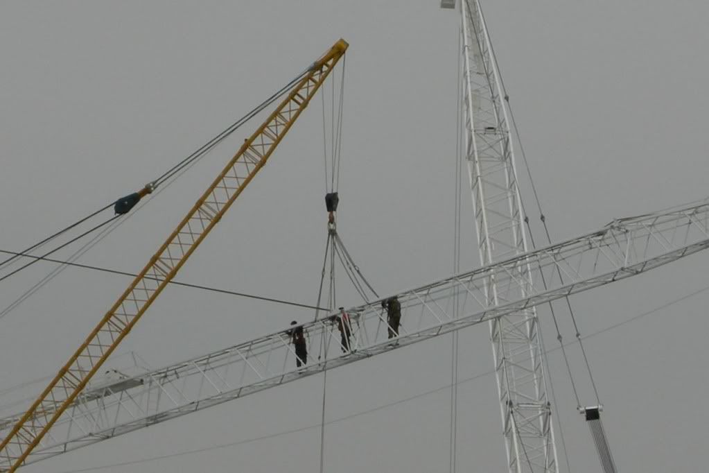
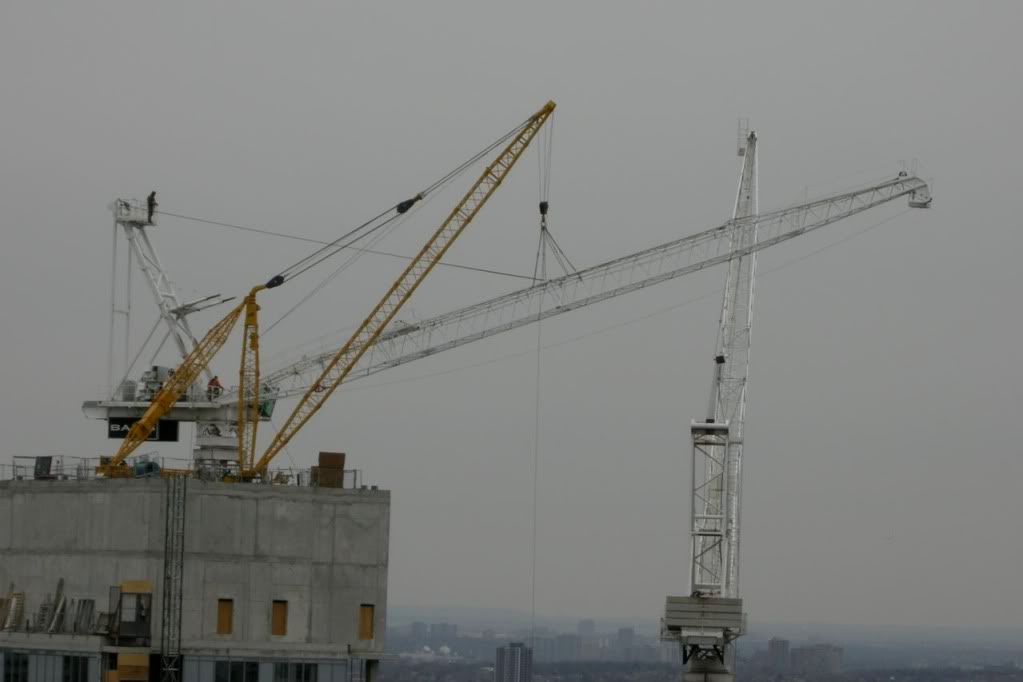
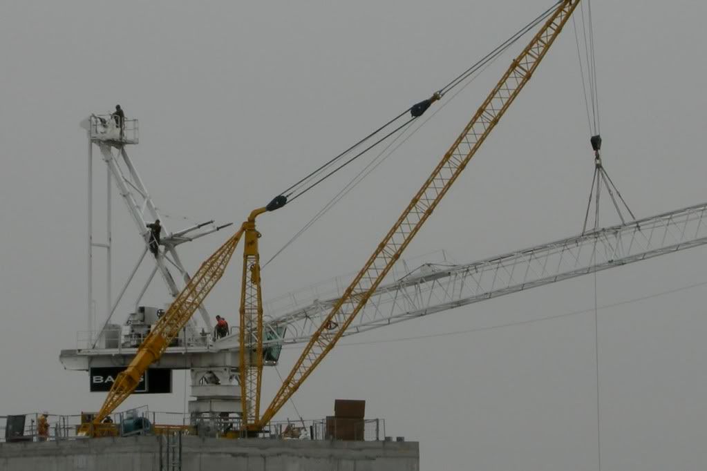
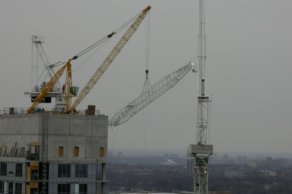
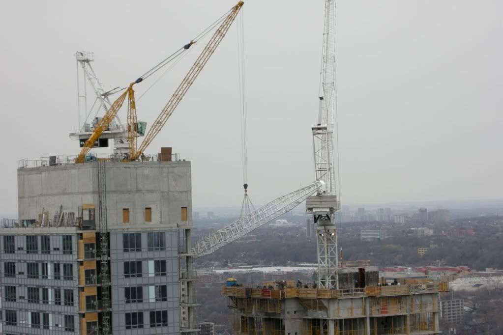
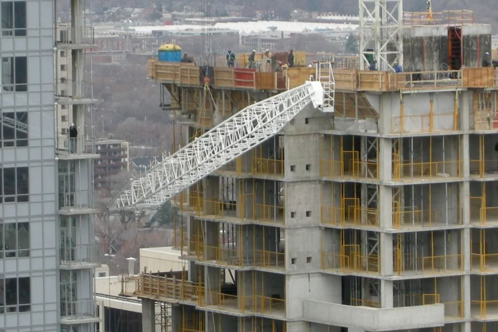
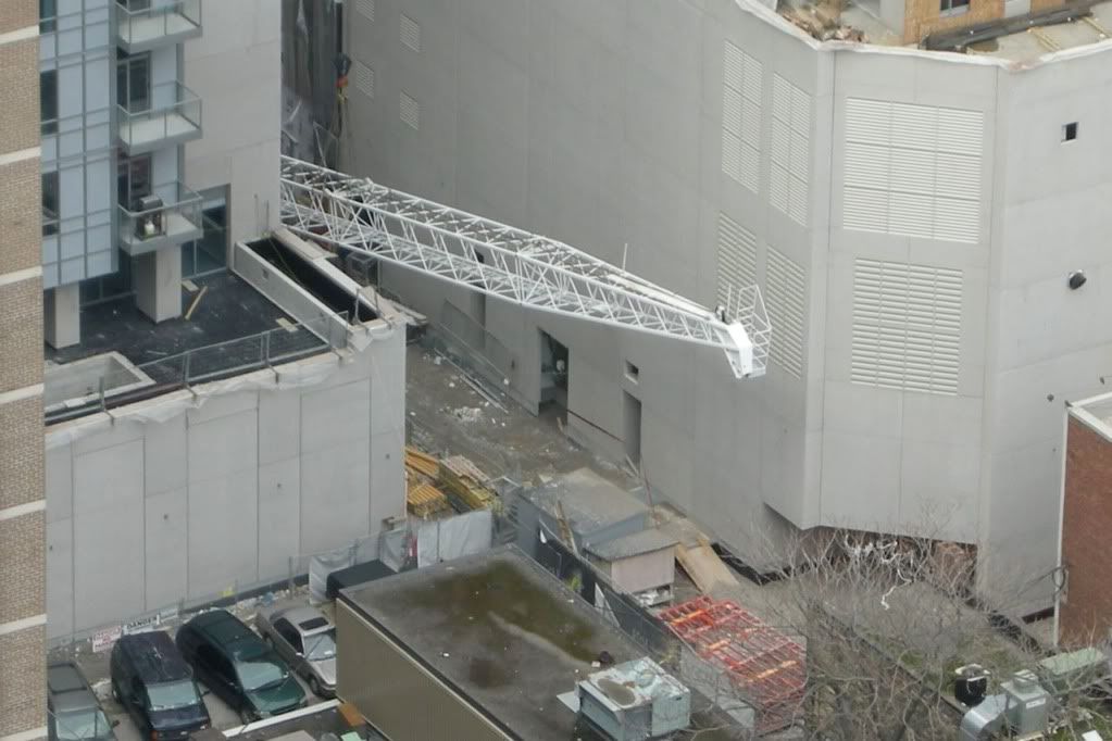
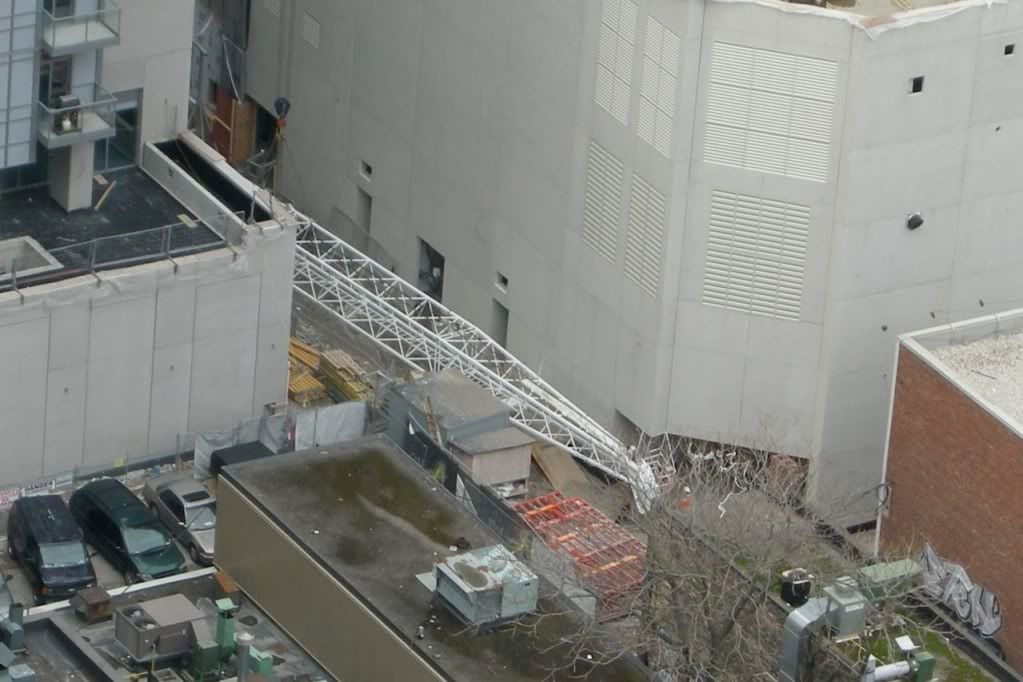
I wonder if in this instance they would just borrow the Uptown crane to remove the final pieces.