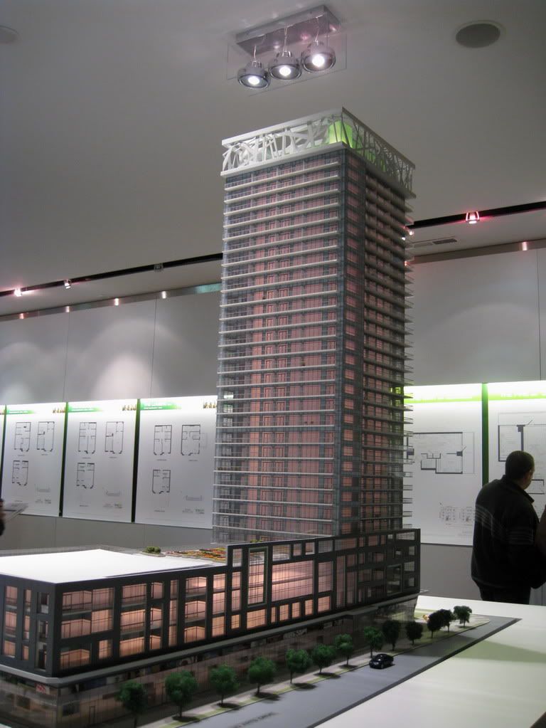
It's time to go rendering-crazy for Limelight: it has certainly been a while since any were posted here, and we have some first-timers, and larger versions to follow:
First, you might remember the first rendering of the south tower. Note that it features a stained-glass style lantern at the top.
You may also have seen a smaller version of the renderings which were released when the second, north tower was announced last fall. Both towers now feature a more flamboyantly-designed lantern, pictured here.
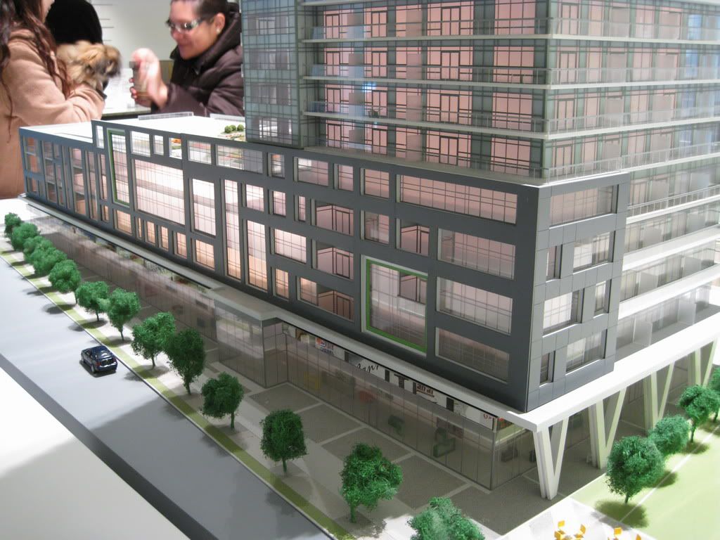
Here are some closer views of the rooflines.
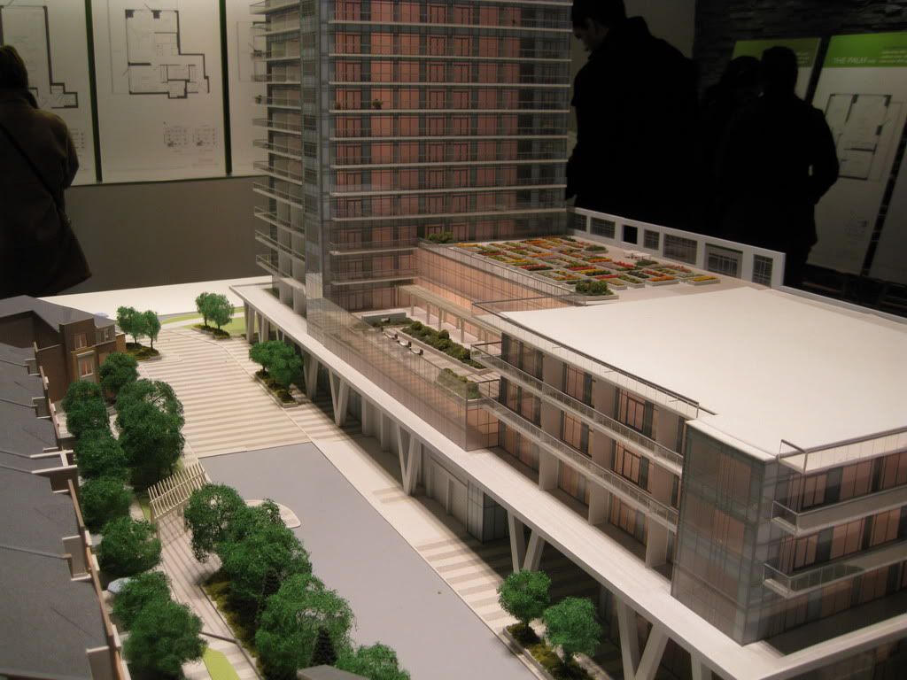
You will notice from these model shots by Jasonzed that the flamboyant lanterns will feature on the south and east sides predominantly: from the north and west the rooftops will be more subdued.
While the lantern has gotten snazzier, so has how Limelight will meet the street. The original plan can be seen in the rendering below: all lines simple, and at right angles.
The new plan brings the diagonals from the roof down to street level, making for a far more distinctive treatment. The buff coloured bricks above have also been replaced with a darker and more dramatic look.
We have three views of common areas within Limelight; first the lobby, then the gym (with the parallelogram ball courts), and finally the sunset-facing terraces atop the podium.
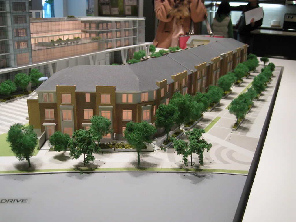
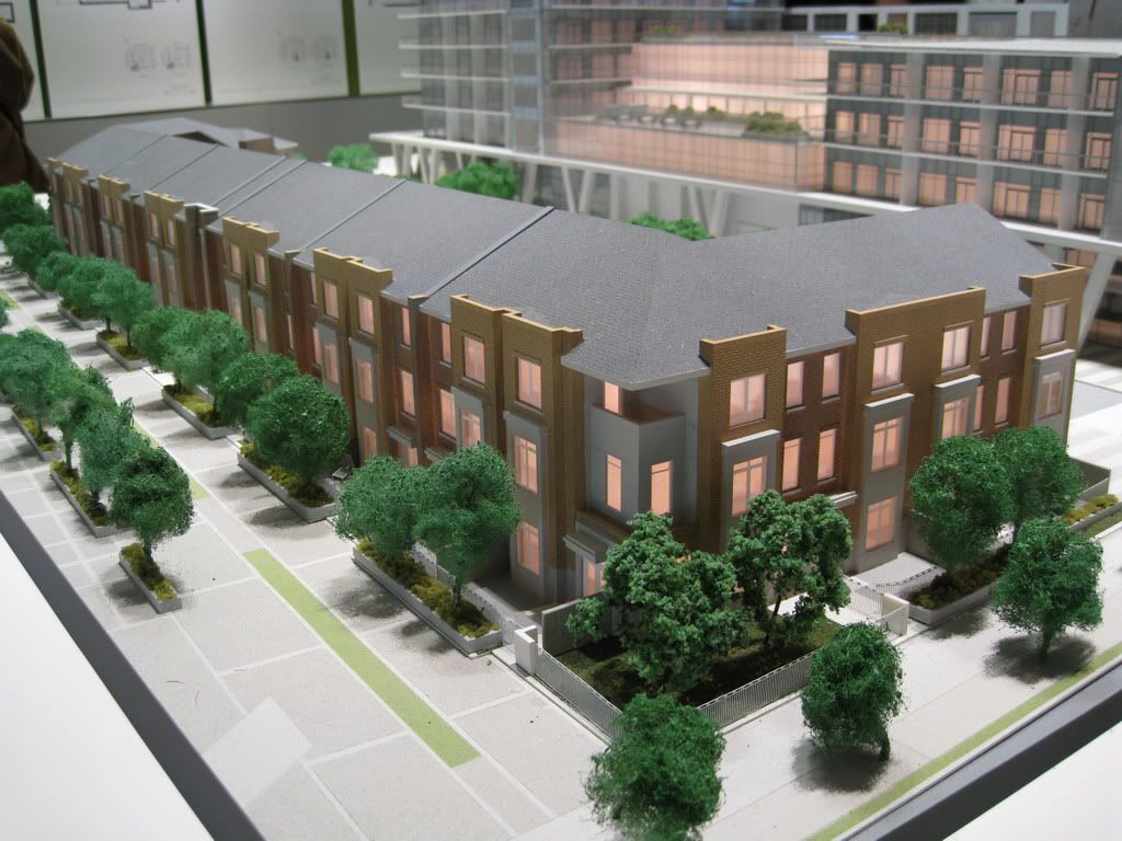
Limelight, as Solaris reminded us a couple of pages ago, includes townhomes as well. First, the site plan, then a rendering of the townhomes.
So, you're up-to-date!


