nice pics... where's the Raptors representation?

I like the towers, but they couldn't look any less like the rendering.
 
Whoa, I wasn't expecting them to paint the maple leaves. Looking at it now, I wish they had used the Leafs current logo. The leaves look kinda weird, sort of like a Canadian maple leaf/TML logo hybrid.
 
wow... those are hideous. as someone who loves the raptors and hates the leafs, I'm not happy with the fact I'll have to see those things when I go to the ACC
 
I presume you meant the ACC.....from up there, however, what is blatantly obvious is how important it is that we get going on the shed roof over the tracks at Union station....with so many of Torontonians now (and soon) going to be living high off the ground in this area, that current roof is a real eyesore!

The ACC roof, while not very attractive, at least is passable and is appropriate for what is under it....an ice rink!
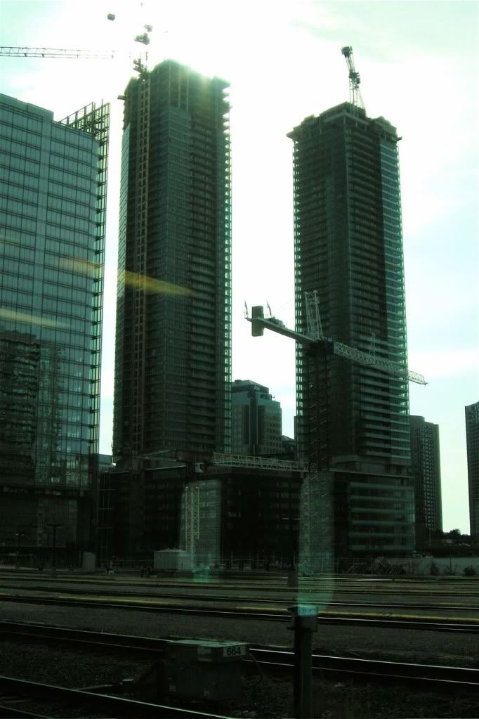
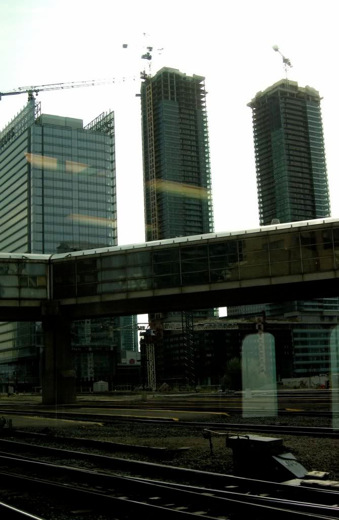
Sorry, I meant the Metro Convention Centre (egotrippin was correct). I agree, though; the ACC roof is fine as-is.
 
A few gloomy shots from the Go Train a couple weeks back...

DSCN4989.jpg


DSCN4990.jpg
 
The area will be the next Bay and Bloor imo:)
How so? I have a really hard time picturing that.

I think it will be more like the new Front St. and Blue Jays Way (feast your eyes on these bullet points):
  • some sterile condos
  • sterile office towers
  • a sports stadium
  • some very blah retail
  • and a rip-off grocery store

...although with superior architecture.
 
Last edited:
When are the cranes coming down??

Bay & Yonge has nothing on this area.

Streets are dead most of the times.

No windows to look into see what for sell.
 
I was hoping the maple leaves would be given a tint of red (or green, red, yellow, and orange)... not turned into Maple Leafs logos.
 
I was hoping the maple leaves would be given a tint of red (or green, red, yellow, and orange)... not turned into Maple Leafs logos.

That would have been a nice autumn touch. But it's no surprise that they would paint it the Maple Leafs logo's. The only problem is that they are not the TML logo's, they are maple leaves painted poorly which give them an overall tacky look.
 

Back
Top