kris
Senior Member

Last edited:
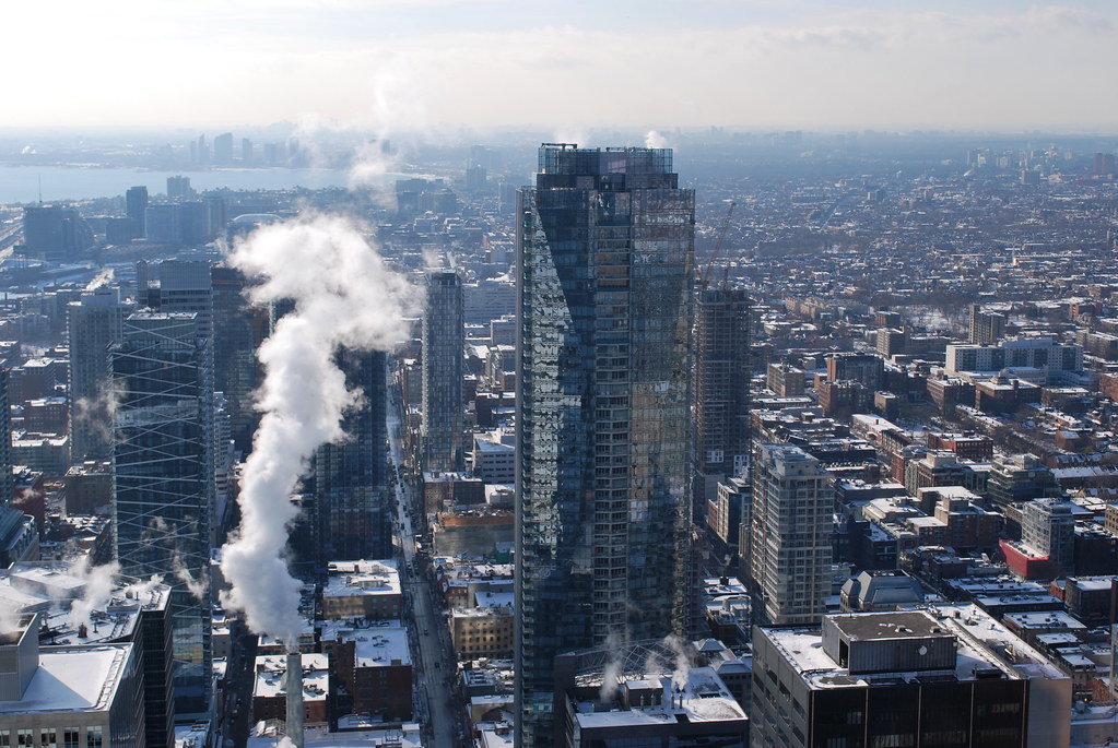
Taken from Trump penthouse I assume from the angle and elevation?
Great design ruined by cheap windows (and way too many mullions) and dull looking, gray panels.
I see nothing ruined here and I see this building every day. Maybe materials could be better but it looks just great as is. You folks are impossible to please.
Would you still say the same thing if the blinds/curtains turn out to be in light colour?The window mullions should've been a darker colour. Maybe black or dark grey.