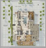
Matrix Element's shots are fantastic and in my eyes make the tower look FLAWLESS-- I am so excited about this one. It's nice-- fits in with Toronto's style of modernism yet brings some new ideas to the table. It's very sexy, to boot.

GAHHH I think I'm in love.
 
IMG_sept-05-090237.jpg


IMG_sept-05-090240.jpg


IMG_sept-05-090239.jpg


IMG_sept-05-090257.jpg


IMG_sept-05-090352.jpg


IMG_sept-05-090422.jpg


IMG_sept-06-09-0080.jpg


IMG_sept-06-09-0221.jpg


Still don't like the base on this side as there something about it I cannot put my finger on about it.
IMG_sept-06-09-0107.jpg
 
I am glad to see cladding progress past the skylobby... it was really slowing it down.

Great high resolution photo updates!.. keep it up :)

as drumm118 also stated, I was never really into the south facing side of the Ritz... it looked to bulky/chunky from that angle and the base doesn't match the rest of the building... The base tiles look too random for such a clean building and the colours look faded... IMO
 
Last edited:
The base of the tower facing the park is my only squabble with this project so far. It doesn't match the rest of the tower in any way, yet it serves no function. What a missed opportunity.

Looking good otherwise tho!
 
Though as some other members have noted, it does sort of look like Sutton Place which was the tallest hotel in Toronto at the time. Because this will (sort of) take that honor for awhile, a parallel, however tenuous it may be, does exist.
 
I see what you mean with the spaces in-between windows... and possibly the base of the building and that (sky lobbyish) part at the top of Sutton...

Exterior_lrg.jpg


The ritz is not entirely hotel so I am not sure if it will be considered the tallest hotel in Toronto when completed because the hotel section ends at around the 21st floor... (not very tall for a hotel)
 
The ritz is not entirely hotel so I am not sure if it will be considered the tallest hotel in Toronto when completed because the hotel section ends at around the 21st floor... (not very tall for a hotel)

A friendly FYI, Sutton Place isn't entirely hotel either. They have luxury business suites (1 or 2 bedrooms) and bach, 1 & 2 bdrm. rental apartments too.
The area at the top of the Sutton Place are flexible spaces for business and personal functions.
 
But for a hotel to be considered a "hotel" it must have MOSTLY hotel units and only some office spaces/board rooms...

For example... The sheraton centre is considered a hotel but it has tons of office space/board rooms... people have business meetings there all the time...

I think the Sheraton Centre is the tallest hotel in Toronto right now... I can't think of any other tall hotel at this moment...

Peace :)
 
The base of the tower facing the park is my only squabble with this project so far. It doesn't match the rest of the tower in any way, yet it serves no function. What a missed opportunity.

Looking good otherwise tho!

Agree 100%. The glass ain't too bad, but what I like most is how narrow this tower's east-west facade is. With that said, the slope and the soon to begin slanting roof make this tower that much better. Question is, does it trump the ugly south base facade?
 
Well I don't think the rear section facing the parkette is ugly, but it's completely out of context with the building, and adds nothing to the park. I will give it time though... maybe it's a grower.

The tower is so graceful. :eek:

The last posted image looking up from the parkette does make the "window collage" I've been complaining about a bit more manageable on the eyes. Perhaps it's a nice touch when you are in the park. I will have to go and experience it in person but I can't quite grasp what it accomplishes at this point in time. :D
 
I'm probably out to lunch with this one but:

I'm not liking this one very much at all so far ...... anyone else with me ?
It's a mishmash of different design elements that, although complement each other to a certain degree, give off an impression it's trying to hard ...

Not only that, nothing in particular stands out as being high quality, so the no mullion windows seem to be true for the upper section of the tower but clearly not the lower part ... yes I know that''s the design.

It has presnse due to it's height and it's slim profile but it's far from elegant. Heck, other then the lobby, which I do love, I bet no one would guess this building was built in this decade - it looks like something from the 70s or 80s and not a good something at that ...

I'll wait until it's complete to fully judge this beast but so far, that's what it is to me, an ugly beast.
 
Is there going to be an outdoor cafe on south side?

There's currently a Square with green space just to the south of the building but it does appear that there will be an outdoor lounge

Click on the thumbnail to enlarge, then click again on the image for full size.


Source
 

Back
Top