Because Brad Lamb is probably pretty broke. (If not Brad, maybe Galen Westin, Rogers family, the Gardiners, etc.....) Toronto doesn't lack cheap millionaires or billionaires for that matter.

By choosing to cut costs on things that don't affect purchasers units (and therefore they don't have to be compensated), such as water features at the entrance and mechanical roof elements, they can pocket the difference as profit. Perhaps they were tempted by being over budget?
 
By choosing to cut costs on things that don't affect purchasers units (and therefore they don't have to be compensated), such as water features at the entrance and mechanical roof elements, they can pocket the difference as profit. Perhaps they were tempted by being over budget?

Technically he could have cut the bands altogether without having to compensate purchasers. Clearly there is some effort being spent on something other than profit. This may be an instance of the cheapening, but I still think Lamb should be given credit despite not delivering a perfectly as-rendered tower.

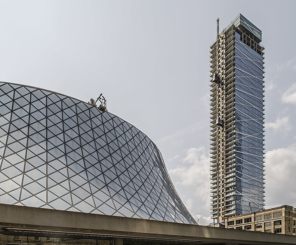
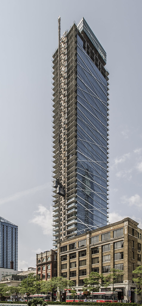
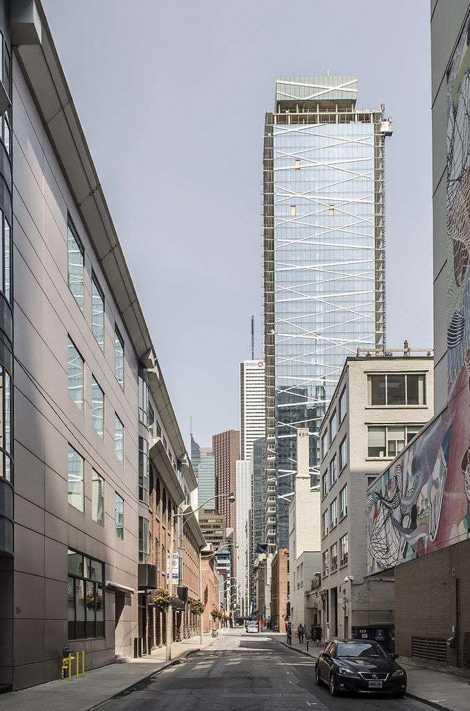
It's the discolouration of the mechanical box which I find the most baffling as that shouldn't really have anything to do with cost.

I agree, the green glass used for the mechanical box is the part that really affects the look of this otherwise fine building. The bands not all lining up well are a negative as well.
 
It's still a nice looking building. It just isn't a show stopper anymore. It went from incredible to "pretty nice" IMO. That's good enough for me in a sea full of blandness.
 
Technically he could have cut the bands altogether without having to compensate purchasers.

How far you go when value engineering isn't the point. The point is you are compromising your design to accommodate it.

But it was never great architecture to begin with...it just has stylistic doo dads that can be altered, added or subtracted at any time....as we have seen.
 
08 August 2014:

Thanks for all the great photos!

Technically he could have cut the bands altogether without having to compensate purchasers. Clearly there is some effort being spent on something other than profit. This may be an instance of the cheapening, but I still think Lamb should be given credit despite not delivering a perfectly as-rendered tower.

It's the discolouration of the mechanical box which I find the most baffling as that shouldn't really have anything to do with cost.

Personally I don't mind the differently coloured mech box -- potentially it could provide an interesting point of contrast, but it depends on how it meets the rest of the cladding.

Despite all its detractors, and despite the fact that it wasn't finished as perfectly as its renders suggested, I still view this building as a brilliant variation of the Toronto Box. It's precisely what you want in the middle of your Entertainment District.
 
I think this is a cool building. I can't decide what to make of that green box at the top. At first glance, I think "they should have just kept that beautiful blue glass going" but hey, maybe some contrast isn't bad? I'll wait until it's finished. It's still something unique compared to many of the condo towers in Canada. Overall a solid 8/10 IMO.
 
Contrast needs to be sharper or more deliberate for it to really work in that way. Being 'close' doesn't work. This just feels like it's off.
 

Back
Top