News   GLOBAL  |  Apr 02, 2020
 9.4K     0 
News   GLOBAL  |  Apr 01, 2020
 40K     0 
News   GLOBAL  |  Apr 01, 2020
 5.3K     0 

Jdot:

The titanium is blue - there are panels are are still covered, and it's white in colour.

Grange Park is unfortunately rather dumpy - just look at those slightly less than true "period" lamp posts. A remake is definitely in order.

AoD
 
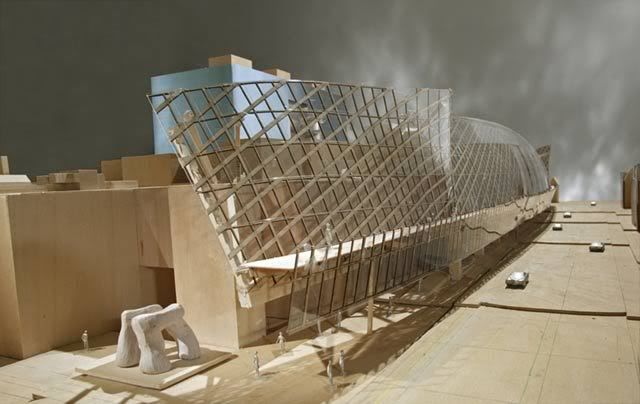
There was never an exterior walkway.

Yes there was/is:

north-east.jpg


Notice the little guy walking on the flat surface between the glass façade and the other glass shield closest to the street.

I'm not sure it's still there, but it would be a nice place for a stroll although I'm not sure what purpose it would serve the AGO.
 
That model conveniently leaves out the mess of the street car cables over the street. Granted, it isn’t as outlandish as other development models that plop in forests and fully-grown trees in areas where no tree would ever grow…
 
Yes there was/is:

Notice the little guy walking on the flat surface between the glass façade and the other glass shield closest to the street.

I'm not sure it's still there, but it would be a nice place for a stroll although I'm not sure what purpose it would serve the AGO.
That little toy man interested me to but I'm pretty sure he is just for scale. There isn't any mention of that section being open to pedestrians in the floorplans.
 
That little man is just a wrongly placed toy. There were no doors for anyone to go outside in that manner (and would they have a walkway with no railings at the ends??).
 
An interesting aspect of Gehry's addition is that, viewed from a pedestrian's perspective, the north and south sides of it could be completely different buildings, so little common design language is there linking them. A huge, curved glass and wood canopy dominates one side, a titanium box with a huge window takes up the other. You could show street-level images of both sides to someone unfamiliar with the project and they wouldn't know they were of the same place.
 
An interesting aspect of Gehry's addition is that, viewed from a pedestrian's perspective, the north and south sides of it could be completely different buildings, so little common design language is there linking them. A huge, curved glass and wood canopy dominates one side, a titanium box with a huge window takes up the other. You could show street-level images of both sides to someone unfamiliar with the project and they wouldn't know they were of the same place.


I drop by the site every week and I think something in a jumbled, multiple personality kinda way is emerging that will actually work big time. Instead of one environment/site, and one iconic sculpture commanding that site... AGO may end up being the most glorious designed mayhem (think Sybil injected by some star-architecture) that actually generates a ton of head-scratching, media awareness and ultimately... traffic to the joint. And I'm only talking about the "outside".
 
^ Not to mention OCAD in the vicinity which also contributes to this "jumble" of unconventional architecture styles.

I hope that Will Alsop doesn't leave town without developing a building for OCAD on the SE corner of Dundas + McCaul. That whole block fronting Dundas is ripe for redevelopment.
 
There's nothing to say that different parts of a building like the AGO, containing galleries dedicated to different sorts of art, shouldn't each have their own identity. And with Dundas Street on one side, and Grange Park on the other - two quite different environments - the invitation to design that way is logical.

I'm very interested in seeing what he's done with the galleries, especially how someone who is none too fond of Palladian formality takes the neo-Classical core of Walker Court as a starting point for his design.
 
I'm loving the AGO's blue so much that I decided to make a crude draw up of how I would have the ROM's cladding re-done:

romcrystaldaymy0.jpg


The red glass entrance marker serves as inspiration for this: Replace the mismatched aluminum slats with semi opaque red glass. Add LED's under these glass slats that would light up the entire structure to a red glow at night.

Libeskind is the loser when it comes to a show down of both buildings, not because of his design but because of his choice of finishings. Gehry is known for the details and it shows in the AGO.

Or they could engage in The Cheapening and just PAINT it red instead.
 
Maybe they could find a project out there that needs 6" x 60" aluminum slats for cladding and sell it at a reduced rate..lol

Seriously, I'm very happy with Renaissance ROM but the cladding totally failed... and some interior details still need to be worked out and polished.

On the other hand, Gehry's AGO didn't seem to be aiming high, but the details are making this a real gem. The Contemporary Arts Gallery (I think that's what they new "box" building is called) is going to be visible down John Street and with this bold blue cladding is definitely going to stand out.
 

Back
Top