News   GLOBAL  |  Apr 02, 2020
 9.8K     0 
News   GLOBAL  |  Apr 01, 2020
 41K     0 
News   GLOBAL  |  Apr 01, 2020
 5.6K     0 


Runnymede Station - Easier Access Project
Runnymede Station is TTC's 50th accessible station

December 2020 update

Good news! Runnymede Station is TTC’s 50th accessible station! Three new elevators connecting the street to concourse and subway platforms levels are now open for customer use.

Other minor project related work will continue at the station.

Runnymede Station elevator cross-section:

cross section of the elevators at Runnymede Station


Public Art

Art is an important component of major station upgrades. As a part of this station upgrade work, Elicser Elliott’s public art concept, “Anonymous Somebody” was selected by an art jury and it was installed at Runnymede Station in 2019.

“Anonymous Somebody” captures the snippets of our bustling Bloor West Village lives while standing still. The artworks aim to communicate the story of individual spirt as fresh and relevant to the metabolism of the neighbourhood. The images work as an anchor to a thought or memory for the person viewing it - to commemorate, celebrate, provoke, and heal. Not unlike Runnymede, a house that became a community, “Anonymous Somebody” welcomes all passengers to reframe the characters’ experience as they pass or wait, fluidly transitioning from past lives to present, making the artwork their own.

– The artist, Elicser Elliott

Please see some of the renderings of Elicser Elliott’s public art installation entitled, “Anonymous Somebody”.
Please see the public notice.

For further information:

Denise Jayawardene, Senior Community Liaison, 416-393-6937; denise.jayawardene@ttc.ca.
 
Have passed by on a few occasions but keep forgetting to snap a pic.

Probably havent had the urge to since the tile colour design around the elevators dont even make even the slightest effort to match Runnymede's existing green tile colour scheme. They are 2 completely different colours.
 
Have passed by on a few occasions but keep forgetting to snap a pic.

Probably havent had the urge to since the tile colour design around the elevators dont even make even the slightest effort to match Runnymede's existing green tile colour scheme. They are 2 completely different colours.
They really haven't even been trying to match the tiles lately. Wellesley (for example) now has 4 kind of tiles (vertical light green on the platform, horizontal light green in the north exit stairs, white (similar to Union) at the street level north exit, and dark teal tiles around the elevators at platform level. It just looks like a complete mess.
 
They really haven't even been trying to match the tiles lately. Wellesley (for example) now has 4 kind of tiles (vertical light green on the platform, horizontal light green in the north exit stairs, white (similar to Union) at the street level north exit, and dark teal tiles around the elevators at platform level. It just looks like a complete mess.

Castlefrank was one of the few handled well; they matched the existing tile, including the trim-colour which they used in a way similar to a feature wall.

I don't understand that randomness.

Some stations they've clearly paid heed to what's there and done a good job; some appear to a poor attempt at a match; and others bare no relation to the existing.

I would prefer one uniform color per line for each station. White walls with red trim.
 
I would prefer one uniform color per line for each station. White walls with red trim.

You may have your preference; we would differ.

I prefer stations to be very distinct; and have an identity of their own where they are recognizable to someone who doesn't speak English; who simply recognizes their stop by material palette, design or colour scheme or some combination of these.

The Spadina Line section of Line 1, to me, is the eptitomal best of Toronto subway design.

Each station, for better or worse (we will all have favourites and ones we care less for) are complete thoughts.

They have unique colour schemes, patterns, materials, murals, ceiling heights and designs; you won't mistake Dupont for Eglinton West; or Spadina for Yorkdale.

I really like that about that section of our system; and wish it were all done that way.
 
They really haven't even been trying to match the tiles lately.
They did an excellent job at Woodbine, when they installed the elevator and second exit.

A lot of replacement tiling in the station as well. Hard to tell what is old and new.

Unless flowers grew on PCCs ...
What about ice cream?
1608269121227.png
 
Last edited:
Wilson is now accessible which is a nice way to close off the year. This year has been great in terms of the number of stations becoming accessible. I've lost count of how many have become accessible this year. Not really a fan of the art piece on the platform though. I feel it takes a bit too much space without giving any real utilitarian benefit to commuters (or perhaps I just have a terrible taste in art).

 
Wilson is now accessible which is a nice way to close off the year. This year has been great in terms of the number of stations becoming accessible. I've lost count of how many have become accessible this year. Not really a fan of the art piece on the platform though. I feel it takes a bit too much space without giving any real utilitarian benefit to commuters (or perhaps I just have a terrible taste in art).


I can't speak to your broader taste in art, as I only know your opinion of this piece..........

But here, we are in agreement; the deformed Hula Hoops add little or nothing; and take away precious space.
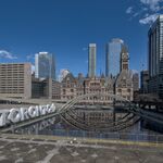
 
But here, we are in agreement; the deformed Hula Hoops add little or nothing; and take away precious space.
Is space at Wilson that precious? I don't think I've actually gotten off there since Downsview opened. But it struck me as relatively spacious - and it's no longer a terminal.

I bet that are piece gets more hands on attention than most installations.
 

Attachments

  • 1608269050358.png
    1608269050358.png
    2 MB · Views: 236
Last edited:

Back
Top