News   GLOBAL  |  Apr 02, 2020
 8.5K     0 
News   GLOBAL  |  Apr 01, 2020
 39K     0 
News   GLOBAL  |  Apr 01, 2020
 4.7K     0 

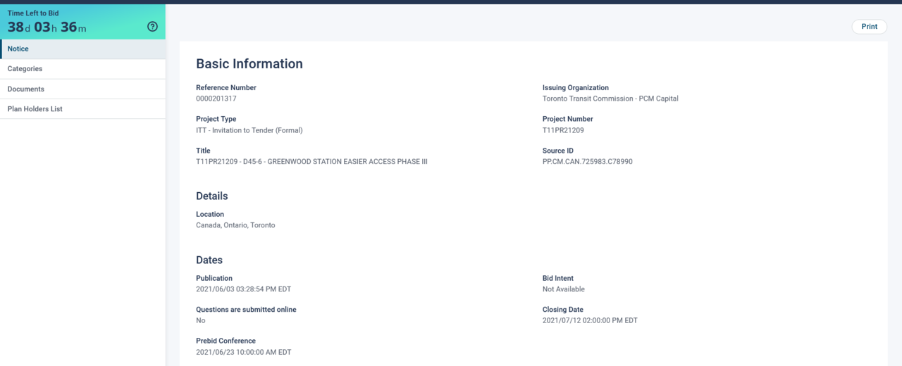
Tender is out for Easier Access for Greenwood Station:
1622816651523.png


****

Of note, the description does not include the 'second exit'..........which has been a problematic project for the TTC at this station. (these are often bundled)

The community wanted a convenient spot, most likely on Danforth; while the Commission originally wanted something less costly on Strathmore I believe.
 
Last edited:
Lets bring this forward for those who don't get Twitter previews and/or are click averse:

1622978487901.png


Needless to say, I, and many here would disagree with Alex, strongly.


1622978641003.png


I would further disagree with this statement.

I viscerally dislike carbon copy architecture. The Spadina Line is my favourite part of the system for each station's unique architectural expression.

Line 2, as a whole is my least favourite, both for the general reason of standardization, and secondarily for the fact that standard has a public washroom aesthetic with a bland design and blander finishes.
 
Last edited:
Lets bring this forward for those who don't get Twitter previews and/or are click averse:

View attachment 325658


Needless to say, I, and many here would disagree with Alex, strongly.


View attachment 325661

I would further disagree with this statement.

I viscerally dislike carbon copy architecture. The Spadina Line is my favourite part of the system for each station's unique architectural expression.

Line 2, as a whole is my least favourite, both for the general reason of standardization, and secondarily for the fact that standard has a public washroom aesthetic with a bland design and blander finishes.
I looked him up on twiter he's an arcatre critic for the globe and mail
 
The “”disciplined design” of the BD is not an uncontroversial subject - how many on here remember then-Councillor Sandra Bussin’s views?
 
Ok, I get that it isn't going to win any architecture awards, but the TTC doing renovations always tacks something on to what is there and doesn't really put architecture at the top of the priorities. They build things that are functional. The tiles will not match the colours exactly, it will look a little out of place, but at least the things they are doing here are somewhat playful and non-traditional. I would prefer this to the station change at Pape or the traditional red brick and concrete entrances they have elsewhere that are simply boring. Nobody will stare a minute at the other Chester entrance to admire its architecture, form, materials, or whimsy.
 
The tiles will not match the colours exactly, it will look a little out of place, but at least the things they are doing here are somewhat playful and non-traditional.
Chester uses the same green tiles at Woodbine. The tiles in new entrance there looks virtually the same, if not identical to the existing tiles in the station. If there's a difference, it's subtle enough I've not noticed it.

Why would it be a problem at Chester?
 
Why would it be a problem at Chester?
I don't mean at Chester specifically, I mean in general. For example at Wellesley the tiles are completely off. At Keele they went with colorful additions that have no relation to what was there before. At St. Clair West despite a more earth tone theme on the initial station, blue and purple titles for easier access additions. In general none of these additions are thought out in a way that shows a goal of respecting the original design philosophies. They are colorful additions that stand out.
 
I don't mean at Chester specifically, I mean in general. For example at Wellesley the tiles are completely off. At Keele they went with colorful additions that have no relation to what was there before. At St. Clair West despite a more earth tone theme on the initial station, blue and purple titles for easier access additions. In general none of these additions are thought out in a way that shows a goal of respecting the original design philosophies. They are colorful additions that stand out.
I think a lot of the problems that they ran into with tiles is that they don't make the same type of tiles anymore and sometimes getting a color match isn't as easy as it is with paint.
 
I think a lot of the problems that they ran into with tiles is that they don't make the same type of tiles anymore and sometimes getting a color match isn't as easy as it is with paint.

Agreed. Look at Dundas.

When they built the entrance to 10 Dundas they used a newer, glossier yellow tile. It did not match the 1980s dark yellow matte tile that was there. It did however match the original vitrolite better.
 
I think a lot of the problems that they ran into with tiles is that they don't make the same type of tiles anymore and sometimes getting a color match isn't as easy as it is with paint.
I'm not sure how they got such a perfect match for the green, but can't do the other colours. Is it a case of can't, or don't know how and won't?
 
Putting aside 'matchiness'; the quality of the finishes on a stand-alone basis vary widely between stations.

I wonder if the variance is based on on who in the TTC is managing the project?

Might make an interesting bit of research.
 
Last edited:
The TTC agenda is out for July 7th, 2021.

Fairly light over all; but 3 reports pertain specifically to Easier Access.

The first, is about approval to award contracts for making each of Summerhill, Rosedale and Castlefrank accessible, as well as delegated authority over the summer for additional such contracts.

Report Link Below:


From said report:

1625104312682.png


The second report concerns making High Park Station accessible, and seeks approval for the City to acquire easements needed due to sewer relocation as part of said project.

Report linked below:


The third and final report on accessibility is similar to the above, but seeks approval to acquire easements in relation to making Old Mill Station accessible.

Report linked below:


Back
Top