News   GLOBAL  |  Apr 02, 2020
 8.9K     0 
News   GLOBAL  |  Apr 01, 2020
 40K     0 
News   GLOBAL  |  Apr 01, 2020
 5.1K     0 

If it means anything, the subway lines are in fact numbered. www3.ttc.ca/Subway/index.jsp

With the LED displays on the front of the new trains, maybe have the screens switch between "1 Yonge-University" to "To Finch".

One thing I liked about New York's subway is the stations had secondary names. We kind have this with Bay with Bay-Yorkville, maybe we should look to expand this. Some examples could include Dundas-Eatons Centre, Pape-Greektown, etc. We could even use Doug's scheme to bid off the naming rights to accessible businesses (open to public customers, not private offices) within a 5 minute walk of the stations.

I've known this for a while. But I'm a little surprised that the TTC talked about it on their website. I thought that was only for TTC workers
 
If it means anything, the subway lines are in fact numbered. www3.ttc.ca/Subway/index.jsp

With the LED displays on the front of the new trains, maybe have the screens switch between "1 Yonge-University" to "To Finch".

One thing I liked about New York's subway is the stations had secondary names. We kind have this with Bay with Bay-Yorkville, maybe we should look to expand this. Some examples could include Dundas-Eatons Centre, Pape-Greektown, etc. We could even use Doug's scheme to bid off the naming rights to accessible businesses (open to public customers, not private offices) within a 5 minute walk of the stations.

I've known this for a while. I'm surprised that the TTC listed the numbers on their website. I thought that only TTC workers used that.

Regarding the secondary names, I think thats a great idea. But we'd have to make sure that the names are relevant to the location (eg: Dundas - Eatons Centre) and not something like Spadina- Pizza Pizza.
 
Naming rights from private businesses existed on the TTC since 1978.

Oxford Properties, the owner of Yorkdale, does not pay a single penny to the TTC to have naming rights to said station.

If paid naming rights were to come into effect, then Oxford Properties would have to begin paying the TTC to be fair.

Perhaps the TTC should threaten to call Yorkdale station Ranne until Yorkdale begins paying?
 
It's Eaton Centre. Or more correctly Toronto Eaton Centre.

I say we wait on the renaming until the DRL gets built, especially if University is severed from Yonge and joined to the DRL instead.
 
"STAIRS LABELLED "STAIRS" WITH AN ICON"
I remember a logo sign for stairs in a hospital, it was put up sideways, and people were asking me if this was the way to the swimming pool, or the wave pool.
16jluf5.png

Thats a pretty poor staircase icon. There should be an arrow pointing up.
 
Let's call Yorkdale Station as Ranee Station instead until Oxford Properties pays the TTC.

Alternatively, Oxford Properties can pay for the re-installation of the coloured neon lights that were removed decades ago from Ranee Station, as well as maintenance of the station, so that the name Yorkdale can be retained for the subway station.

If Oxford Properties can afford an expansion of Yorkdale Shopping Centre, then why are they not renovating the station? It is much cheaper to install LED fixtures on the ribs of the station to mimic the old fixture than to add extra shopping space in a large shopping mall.
 
Last edited:
The TTC logo is great. But there are better fonts then this.

Great posts, and great signage I think. But you lost me on this. The TTC logo is terrible! I think one reason they are experimenting with so many alternatives at Osgoode is that the logo does not look like a transit logo to visitors to Toronto. The international standard is some kind of stylized M or T, maybe with a geometric shape. That might be a bit boring (though some are excellent) but it does help when I'm being a tourist somewhere unfamiliar. The standard isn't used every place, but look how much TTC stands out form all the others: http://mic-ro.com/metro/metrologos.html

Even putting tourists aside, the TTC logo is terrible. The letters don't just overlap, they're all jumbled up. Ironically it looks like a train wreck!

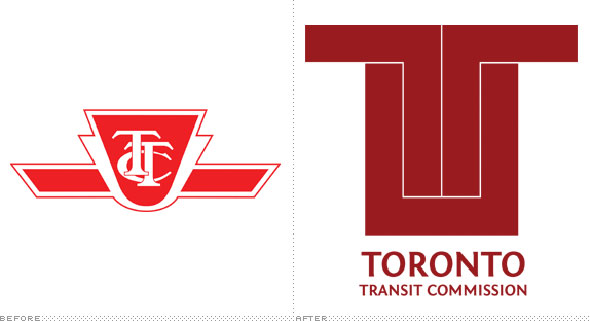
The TTC logo is so terrible, it's terribleness made it all the way to Sydney where some design student designed this:

2010715-ttc-logo-2b.jpg


There's some obvious problems with that, but I really like the idea of incorporating the flying-U somehow with a letter T. You seem to have some design skills, want to try?
 
Hmm... I stumbled upon this on Twitter: https://twitter.com/TTCchris/statuses/165483921415479296 . Looks like the TTC is trying to redesign their fare booths. But their "solution" looks like it does little to solve the real problem: too much information, too little space, no organization.

And why exactly does the TTC feel the need to place ALL that information on the booths? When you have thousands of people entering a station per hour while the turnstile can only hold one person at the time, why in the world would the TTC think that putting that information there would be a good idea. The last thing we need is for people to be slowing down the line as they to find an obscure piece of information on the booth. The one and only thing that should be on the booth is the price of fare. Thats all that passengers need to know at that moment.

And while I'm ranting about fare booths I might as why take time to say this: WHY IN THE WORLD IS TORONTO STILL USING FARE BOOTS AS THE ONE AND ONLY WAY OF GETTING INTO STATIONS. MOVE INTO THE 21ST CENTURY ALREADY! It is absoutley outrageous that the TTC hasn't moved to a system like this:

fare-gates.jpg


With those all you do is drop your coin or swipe your card and go. If someone is in the way, move over to the next one. The problem of waiting in line for two minutes as a mother and her four children discuss fares with the collector are gone.

Now I know what some of you are thinking:

-What if I need coins or tickets? Who will give them to me?

The answer: a macine thats tucked in a corner somewhere. I know that its impressive technology. Welcome to the 21st century.

-What if I need directions?

The answer: There will still be a booth. But it will just be there to answer questions and it won't be collecting fare. There is no reason why other customers should wait in line for 10 and a half minutes as the fare collecter gives you a personal tour of Toronto from his box. And if we're lucky, we may be able to get rid of all the booths and replace them with magical little boxes called computers. From a computer you can get accurate directions to more places then you could ever dream of visiting. Isn't technology amazing?

*rant over*
 
Great posts, and great signage I think. But you lost me on this. The TTC logo is terrible! I think one reason they are experimenting with so many alternatives at Osgoode is that the logo does not look like a transit logo to visitors to Toronto. The international standard is some kind of stylized M or T, maybe with a geometric shape. That might be a bit boring (though some are excellent) but it does help when I'm being a tourist somewhere unfamiliar. The standard isn't used every place, but look how much TTC stands out form all the others: http://mic-ro.com/metro/metrologos.html

And that kind of "standing out" is bad?
 
The TTC logo is terrible! I think one reason they are experimenting with so many alternatives at Osgoode is that the logo does not look like a transit logo to visitors to Toronto. The international standard is some kind of stylized M or T, maybe with a geometric shape. That might be a bit boring (though some are excellent) but it does help when I'm being a tourist somewhere unfamiliar. The standard isn't used every place, but look how much TTC stands out form all the others: http://mic-ro.com/metro/metrologos.html

Even putting tourists aside, the TTC logo is terrible. The letters don't just overlap, they're all jumbled up. Ironically it looks like a train wreck!

I think the page you linked shows that there's a huge diversity of transit logos, many of which are completely different from an M or T. Nobody would suggest ditching the London Underground logo just because it doesn't conform to the "international standard". I don't see how it's a bad thing that the TTC logo is unique. Yes, like with many cities' logos, you have to learn that it stands for transit, but once you do, there's no way to ever mistake it for anything else.

The "jumbled up" lettering used to be quite common for North American railway logos (well, maybe for logos in general), and I like that heritage aspect.

And while I'm ranting about fare booths I might as why take time to say this: WHY IN THE WORLD IS TORONTO STILL USING FARE BOOTS AS THE ONE AND ONLY WAY OF GETTING INTO STATIONS. MOVE INTO THE 21ST CENTURY ALREADY! It is absoutley outrageous that the TTC hasn't moved to a system like this: [...] With those all you do is drop your coin or swipe your card and go.

Do you actually use the TTC? You do realize that you can just "drop your [token] or swipe your card and go" at TTC stations too, right? The fare booth is just for people who need to pay cash, buy tickets/passes, or show a transfer. There are plenty of other turnstiles. Yes, the TTC's fare system is embarrassingly antiquated, but the fare booth is hardly the only way to get into a station!
 
Last edited:
Why are we still swiping cards? Waiving or 'tapping' a pass is so much faster

Presto is coming (eventually). But that wasn't the previous poster's point. (And anyway, there's no difference in speed between tapping my Oyster card in London and swiping my Metropass in Toronto.)
 

Back
Top