News   GLOBAL  |  Apr 02, 2020
 9K     0 
News   GLOBAL  |  Apr 01, 2020
 40K     0 
News   GLOBAL  |  Apr 01, 2020
 5.2K     0 

There's one, just one, really rather pretty 60s modernist apartment block with white glazed brick on Sherbourne looking onto Allan Gardens, keep that, raze the rest. (Raze their roofs!)

Re Globe and Mail. The outside pretends to hide the sexy goings on of a major newspaper, mirrored secret-headquarters windows and all. But once you get inside, lamesville. Mouldy, dark, stained, confusing. The building rambles on for so long and so far that a circus school has taken over a whole wing, and no one's noticed.

There is also quite a nice yellow brick 50's modernist apartment building on the north side of Carlton overlooking the park.

Re: Globe and Mail. I recall John Bently Mayes gassing on about how he thought it was one of his favourite buildings in Toronto (sans the doors from the Moderne Globe & Mail building which used to be at King & York)
 
Would anyone really get rid of the old churches around Allan Gardens?

I'll just put some stuff down I haven't seen yet:

- All of Moss Park: the armouries, the housing project and the rink
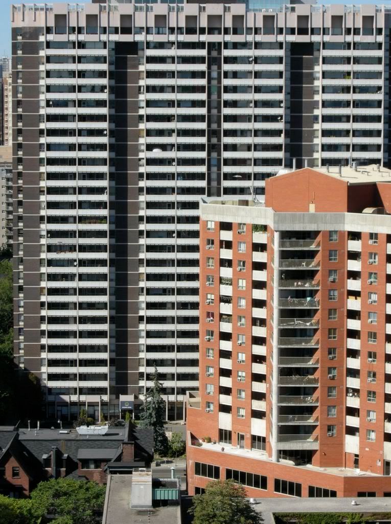
They already started with Walnut Hall...
 
Sorry dt toronto geek... your views are amazing... but 100 Wellesley's never really been much of a looker. It's a bit of a monster (same with the red building on the south west corner of Jarvis and Wellesley.)

DSCN0859.jpg
 
I agree, they're both ghastly buildings. I would only defend '100' for what it offers inside the building, which is why I live here now.
 
Harbour Square
The 5 uglies at Harbourfront
Redpath Refinery
Metro Convention Centre
Hearn Generator and smokestack
Island Airport (not sure if that counts as a "building")
HBC
Sheraton Centre
2 Bloor W
Torch
Yonge-Eglinton Centre
"Fort Jock" at U of T
Pure Spirit (and all future Spirits at DD)
Union Station shed
Rye Business Building
180 Dundas W
Infinity
Pinnacle
Toronto Sta--

--Aw, crap, this list is already too long and it's depressing the hell out of me.
 
What's with the hate-on for Sid Smith? While I agree that it's a nightmare to navigate, I hardly find the exterior to be so offensive.

sidsmithopens.jpg

(not the most current picture)
 
Offending buildings are 10 times more offensive when the interior deserves obliteration, too. Sid Smith is not a throwaway "eww, I don't like exposed concrete" nomination, it's interior alone is begging to receive an arsonist's deft touch, or possibly an earthquake.
 
So this is a great thread? I think it sorta stinks with terrible ideas.

When I revisited, I thought I ought to re-write my response. Let "obliterate" mean "change / disguise / alter" to the max. And I am sticking by my response .. Hudson Bay Centre, at Yonge/Bloor. I recall there once was a plan to add a lot of glass to the exterior of the department store facing Bloor, to disguise those huge, sheer, windowless, pre-cast walls, but somehow the people who own the place changed their minds. The buck, you know, that won out. While I'm at it, the clumsy towers alongside/on top of the place could stand a new finish, how to do that I do no know.

My second major change is First Canadian Place. It's Toronto's largest building and its exteriour is so f###ing bland. How about a totally new face for it? No more sadistic cold white marble. I have no suggestions though. Some drama, please?

My third major change would be to tear down Eaton Centre completely and start again -- this time around, no suburban mall stuck in the middle of a great urban city. EC is street-unfriendly. Nothing is good about it. It sucks all the street life away. Have you ever wondered why Yonge from Queen to Dundas is so dead? It's because of Eaton Centre.

But really, someone responded TD Centre. I love that complex, so dramatic, such a statement. I just love it. And maybe Fort Book, aka Robarts library, isn't pretty, but it has detail and it makes a point. HBC on the other hand makes no point at all.
 
FCP would look great if only they could keep it one colour (clean). I don't believe this is possible with marble. But I love the white...Toronto has a reasonably colourful core of skyscrapers and the white really stands out.
 
most of the worst examples have already been mentioned... Harbour Square for sure!

What about those cement silos that are part of the round house... havent looked at them up close recently, but arent they sort of half demo'd already? Actually I would like to see that whole area cleaned up... I know that they are trying to sort of preserve it as an historical building and its good that it has tenants, but it always looks like crap whether up close or far away...

Also have an architectural critique to offer on Phase II of BCE Place (now Brookfield I guess) The design seems so unbalanced with no roof ornament... the top several floors taper down to flat roofs...? I think they need to echo the spire on TD Can Trust tower... two little antennas, one on each roof. I believe thats how they looked in the renderings way back when... it just bugs me everytime I look at that building, just unfinished!
 
And maybe Fort Book, aka Robarts library, isn't pretty, but it has detail and it makes a point.

And that point is "this building is unwelcoming to humans. Its purpose is to intimidate. Do not enter. And if you dare to, it will not be easy to access a book, nor comfortable to remain while you read it."
 

Back
Top