News   GLOBAL  |  Apr 02, 2020
 8.9K     0 
News   GLOBAL  |  Apr 01, 2020
 40K     0 
News   GLOBAL  |  Apr 01, 2020
 5.1K     0 

Bogtrotter:

The massing is fine, the materiality isn't. Something light and airy would have been significant improvements to the intersection - instead, we've got a doubling of bulk.

AoD
 
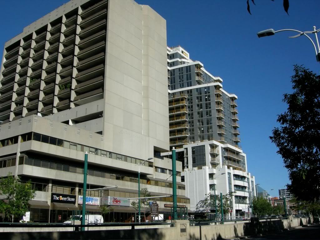
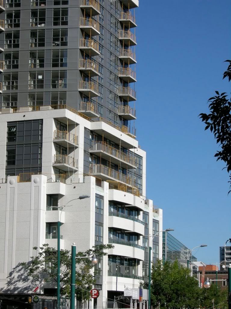
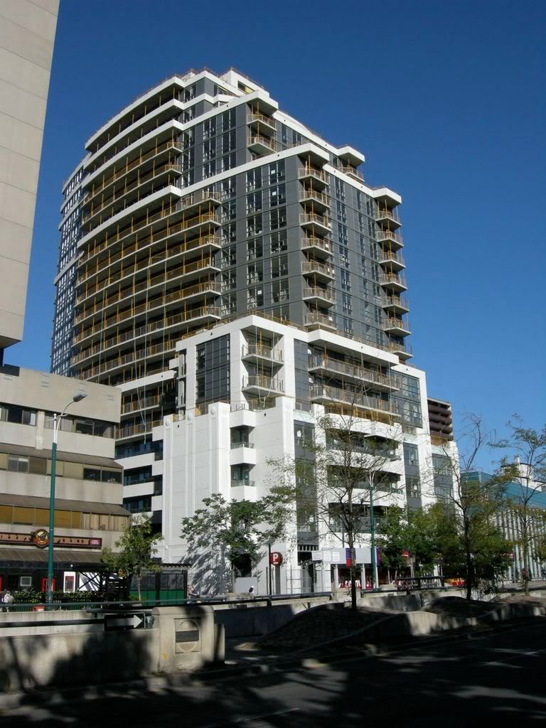
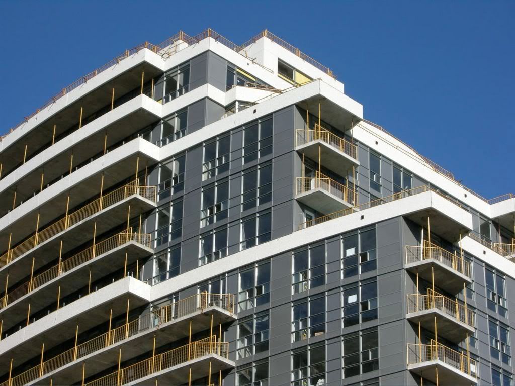
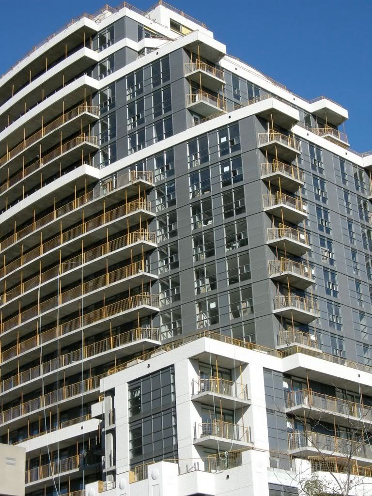
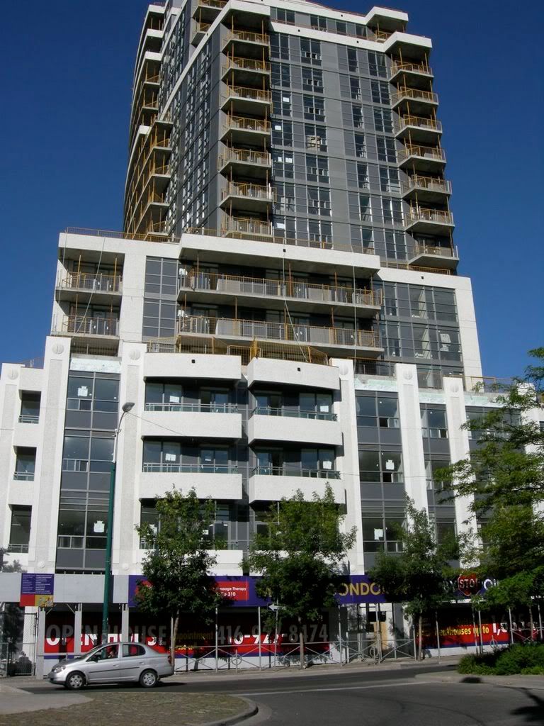
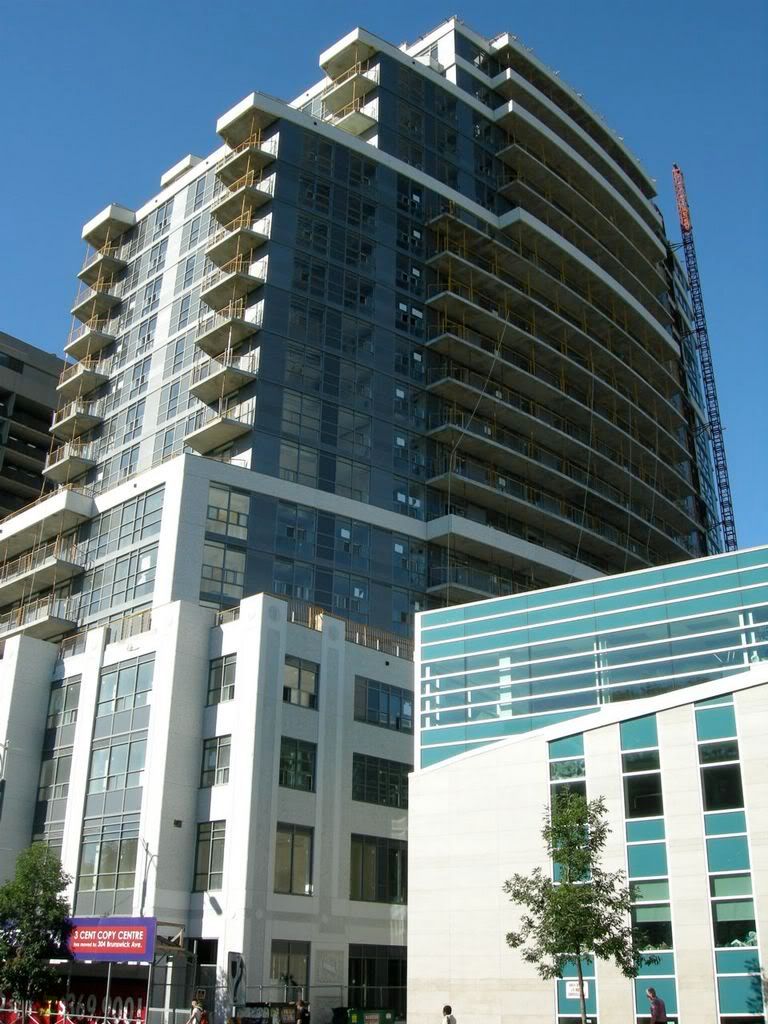
Mosaic Construction Progress Aug 17, 2007

Overdue for an update...

Except for that brutal slab residing directly south, I think I love everything about this building. The gradual curves are great.

mosaic1.jpg


mosaic2.jpg


mosaic3.jpg


mosaic4.jpg


mosaic5.jpg


mosaic6.jpg


mosaic7.jpg
 
Not happy with the dark windows and the overall feeling of "weight" that this condo brings to the area - There are so many aspects of it that are just awkward.
 
Overdue for an update...

Except for that brutal slab residing directly south, I think I love everything about this building. The gradual curves are great.

mosaic6.jpg

I think they've done a pretty lousy job to the Spadina face - with the centreline moving to the left twice. It looks inelegant and bulky to me.

42
 
Thanks for the pics.

Well, that is certainly a lot of...grey panels.

The building appears to fit the site well enough but nevertheless looks large and heavy. A lighter bluish-grey would have been a better colour for all that cladding/panels but the building certainly looks a little lighter on top (lighter than its heavy base).

The pre-cast could have been worse, insofar as it could have been beige (a favourite colour in this city - see Spire, Pentages, District Lofts, etc.) or darker. If it gets decent glass balconies, and the retail at the base works, I would give it a B- (apologies to Hume).
 
This is a fantastic building; and a large improvement over the building directly next to it.

Funny thing is, I did'nt even know about it. Thanks for taking pictures and posting.

Great Great stuff.
 
It just dawned on me...

...but the "brutal slab" looks very Clewesian! Here's what they need to do: replace the balcony railings and windows with clear glass and you'd get a sort of 22 Wellesley-style building--the big wrap around concrete shell (sure it's facing the "wrong" way but so what!) with clear glass balcony/curtain wall. It suddenly--for the first time--appeals to me!

The real mess just might be Mosaic--ironic! (The lower portion of Mosaic is okay--it's the curvy "tower" portion that looks out of place--two buildings in one looks as bad as that one on Bellair.)
 
Judging all that is humdrum and awkward about it, I'd stop short of deeming it a huge improvement on its S neighbour--relative to their respective times, they're about equal...
 
At first I wasn't crazy about the thick grey panels either (especially on the lower balconies), but doesn't that help it fit in with its neighbours to the south and north?
 
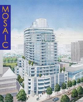
Just for comparison's sake... it does look much better in the rendering without the dark brown glass...

mosaicrender.jpg
 
Wow what a hideous nightmare! I was expecting a lot more from this project – the potential was certainly there for a nice development. Reminiscent of downtown’s other monstrosity – SPACE on Richmond. Gross! The $5 windows are frightful – and just wait until the white precast starts getting stained and dirty – this will truly turn out to be a disaster. At least there is density at a TTC hub.
 
and just wait until the white precast starts getting stained and dirty

all that grey sprandrel will discolour into a fugly light grey/brown long before we need to worry about the pre-cast
 

Back
Top