Northern Light
Superstar
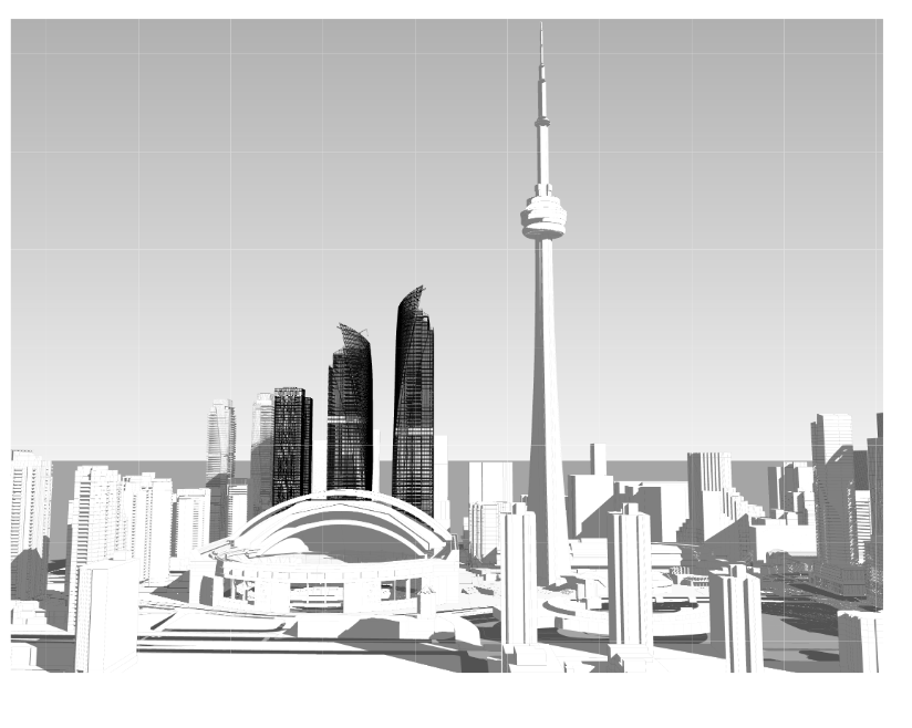
From the architecture plans:

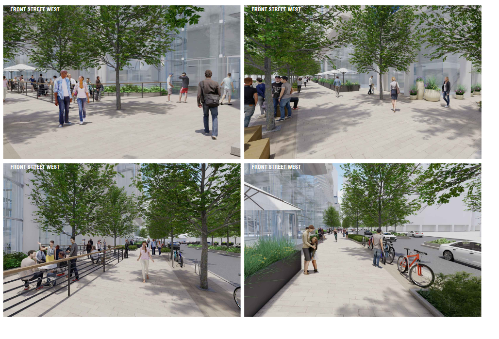
From the Landscape and Lighting Plan:


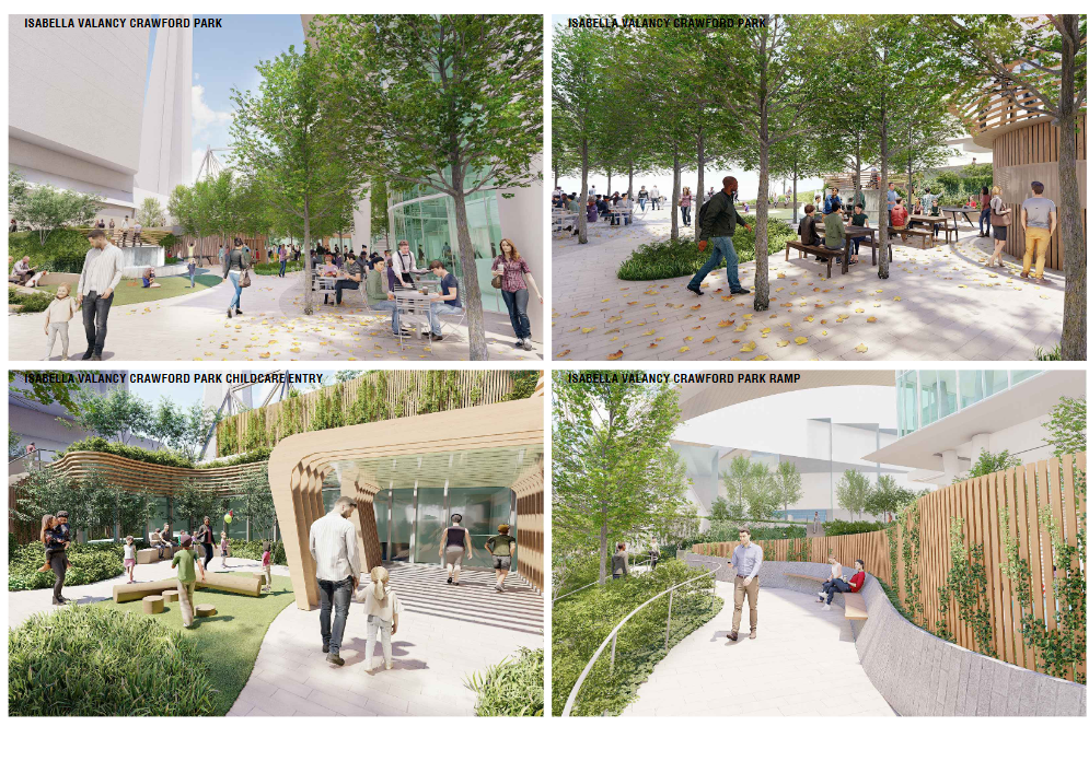
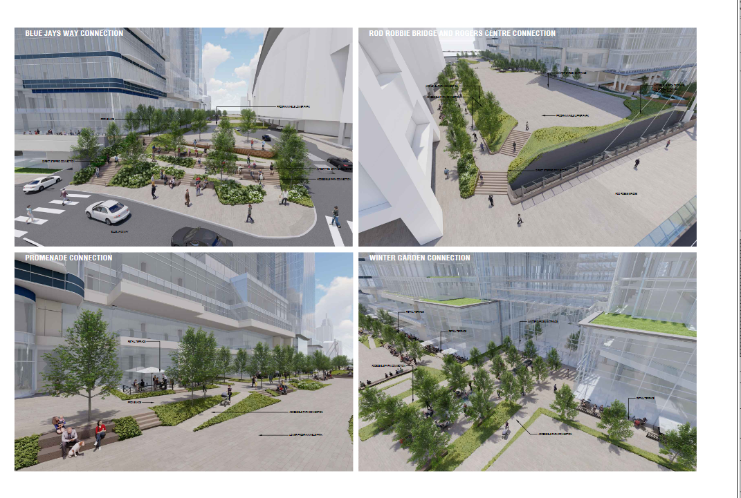
From the Landscape and Lighting Plan:
Still going for the all-glass lobby on Front huh? That’s unfortunateI have a strong sense that space is going to be completely dead in winter.
Much better than that old Conference Center that is there now
When is this getting built again?
I dunno - it's not a particularly 'warm' space with uses that encourage people to stay around. I would be very happy to be proven wrong; the last thing Toronto needs is another monolithic facade that has no street life the moment the temperature drops.It won't be built until Phase 2 with the East tower so there will be 3 million SF of office overhead. It'll be pretty busy.
How many times before we learn that monotonous block-long glass walls are not a desirable ground realm? Add some variation in texture/materials, crimp the glass in sections to provide some intrigue, introduce a little colour, and yes provide the patios it seems they already are. The designers heard this from the DRP and seem to have promptly done nothing about it. Imagine creating a sense of arrival at the Winter Garden entrance as the facade condition changes from the edges of the site towards the grand entry way. As it stands the entirety of it feels ubiquitous. Where is the sense of celebration and arrival?
If that ground floor façade along front isn't better broken up or articulated, this thing is going to fail at promoting any sort of inviting pedestrian quality to Front St.
Apart from that the rest of the buildings are perfectly mediocre. The park(s) has promise and I'll await the final designs on that.
I hate to sound negative when this will be an improvement over what is currently there but it's so frustrating that we repeat these mistakes over and over.
I think it is hard to tell honestly what it will be. Guess These are after all, s. Hopefully that will be drawn out in the SPA phase.I dunno - it's not a particularly 'warm' space with uses that encourage people to stay around. I would be very happy to be proven wrong; the last thing Toronto needs is another monolithic facade that has no street life the moment the temperature drops.
How many times before we learn that monotonous block-long glass walls are not a desirable ground realm? Add some variation in texture/materials, crimp the glass in sections to provide some intrigue, introduce a little colour, and yes provide the patios it seems they already are. The designers heard this from the DRP and seem to have promptly done nothing about it. Imagine creating a sense of arrival at the Winter Garden entrance as the facade condition changes from the edges of the site towards the grand entry way. As it stands the entirety of it feels ubiquitous. Where is the sense of celebration and arrival?
If that ground floor façade along front isn't better broken up or articulated, this thing is going to fail at promoting any sort of inviting pedestrian quality to Front St.
Apart from that the rest of the buildings are perfectly mediocre. The park(s) has promise and I'll await the final designs on that.
I hate to sound negative when this will be an improvement over what is currently there but it's so frustrating that we repeat these mistakes over and over.
Sent an email expressing these concernsDon't just wait on improvement.
Talk to those who can affect change.
View attachment 305772
Or write directly to Oxford; or their architects.
Hopefully the PATH issue would be fixed with a future redevelopment of the convention centre, but yeah the current plan definitely isn't ideal.I think it is hard to tell honestly what it will be. Guess These are after all, s. Hopefully that will be drawn out in the SPA phase.
As much as I agree - this is a rezoning application not an SPA. Most rezoning applications change. Materiality and articulation can be solved in SPA and I've confidence in Oxford on programming.
.
said some elements are going backwards. The south tower here which used to be iconic has been VE'd and the PATH is not longer direct to Union Centre. It has been jogged over the rail which is awful.