YourBoy007
Active Member
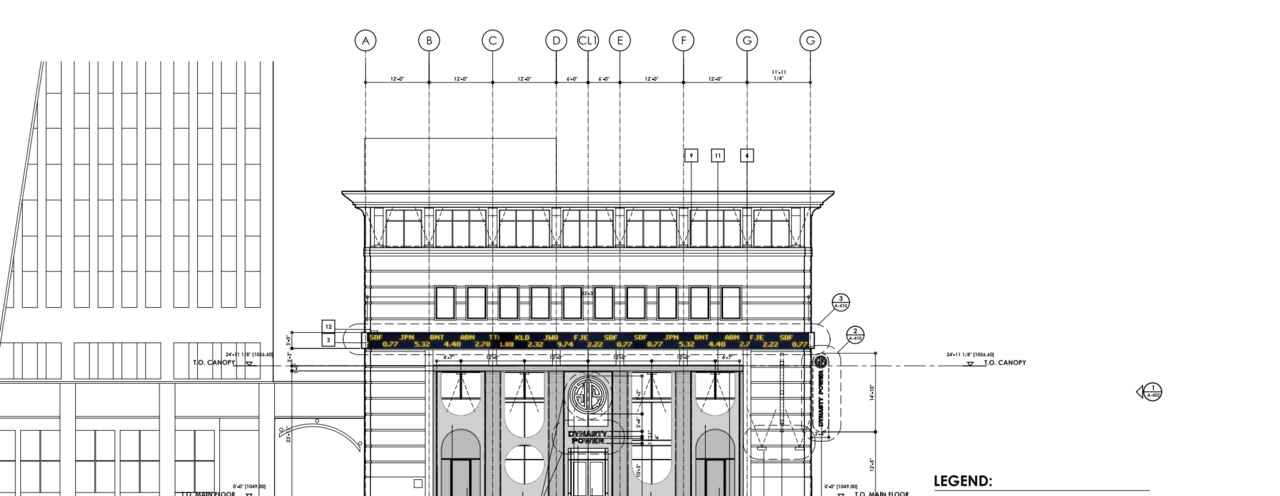
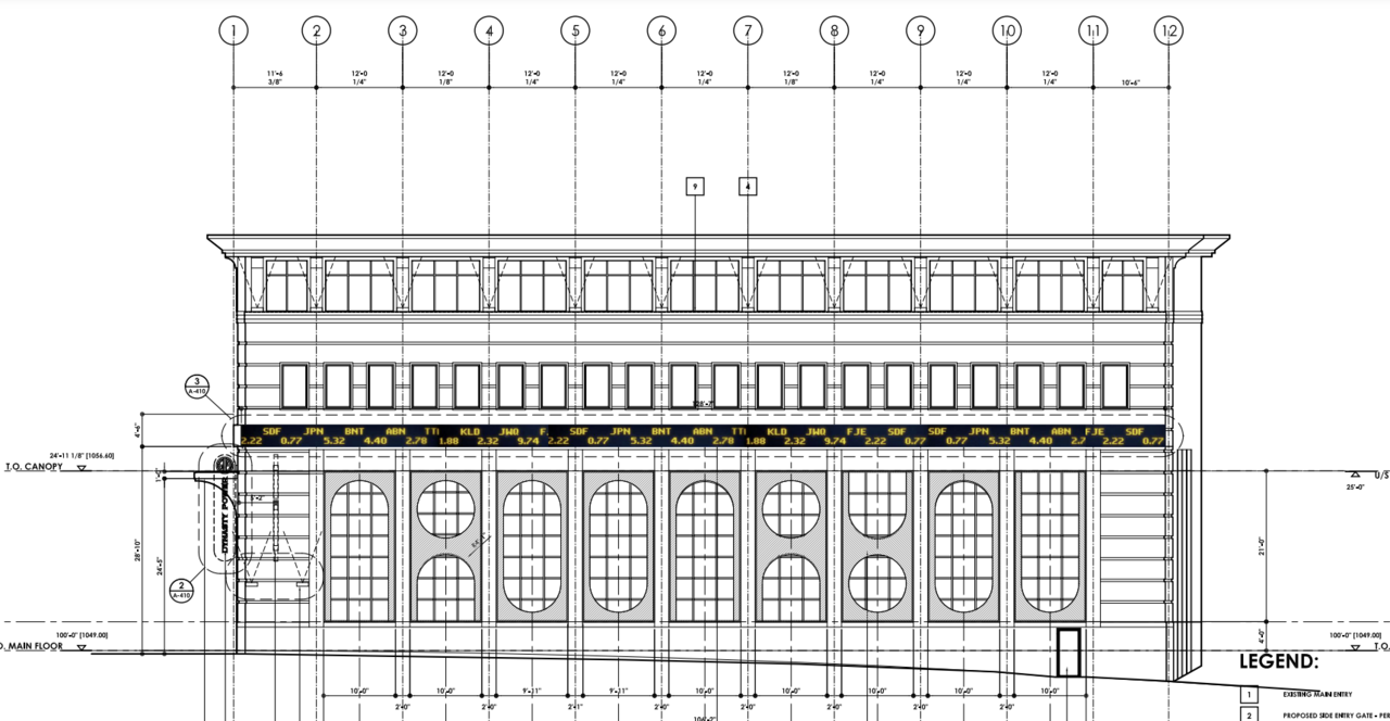
Digital Stock Tape Ticker on Stephen Ave


Seems like only recently they converted that one TO offices.the Lorraine

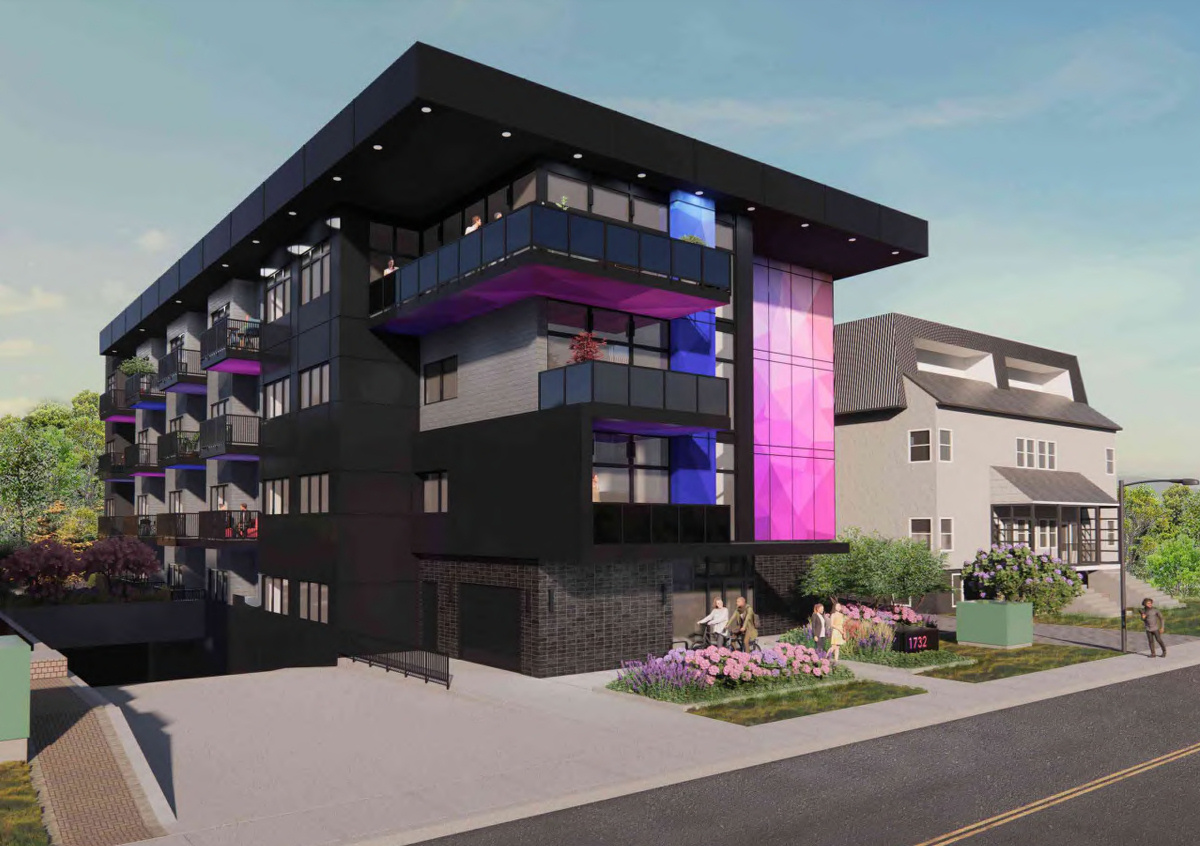
Pulled this from the DP.New apartment proposed for 1819 26 Avenue SW. https://developmentmap.calgary.ca/?find=DP2023-00789
The problem for me is I hate that mid-century vibe. Can’t stand Elveden Centre.Both the Fina and Taylor buildings have a nice mid-century vibe...so I hope they don't go and ruin those facades with some cheap patterned paneling.
The others, they can do whatever the hell they want with...
A bit of a facelift and some dramatic lighting is all it really needs on the outside.
I love the mid-century vibe. I wouldn't want the whole downtown to be mid-century, but I find there is more character to that era than the era from the 70's or 80's. When I look at buildings like Fifth Ave Place, Sun life Buildings or 5th & 5th my first thought is, 'did someone actually paid to design this junk?'The problem for me is I hate that mid-century vibe. Can’t stand Elveden Centre.
I don't mind Fifth ave place, I think it fits for its purpose. If someone asked me what a glass office building might look like, that's what would come to mind, which I guess fits the point that it doesn't feel like it took much thought to design. It's absolutely best to have a mix of designs, and I like having a few of the mid-century buildings as well.I love the mid-century vibe. I wouldn't want the whole downtown to be mid-century, but I find there is more character to that era than the era from the 70's or 80's. When I look at buildings like Fifth Ave Place, Sun life Buildings or 5th & 5th my first thought is, 'did someone actually paid to design this junk?'
this is the time in the life cycle when a buildings appeal seem to bottom out, 10yrs later everyones regretting they disappeared.The problem for me is I hate that mid-century vibe. Can’t stand Elveden Centre.
I would probably like 5th ave place better if we didn't have so many other boring twin and triplet office towers. It's one redeeming quality is the reflection of one tower off of the other one, but other than that it's so boring. That said, it the towers were combined into one 60 storey tower I might like it.I don't mind Fifth ave place, I think it fits for its purpose. If someone asked me what a glass office building might look like, that's what would come to mind, which I guess fits the point that it doesn't feel like it took much thought to design. It's absolutely best to have a mix of designs, and I like having a few of the mid-century buildings as well.
If there's any building type I wish we had less of, it would be all the older apartment buildings with massive above-ground parkades before the residential portion. Looks horrible, has bad street-level integration from a pedestrian perspective, and the towers themselves are not particularly great to look at either.


