Towered
Superstar
Wallman hasn't impressed for quite a while. This is no exception.
You just made me think of that as new standard slogan for all mediocre development.
"We're better than a gas station!"

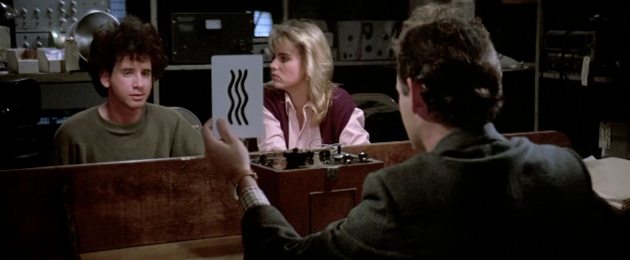
Soon we'll have all the stones from The Fifth Element in HBSAll I can think of is this scene from Ghostbusters:

"Uh, a couple of wavy lines?"
Right but here's an idea for you. Why shift floorplates when you could just make a square box..? Right, see the genius all the sudden!?As M1 & 2 have proven, one could shift the floor plates in conjunction with the waves for a far more dramatic effect...
...but in the end, it's a glass box with sqiggly lines impressed upon the wrap arounds. Done before. And worn the T-shirt. /sigh
...and that's why we got those squiggly lines instead. /sighRight but here's an idea for you. Why shift floorplates when you could just make a square box..? Right, see the genius all the sudden!?
Taken today, this tower would appear in view beside Eau de Soleil, with clearly visible squiggly lines helpfully reminding observers who may have forgotten, that the lake is right there:
View attachment 357345
View attachment 357346