


digi
Active Member
It's small, attractive, and is an all in one solution for modem + WiFi with just one cable.
....it's also crap, have fun rebooting it every day.
|
|
|
It's small, attractive, and is an all in one solution for modem + WiFi with just one cable.


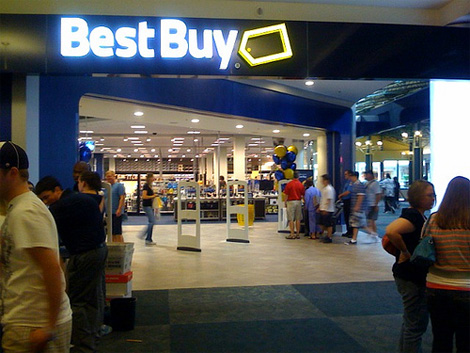
I don't mind Best Buy's rebranding. The old logo is a little too INYOURFACE.
....it's also crap, have fun rebooting it every day.

OMG! Have you all seen the horrible remake of the FIDO brand?
Gone are the brilliant dog ads and in is an over stimulating yellow everything website and a logo taken from MS Office's Clipart....ugh.. puke
www.fido.ca
Bell's new branding has had quite a positive effect on my view of the company and their new stores offer a simplified, clean look that's quite refreshing in our market. Fido goes in the extreme opposite direction.
